tech support 8

  • Subscribe to our RSS feed.
  • Twitter
  • StumbleUpon
  • Reddit
  • Facebook
  • Digg
Showing posts with label accessibility. Show all posts

Sunday, 1 December 2013

Web Development Advent Calendars for 2013

Posted on 05:46 by Unknown

Photo of an advent calendar with a leg lamp, potted ivy, and small statue of Ganesha.
Ganesha may or may not be stealing chocolate from the advent calendar.


For a few years now web developers around the world have celebrated Saturnalia Christmas with advent calendars covering topics related to the web. Some come and go, but you'll probably recognize a few regulars on this list.


I may have missed some, so please pass them along if you know of any. For those I know are not returning, I have listed them at the end.


1. 24 Ways


24 Ways, the one that most of this think about for web development calendars, is back again. It's been going strong since 2005 and based on its history this year should have some good articles.


2. Perl Advent Calendar


Perl Advent Calendar goes all the way back to 2000 (and back then looked a bit more like a traditional advent calendar, too) and has been dispensing tips for Perl developers ever since.


3. 24 Jours de Web


24 Jours de Web is starting its second year as an advent calendar for web folk. Written in French, it is clearly primarily targeted at French speakers, but a round of Google Translate will open it up to far more readers (like me).


4. UXmas


UXmas is an advent calendar aimed at the user experience community. Coming from Australia, American readers may be thrown just a bit by the schedule. The calendar promises everything from sketches, to articles, to tools, to videos.


5. Webkrauts


Webkrauts has an all German advent calendar, and it also dates back to 2005. It covers general web topics, but being in all-German readers like me will benefit from a Google Translate version of the page.


6. 12 Devs of Xmas


12 Devs of Xmas will also start the day after Christmas and go for 12 days from then. When all the other calendars have wrapped up, you'll still have one to read. The site is silent on its return, but this tweet suggests it's gotten writers and has a plan.


7. Freelancember


Freelancember 2013 is targeted squarely at freelancers. Its daily entries will consist of downloadable gifts in the form of PDF worksheets. Think of this as less about web-tech and more about MadLibs for projects. It has last year's calendar there as well, and so far (as of December 1) I cannot tell the calendar will just be a repeat of last year.


8. Mozilla Developer Network Holidays calendar


Mozilla Developer Network Holidays calendar includes brief links to resources or demos and suggests that you can edit them (if they are MDN resources). It doesn't link to previous years, but you can just hack the URL.


9. SysAdvent


SysAdvent is targeted to systems administrators, but there is a some cross-over to web developers. It has posts dating back to 2008 (and yet I missed it in last year's collection), so there is plenty of good material there if you're too impatient to wait for each day to be revealed.


10. Web Accessibility Advent Calendar 2013


Web Accessibility Advent Calendar 2013 is in Japanese, and thanks to the wonderful powers of Google Translate, I can tell you that it is a calendar to make the talk about Web accessibility (based on this statement: Webアクセシビリティに関する話題でつくるカレンダーです。). If you know Japanese, I welcome any corrections. The site Adventar.org appears to host other advent calendars, some about web technologies, some about ramen.


Not Returning


A handful of calendars aren't returning this year (so far), but in most cases content from previous years is still available. These include Font Deck's Adfont Calendar (which also skipped 2012), the Fronteers advent calendar (in Dutch, and also skipped 2012), Web Advent (it's taking a year off), Performance Calendar, HTML & CSS Advent (this is the 2012 calendar), She Said It (no access to old calendar), 12 Days of Podcasts (or at least there is no indication on its site or Twitter).


Not Web Related


ScienceGeek Advent Calendar Extravaganza is not web-related at all, and frankly it isn't promoted nor is it tagged (although I linked to “special” since that tag had the first day and nothing else). It is, however, probably going to be neat stuff given the first day is a giant image of the Christmas Tree Cluster.

Read More
Posted in accessibility, css, design, fonts, html, internet, mobile, standards, usability, UX | No comments

Sunday, 24 November 2013

Image alt Exception Change Re-Re-Re-Requested

Posted on 14:38 by Unknown


HTML5 logo — I am the 'alt,' not the 'title'
This post is an unexpected follow-up to my post Image alt Exception Change Re-Re-Requested (note one fewer “re-”) from June 2012. Back then, some had called into question the need for alt attributes to be required and ubiquitous on all img tags.


Well, guess what — alt is back under review.


The Web Content Accessibility Guidelines (WCAG) working group is reviewing (and soliciting feedback on) changes to determine how a page may fail WCAG Guideline 1.1 Text Alternatives, which outlines how a page uses the alt attribute for images. This also means changing the techniques authors may use to pass Level A validation for WCAG SC 1.1.1.


To simplify, the discussion is centered on allowing authors to omit alt if the author uses aria-label, aria-labelledby, or title attributes. For example, the following three examples would all be valid:


<img src="fox.png" title="Photo of a fox reading aloud from a book.">
<img src="fox.png" aria-label="Photo of a fox reading aloud from a book.">
<img src="fox.png" aria-labelledby="FoxPic">
<p id="FoxPic">Photo of a fox reading aloud from a book.</p>


David MacDonald has already captured the arguments for and against that are already being bandied about, which I reproduce here:


Arguments for the Change


  • These alternatives on the img element work in assistive technology;

  • The ARIA spec says these attributes should get an accessible name in the API;

  • They say it's easy to teach beginner programmers to just always use an aria-label on everything, rather than requiring a label on form fields and alt on images;

  • They feel that F65 is overly strong since it can fail the entire page for a single missing alt (regardless of the validity of the rest of the page), and they would like to soften it to allow those other valid elements to carry the page;

  • HTML5 allows a figure/legend combination instead of alt, so they feel WCAG will have to change F65 regardless in order to allow a figure with a legend, and that helps open the door to this discussion.


Arguments against the Change


  • aria-label, aria-labelledby, and title, are not really suitable attributes for img alternative text because they imply a label or title, rather than alternate text, so they are not semantic equivalents;

  • title is not well supported;

  • Some feel that the ARIA spec is not in any way suggesting these as replacements to alt;

  • ARIA instructs authors to use native HTML where possible, and they could not come up with viable use cases for omitting alt text;

  • There are hundreds of millions of dollars invested in current evaluation tools and methodologies, and this would represent a major departure from one of the most basic accessibility conventions, one that is almost as old as the web and is the “rock star” of accessibility;

  • It could cost a lot of money to change guidance to developers and muddy the waters on a very efficient current evaluation mechanism;

  • When the figure/legend combination is supported by assistive technology we can amend F65, but that is a different issue and the semantics of this construct are OK for text alternatives, rather than the aria-label, aria-labelledby, and title options;

  • It may cause some confidence problems to WCAG legislation because it represents a strong loosening to a fundamental Success Criteria, an unnecessary change that doesn't help the cause of accessibility, but just complicates things;

  • alt is better supported;

  • The alt text appears when images are turned off;

  • Initial twitter feedback from the community is strongly against changing this failure.


Where You Come In


You don't have to be a part of any standards body to weigh in with your opinion. You can leave comments here and I will happily carry them back to those discussing this (even if I don't agree). You can also let me know on Twitter or you can let Steve Faulkner know, as he is one of the HTML editors.


My Opinion


It is my understanding that ARIA was intended to cover the gaps where HTML didn't already have elements or features to enable accessibility. Moving to supplant an accessibility feature that is widely understood and broadly supported with one that most web developers don't understand seems like a step backward, especially when that specification should fall away in time.


There is also the case to be made for the current status of WYSIWYG editors and code generating features of CMSes. It's taken more than a decade, but for the most part they have support for alt. It seems unlikely that these tools will implement logic to exclude alt when there are valid aria- or title attributes, so they will probably still include alt regardless.


Revisiting HTML elements and attributes is warranted and should be part of the process. We've removed oddities such as hgroup and re-instated valuable bits like time. However, I am not sure why alt seems to get an annual review when it has clear history and use cases.


My very quick responses to the arguments outlined above:


Alternatives to img work in assitive technology


I am not an AT user, so I cannot address this other than to say that it is my understanding that the alternatives work inconsistently across AT whereas alt has a far more consistent experience.


ARIA says these attributes should get an accessible name


That may very well be the case, but should itself doesn't require it.


Easier to teach aria-label on everything, rather than requiring a label on form fields and alt on images


I think there is a false dichotomy here. In modern development shops, the team making forms isn't necessarily the one placing images. Labels have a clear functional association that mirrors desktop software experiences. Alternative text for an image is not a label, though sometimes it may be considered such. This also implies the label element itself may be replaced with aria-label, which isn't the point of ARIA.


Missing alt can fail an entire page


As far as I am concerned, if your entire page fails accessibility validation because of a missing alt, then that is a valid failure. It stands to reason that some items should fail regardless of how perfect the rest of the code may be. Softening the failing power of alt can be a separate discussion, but allowing it to be bypassed seems like a blanket solution. I can't imagine an entire new building is considered accessible even though there is no ramp to bypass the front steps.


Since HTML5 allows a figure/legend combination to bypass alt…


This goes back to my original resistance to allowing any exceptions for alt. I worried that any exceptions would be used as a wedge to ultimately tearing down alt. As such, I don't consider this a valid argument. If anything, it should be used as an argument to re-examine the value of making exceptions for alt and perhaps rolling them back (counter-suit!).


Related (on this blog)


  • Image alt Attributes Not Always Required in HTML5, April 19, 2011.

  • More on Image alt Requirement in HTML5, May 2, 2011.

  • Image alt Exception Change Re-Re-Requested, June 11, 2012.

  • Still Guessing on Accessibility, January 31, 2013.


Update: November 27, 2013


It is possible for W3C non-members to post their opinions/thoughts to the Accessibility Task Force list (one of the lists where this being discussed). Source:


@patrick_h_lauke anyone can mail public-html-a11y, it just may take some time to show up on list http://t.co/sFe84xMDio :) cc @stevefaulkner

— Mark Sadecki (@cptvitamin) November 27, 2013


@chaals @patrick_h_lauke @w3c all a11y TF moderated emails are being redirected to the list as quickly as they can, w/in minutes of posting

— Mark Sadecki (@cptvitamin) November 27, 2013


All the info you need to respond (reproduced here):


  • E-mail discussions taking place on the HTML Accessibility TF's W3C mailing list, public-html-a11y.

  • Weekly (or less frequently, as needed) HTML Accessibility TF teleconferences with minutes distributed to HTML Accessibility TF mailing list (archive);

  • Sub-group teleconferences with minutes distributed to HTML Accessibility TF mailing list;

  • The HTML Accessibility TF Wiki.

  • The HTML Accessibility TF may use Web-based surveys instead of email to poll group opinion.


Read More
Posted in accessibility, html, standards, W3C, WAI, WCAG | No comments

Wednesday, 13 November 2013

Captions in Everyday Use

Posted on 11:35 by Unknown


Yesterday Henny Swan asked a simple question on the Twitters:


I'm curious to know, who uses subtitles on web content (X device) who's not deaf or hard of hearing? For example I did when breastfeeding.

— Henny (@iheni) November 12, 2013


Adam Banks put together a Storify of the responses that show there are plenty of use cases for those not hard of hearing to get value from closed captioning.


In general, any context where either the audio track is loud enough that the viewer doesn't want to disrupt those nearby, or the background noise is too much to hear the audio track clearly, is a case where captions have value for all users. Other cases that popped up include multi-tasking or working with a new language or just tough accents.


In short, closed captions have value for all users.


There is also no reason to panic about providing them, particularly if you use a video service that can do them for you. For example, back in 2010 YouTube committed to enabling auto-captioning for everyone, and Google has documents to help plus tutorials from others, such as this step-by-step or or this video.


Image of the captions in use on President Obama's speech about the Chile earthquake.


Of course, as I was writing this post, Henny posted her own reference to the Twitter conversation: The weird and wonderful reasons why people use subtitles / captions


The Storify of responses I mentioned above is embedded here to spare you all the hassle of clicking the link and to bloat my page with unnecessary script blocks:


Update: November 14, 2013


While I was writing this, Dave Rupert was putting together a very neat experiment, Caption Everything: Using HTML5 to create a real-time closed captioning system.


It's a neat proof-of-concept to show how real-time closed captioning is a possibility with current technology, albeit imprecise and cumbersome. If nothing else, hopefully it can bring more attention to a technique that, as demonstrated above, can benefit all users in everyday situations.


It's such a nifty experiment, I am embedding it here (remember, this isn't mine, this is Dave Rupert's code):


See the Pen Closed Captioning with HTML5 by Dave Rupert (@davatron5000) on CodePen


Read More
Posted in accessibility, i18n, internationalization, localization, translation, usability, UX, video, YouTube | No comments

Friday, 27 September 2013

Slides: Responsive Web Design Primer

Posted on 10:47 by Unknown


Yesterday I had the pleasure of visiting the University at Buffalo (my alma mater) to give a presentation for its CIT professional development series. I got to talk about responsive design.


Knowing in advance that the room would have technical and non-technical users I went for a code-free presentation. One thing I learned is that code would have been useful, so if you're looking for any in here you won't find it.


I understand there is video from the event, and as soon as I have it I'll share it here as well. In the meantime, enjoy the slides without any context. Which may be more entertaining than my typically awful attempts at humor.


Responsive Design Overview for UB CIT from Adrian

Read More
Posted in accessibility, css, design, html, mobile, print, project management, speaking, standards, touch, usability, UX | No comments

Monday, 22 July 2013

Infographically Disinclined

Posted on 13:21 by Unknown


I don't care for infographics. Their original purpose of visually conveying otherwise complex information has been superseded by their current use as marketing drek with "quirky" illustrations, blocks of prose, and the occasional useful factoid.


The love affair with inforgraphics is confounding to me as a web developer. They are often deployed on the web as a giant image that typically has text too small too read, that cannot be selected, and doesn't include any kind of accessibility affordance. In short, the likelihood I can get one them to display properly in anything other than a desktop web browser is slim.


Doing It Wrong


This example in particular seems to epitomize the poor planning and execution of the typical infographic.


Example of a poorly-done infographic about accessibility in HTML email.


It is intended to convey the challenges of designing and building HTML-formatted emails for users with disabilities. Got that? It's an infographic about accessibility best practices.


How many ways is this doing it wrong, just from an accessibility perspective?


  1. All of the text is set as an image. There is no selectable text.

  2. At default zoom settings, the text is too small.

  3. The text and background colors don't provide enough contrast.

  4. The numbered examples require extensive scrolling to see the accompanying text.

  5. The blog post of this infographic has useless alt text ("Accessibility-Email-Design-1000px").

  6. The title of the blog post is easily as useless (again, "Accessibility-Email-Design-1000px").

  7. The blog post itself has no other content. No words, no explanation, no plain-text equivalent.

  8. The option to embed the infographic on your site perpetuates the same inaccessible content.


Feel free to suggest more.


I'd also like to qualify that if your infographic is primarily text, you're doing it wrong. All text save for two useless pie charts and a
fake screen capture do not make up for the volume of copy stuffed into this image.


Another example of doing it wrong: NASA's Falling UARS Satellite Explained


Doing It Right


Example of an infographic getting it right, from XKCD.


This simple and direct infographic isn't even meant to be an infographic, but it conveys quite a lot of information in very little space with very few words. In fact, this information is conveyed better visually, with no words, than as long blocks of prose.


At a quick glance you can see the height that the ice achieved relative to familiar landmarks and relative to each of three other cities. No long-winded explanations, no pointless pie charts, just familiar context and simple references to learn more. This is data visualization, simply put.


Another example of doing it right: Wind Map


Giving It a Go


I figured that, on a lark, I'd make my own infographic using HTML and CSS and code it so that it's accessible. Then I realized that I don't have a topic I think is best represented by a graphic. Nor am I a data visualization expert. So I cheated and made a Venn diagram (often labeled as an infographic, even though it's a diagram) about infographics:


Cannot copy text.


Large download.


Forgot its roots.


Cannot copy text + Large download = Flash


Large download + Forgot its roots = Animated GIF


Cannot copy text + Forgot its roots = Text as image


Cannot copy text + Large download + Forgot its roots = Infographic


I also made a version on CodePen if you want to hack it for your own use.


Related


  • We've Reached Peak Infographic, and We're No Smarter for It

  • 70 best infographics on the web (The number keeps changing as they add more and retweet it, also, I disagree with the assertion in the title.)

  • Why your Brain Craves Infographics (I'll give them credit for building it in HTML, even if it's still a text-laden scroll-a-thon.)

  • WTF Visualizations: Visualizations that make no sense (added September 12, 2013).

  • Creating an Accessible Infographic (added September 23, 2013).


Update: November 11, 2013


SMBC put together a great infographic this weekend, The Top 6 Reasons This Infographic Is Just Wrong Enough to Sound Convincing. It struck a cord with some at Slate, because it got re-purposed over there with a lot of handy links to other infographical horrors: Why Infographics Are Terrible, in One Terrible Infographic.

Read More
Posted in accessibility, design, infographic, rant, standards | No comments

Friday, 12 July 2013

My Carousel Use Stats

Posted on 09:14 by Unknown


Screen shot of the carousel on the Algonquin Studios home page.


I started this post way back in March after reading Brad Frosts' bit on carousels. Then I let it sit unfinished. With the buzz around ShouldIUseACarousel.com this week, I figured I'd finish it up. The data is old, although I offer updated numbers at the bottom.


The Process


I looked at all the visits to my home page between February 1 and March 3 to get 30 days of data. Of those visits to the home page, 83% of the time the home page was the landing page. I figured if a smaller percentage of initial visits to our site came via the home page then I would not read too much into the value of these numbers as the user might have already been through enough of the site to get what he or she wanted, but 83% is a pretty big number.


The home page has many content areas, but by far the most prominent is our carousel. During the time frame tested, there were 5 different carousel images with accompanying text. Each one has its own Google Analytics event tracker so I can tell which carousel item has been clicked.


For those playing at home, and using Google Analytics, it's as simple as adding an onclick to your anchor: a href="/Products" onclick="_gaq.push(['_trackEvent', 'Slider', 'Columns']);". In this case I am tracking a custom event named "Slider" with the value of "Columns" (so I know which specific image/slide was chosen).


The Results


In the 30 days I tested, the carousel links were clicked less than 1% of the time the home page was visited — 0.8% to be slightly more precise.


Every other element on the home page received at least twice as much activity, with the tabs getting used nearly 10% of the time. Site-wide, the skip navigation link got clicked (tapped, followed) half again as much as the carousel at 1.2%.


To qualify this a bit, the carousel wasn't intended to serve as our only call to action on the home page. It's more about presenting a message to help brand the company as part of our new marketing push. Adding this tracking feature has allowed us to track how the carousel gets used, if at all, and which images/messages are more compelling.


The Latest Results


For this updated version of my draft post I looked at the last 30 days again (June 11 to July 11, 2013) to see what activity we've had on the carousel. The last 30 days are a good fit since we haven't been showing off the features of the slider to clients (which results in activity that is a function of people playing, not truly discovering and naturally using).


For the last 30 days, the number of clicks on the carousel is much lower. 0.2% of unique visitors clicked a carousel slide. For every 500 unique visits to the site, someone clicks on the carousel. Interestingly, this is the same number of people who print pages from our site and lower than the "skip navigation" activity in the same time period.


About the Carousel


Our site is a great place for us to experiment with the carousel since we can quickly refactor it, tweak it, replace it, and so on. Since its launch 7 months ago I have made a number of tweaks to the technology and we have played around with the messages to see what sticks.


We're revisiting the design of the carousel now to see how its relative size and different images and messages can affect its use. At some point it may go away, but not until I've had a chance to gather lots of data.


The carousel itself is both swipe-friendly and keyboard-friendly, uses a linear flow with a clear start and end, has indicators to show where a user is in the overall collection (also allowing a user to jump to a specific slide), and pauses when there is any action taken on the carousel (hover, click, tap, etc.). I built it to also serve images at appropriate sizes for appropriate devices, something which I am regularly tweaking. The base for this is the Royal Slider.


Related


  • ShouldIUseACarousel.com

  • Accessibility expert warns: stop using carousels, July 11, 2013.

  • Carousels, January 23, 2013.

  • Carousel Interaction Stats, January 22, 2013.

  • Auto-Forwarding Carousels and Accordions Annoy Users and Reduce Visibility, January 19, 2013.

  • Don’t Use Automatic Image Sliders or Carousels, Ignore the Fad, September 27, 2012.

  • That big sliding banner? Yeah, it’s rubbish, September 6, 2012.

  • 5 Big Usability Mistakes Designers Make on Carousels, August 2, 2011.


Read More
Posted in accessibility, analytics, design, mobile, rant, touch, usability, UX | No comments

Tuesday, 14 May 2013

Balancing Act: Features, Budgets & Timelines at Web Standards Sherpa

Posted on 13:55 by Unknown


As of today I am an author over at Web Standards Sherpa. I wrote an article discussing the process of juggling a no-budget, tight-timeframe web site for Buffalo Soccer Club while still trying to adhere to best practices. The article is titled "Balancing Act: Features, Budgets & Timelines."


I get a chance to talk about responsive design and even rant just a little bit about print styles (the article itself prints well, too). The article also has the nifty ReadSpeaker feature which means that the page can read the article aloud to you in a voice that is entirely unlike mine (at least it's a male voice by default).


Balancing Act: Features, Budgets & Timelines
Adrian offers insight into the decision process of building a new site for the Buffalo Soccer Club, a not-for-profit with little to no budget and a looming deadline. Read it…


Read More
Posted in accessibility, clients, css, html, mobile, print, project management, standards | No comments

Tuesday, 12 February 2013

ARIA Tabs

Posted on 07:06 by Unknown


Photo of whiteboard and ARIA tabs sketch.


Last week I spent my Friday afternoon trying to get my head around how to apply ARIA properly to a tabbed interface. I even got so far as to map it out on my whiteboard and snap a photo so I could mull it over during the weekend.


And then the very next day Marco Zehe, responsible for accessibility quality assurance at Firefox, posted Advanced ARIA tip #1: Tabs in web apps and suddenly my weekend of snow shoveling turned into fiddling.


Marco's post included sample HTML for tabs and an outline of how the script to control it should function, but did not include the necessary styles or script to make it behave as tabs. Since I was marking up a tab list anyway to incorporate ARIA, I'm sharing my code here for others to try, enhance, and so on. It's also on CodePen, so you can fork it and fiddle there.


The HTML


My code has minor differences from the example. For instance, I add a return false; at the end of the event handler. I also call the function that activates the first tab at the bottom of the page, so all tabs start as un-selected and no tab panels are visible until that function fires. You can just as easily put the logic into your HTML and CSS to have one pre-selected and skip that function call altogether.


<ul class="tabList" id="tabs" role="tablist">
<li role="presentation"><a id="tab1" href="#panel1" onclick="showTab(1);return false;" role="tab" aria-controls="panel1" aria-selected="false">Tab 1</a></li>
<li role="presentation"><a id="tab2" href="#panel2" onclick="showTab(2);return false;" role="tab" aria-controls="panel2" aria-selected="false">Tab 2</a></li>
<li role="presentation"><a id="tab3" href="#panel3" onclick="showTab(3);return false;" role="tab" aria-controls="panel3" aria-selected="false">Tab 3</a></li>
</ul>

<div class="tabPanels">
<div id="panel1" role="tabpanel" aria-labelledby="tab1">
<p>
Nulla tincidunt pharetra tortor. In dapibus ultricies arcu. Suspendisse at purus eu est tincidunt feugiat. Praesent et sapien. Vivamus fermentum, diam vel ornare vestibulum, nibh massa imperdiet lectus, eget tincidunt urna urna nec erat. Curabitur interdum. Nam lorem nunc, posuere quis, suscipit eu, hendrerit vitae, nisi. Etiam hendrerit tincidunt felis.
</p>
</div>

<div id="panel2" role="tabpanel" aria-labelledby="tab2">
<p>
Vestibulum id eros eu lorem tincidunt sollicitudin. Suspendisse ligula. Sed nisi magna, elementum at, ultricies in, tincidunt imperdiet, quam. Nulla semper. Suspendisse potenti. Sed sollicitudin dolor aliquet purus. Aliquam dui. Proin arcu metus, porttitor eget, pulvinar nec, molestie dapibus, ligula.
</p>
</div>

<div id="panel3" role="tabpanel" aria-labelledby="tab3">
<p>
Pellentesque habitant morbi tristique senectus et netus et malesuada fames ac turpis egestas. Aliquam vel erat. Vestibulum egestas purus ut felis. Cum sociis natoque penatibus et magnis dis parturient montes, nascetur ridiculus mus.
</p>
</div>
</div>

<script>
showTab(1);
</script>


The CSS


This CSS presumes you've already set your typefaces, your page background, and everything works as you want. I have put the minimum styles to make it visually look like tabs. You may notice that I use two different selectors for both a selected tab and for a hidden tab panel. One is by a class name, the other is by the value of the appropriate aria- attribute. Use the first for broader (older) browser support and the latter if you don't care. If you do target just current browsers, then you may adjust the script below to skip writing classes.


.tabList {
list-style-type: none;
padding: 0;
margin: 0 auto;
}

.tabList a {
display: block;
float: left;
border: .1em solid #000;
padding: .25em 2em;
margin: 0 0 -1px .25em;
border-radius: .5em .5em 0 0;
background-color: #aaa;
}

.tabList a:link, .tabList a:visited, .tabList a:hover, .tabList a:focus, .tabList a:active {
text-decoration: none;
color: #000;
}

.tabList a:hover, .tabList a:focus {
background-color: #ccc;
}

.tabList a.selected {
background-color: #fff;
border-bottom: 1px solid #fff;
}

.tabPanels div {
clear: left;
margin: 0 auto;
padding: 1em 2em;
border: 1px solid #000;
border-radius: .25em;
background-color: #fff;
display: none;
}

.tabPanels div.selected, div[aria-hidden=false] {
display: block;
}

.hide, div[aria-hidden=true] {
display: none;
}


The Script


The following script toggles classes for the tabs and the tab panels, as well as adjusting the aria-selected and aria-hidden attributes. There is no keyboard functionality in it at all, but I am always willing to take some from a kind donor. As I noted above, if you use solely the aria- attribute as a CSS selector, you can drop the part that changes the class for each element.


var OpenTab;

function showTab(num) {
try{
if(OpenTab!=undefined){
var OldTabID = document.getElementById('tab'+OpenTab);
var OldPanelID = document.getElementById('panel'+OpenTab);
OldTabID.className = '';
OldPanelID.className = 'hide';
OldTabID.setAttribute('aria-selected', false);
OldPanelID.setAttribute('aria-hidden', true);
}
var TabID = document.getElementById('tab'+num);
var PanelID = document.getElementById('panel'+num);
TabID.className = 'selected';
PanelID.className = 'selected';
TabID.setAttribute('aria-selected', true);
PanelID.setAttribute('aria-hidden', false);
OpenTab = num;
}catch(e){}
}


An Example


The following is an embedded version of the tabs on CodePen. Because of how CodePen works, you'll see a few minor differences in styles, but this is at least a functional example which you can fork and tweak.


For example, on CodePen, the function to enable the first tab must be called in the block of script itself, but I prefer to call it at the bottom of the page.


For reasons I cannot figure out, the tabs on the embedded version of this Pen do not work. Visit the tabs directly on CodePen to see them in action.


Check out this Pen!


Wrap-up


That's it, pretty simple. If you have suggestions, corrections, or are a regular AT user and can offer further insight, please feel free to share in the comments or tweet me on the Twitters.


Update, August 6, 2012


Marco Zehe, the guy who wrote the article Advanced ARIA tip #1: Tabs in web apps (which I link above) offered some adjustments to make to my sample code. In essence, dump the aria-hidden from the HTML and use the CSS style visibility: hidden; in its place. His explanation:


@aardrian That would definitely be preferred over aria-hidden, since aria-hidden is not supported by all screen readers.

— Marco Zehe (@MarcoInEnglish) August 2, 2013


@aardrian Especially older versions of JAWS, which you'll still find a lot, will ignore it.

— Marco Zehe (@MarcoInEnglish) August 2, 2013


@aardrian So use visibility: hidden; in addition to display: none;, and you should be good. Leave aria-hidden out completely.

— Marco Zehe (@MarcoInEnglish) August 2, 2013

Read More
Posted in accessibility, ARIA, css, html, JavaScript, standards, W3C, WAI | No comments

Thursday, 31 January 2013

Still Guessing on Accessibility

Posted on 09:18 by Unknown


I have no illusions that accessibility on the web can be tricky. It's primarily tricky because of the way developers choose to implement it. Web Axe nicely sums it up:


Most people don't realize that the web IS accessible. The problem is that designers and developers break it.

— Web Axe (@webaxe) January 28, 2013


Part of the reason developers break it is because they make assumptions about disabled users. I feel there is a trend toward assuming all disabled users are blind, all blind users surf on JAWS, all JAWS users have the same version, and this version is configured in the same way for all users.


But that's nowhere near true. The spectrum of disabilities runs from cognitive impairments through physical impairments, from dyslexia to no motor control. The spectrum of vision impairment alone runs the gamut from colorblindness, to full blindness, from age-related vision loss to at-birth loss. Even from normally-sighted users in ideal lighting conditions to normally-sighted users at an awkward viewing angle with the sun on their LCD screen.


When we think of only one disability we treat all disabled users the same. When we get feedback from one user with an issue we ourselves cannot comprehend, we tend to apply it to all users. You can learn plenty one user at a time, as I did from a web developer with dyslexia and dyscalculia. But just as a focus group of one is not adequate to extrapolate to all your users, finding one user with one variant of an impairment doesn't translate to all users with all forms of disabilities.


All of this swirled around in my head as I read two well-meaning posts from two respected web developers that, both in the original post and in the comments, show a whole lot of guesswork:


  • Navigation in Lists: To Be or Not To Be, January 29, 2013 by Chris Coyier.

  • On Alt Text, January 30, 2013 by Jeffrey Zeldman.


I think it's great these posts were written, even if I think we should be beyond this. While I disagree with some of the arguments in the posts, and many of the arguments in the comments, you'll find that both posts lack direct feedback from the users they purport to be supporting. The comments are littered with people guessing and asserting what disabled users need, but with little to back it up.


As you read through you will find a lot of justification built around how easy it is for the developer or how the developer thinks the user wants to "view" the content.


Posts that would benefit from comments from screen reader users:
Navigation in Lists css-tricks.com/navigation-in-…
On Alt Text alistapart.com/blog/post/on-a…

— Adrian Roselli (@aardrian) January 30, 2013


As commenters with experience working with accessibility or using accessibility tools weighed in, it still felt like the other commenters and the original authors didn't quite like the answers they were hearing.


And so we are, some 20 years after the rise of the web, still guessing how to implement accessibility. As a community, we're happy to build device labs where we can let people test on every conceivable mobile device, but we aren't building the same thing for accessibility. I am fortunate to have had a good deal of experience with disabled users both in my community, among my clients, and in my personal life. I am not so sure we as a web development community can claim that.


If you do wade into the comments on both articles, I recommend you read John Foliot's comment on the A List Apart article, even if others seem to dismiss it. In the CSS Tricks article, Louis Lazaris collects a nice set of references and Léonie Watson provides a quick straw poll of users. Ultimately Chris Coyier gathers some of this feedback.


The Upshot


People are talking about these issues. These two posts provide far more handy, contextual discussion in the comments than most web developers will bother to do on their own.


Related


I've had plenty to say about the alt attribute in the past (for example, let's not call it an alt tag). But with some people asserting that alt is no longer required in HTML5, it's easier to just link to my own retelling of why that's the case in HTML5 and why I think it's a terrible idea.


  • Image alt Exception Change Re-Re-Requested, June 11, 2012.

  • More on Image alt Requirement in HTML5, May 2, 2011

  • Image alt Attributes Not Always Required in HTML5, April 19, 2011


Update: February 1, 2013


There is a comment on the A List Apart article from Marc Drummond that outlines cases where a description in the alt attribute, in this context, is useful to users


Dennis Lembree (Web Axe) has added to the meta discussion with his post Leave Accessibility to the Experts Please. It's worth reading the whole post and the ensuing comments to get the whole picture instead of just reacting to the title.


Update: February 4, 2013


Turning the proper application of alt text into a popularity contest (ok, I know that's not quite fair, but that's how it feels to me), CSS Tricks has a poll for alt Text Usage. With no context (what else is on the page, does the graph get explained later, why use a graph if a table can do the job, etc.), it's not exactly a fair question. There are, however, a few good comments among the rest that try to set people straight.

Read More
Posted in accessibility, html, rant, standards, W3C, WAI, WCAG | No comments

Saturday, 1 December 2012

2012 Advent Calendars for Web Devs

Posted on 15:10 by Unknown


Now that the (Western, my favorite) holiday season is upon us, the tradition of advent calendars whose chocolate is replaced with web-related tips and articles is back. This year's crop is missing some from last year, but there's still good stuff to be found.


If you know of any others, please pass them along. For those not returning, I have listed them at the end.


1. 24 Ways


24 Ways, the one that pretty much defines the genre for me, is back again. It's been going strong since 2005 and based on its history this year should have some good articles.


2. Performance Calendar


Performance Calendar dates back to 2009 (and still defaults to 2011 if you go straight to the domain). It focuses on techniques to speed up your site via scripting, CSS, and general mark-up, along with server tweaks and analysis suggestions.


3. Perl Advent Calendar


Perl Advent Calendar goes all the way back to 2000 (and back then looked a bit more like a traditional advent calendar, too) and has been dispensing tips for Perl developers ever since.


4. Webkrauts


Webkrauts has an all German advent calendar, and it also dates back to 2005. It covers general web topics, but being in all-German readers like me will benefit from a Google Translate version of the page. Suggestion via @patrick_h_lauke.


5. 24 Jours de Web


24 Jours de Web has kicked off its first year as an advent calendar for web folk. Written in French it is clearly primarily targeted at French speakers, but a round of Google Translate will open it up to far more readers (like me). Suggestion via @PhilippeVay.


6. Japanese HTML5 Advent Calendar


HTML5 Advent Calendar 2012 is in Japanese, and thanks to the wonderful powers of Google Translate, it was very little confidence that I suggest it is produced by volunteers who have each picked a day and written something about the web (based on this statement: 登録した日に自分のブログなどにエントリーを書いてください。). If you know Japanese, I welcome any corrections. The site Adventar.org appears to host other advent calendars, some about web technologies, some not.


7. Web Advent


Web Advent is back. I had incorrectly listed it as not returning below, under its original address as the PHP advent calendar. With its name and domain change, it appears to be back again this year and keeping its streak from 2007 going strong.


8. HTML & CSS Advent


HTML & CSS Advent uses a rather self-explanatory name. Moving away from last year's advent-calendar-flap layout and to more of a list of articles, you'll find some experimentation with cutting-edge (or nearly so) features that may not make into client work just yet.


9. 12 Devs of Xmas


12 Devs of Xmas was also listed below as not returning (it has articles from last year), but I misunderstood — it will be starting the day after Christmas and going for 12 days from then. When all the other calendars have wrapped up, you'll still have one to read.


10. UXmas


UXmas is an advent calendar aimed at the user experience community. Coming from Australia, American readers may be thrown just a bit by the schedule. The calendar promises everything from sketches, to articles, to tools, to videos. Found this one via .net Magazine.


11. Freelancember


Freelancember 2012 is produced by the makers of Freckle time tracking software and targeted squarely at freelancers. Its daily entries will consist of downloadable gifts in the form of PDF worksheets. Think of this as less about web-tech and more about MadLibs for projects. Found this one via .net Magazine.


12. Mozilla Developer Network Holidays calendar


Mozilla Developer Network Holidays calendar includes brief links to resources or demos and suggests that you can edit them (if they are MDN resources). I had this one listed as non-returning because last year's address was very generic and the site has no navigation on the home page to direct users here. Perhaps that should be tip #1.


13. She Said It


She Said It is an advent calendar dedicated to providing general tips for the web industry in general, with quotes provided by women in the field. I only discovered this on Christmas Eve eve, so I've seen it fully populated by now. This calendar is produced in Sweden, but its contributors hail from everywhere.


14. 12 Days of Podcasts


12 Days of Podcasts, which I discovered on the day after Christmas, runs from December 26 to January 6, 2013. Each day will have a different audio-only interview with assorted web folks. You can stream them off the site or download the MP3 for later listening pleasure (perhaps during that terrible New Year party you're attending).


Not Returning


A handful of calendars aren't returning this year (so far), but content from previous years is still available. These include Font Deck's Adfont Calendar, and the Fronteers advent calendar (in Dutch).


Completely Unrelated


I discovered this one this morning and have no idea what to expect (other than the first day so far), but it might worth a look: Popperfont's Sciencegeek Advent Calendar Extravaganza. With such a compelling name, how can you not look?

Read More
Posted in accessibility, css, html, internet, JavaScript, usability, UX | No comments

Wednesday, 28 November 2012

New Main Element Approved, then Blocked

Posted on 08:59 by Unknown


HTML5 logo — I am the 'alt,' not the 'title'
When I saw main proposed as an element a few months ago (or content or maincontent as alternate names), I didn't think the process to fold it into the HTML specification would move very quickly.


Much to my surprise on the W3C HTML Working Group mailing list the main element not only got a draft HTML5 extension specification quickly, it also worked its way through the process to become approved as a First Public Working Draft on Tuesday (yesterday) the 27th of November.


And so the process appears to be working.


Except the W3C is just one of the standards bodies working on HTML5. There is also WHATWG, the body that years ago picked up the then-discarded HTML specification from W3C and started to carry it forward to HTML5. Now the two groups work together, with the W3C working on versioned specifications with WHATWG working on the ever-evolving standard.


Over on the WHATWG mailing list, main doesn't seem to be getting much traction from the editor, which leaves it in a bit of limbo. WHATWG does, however, try to reflect in its specification approach that which is already in place in the browsers. For example, if the browser makers suddenly supported main, then WHATWG would consider it viable.


Except WHATWG was started by, and is still made up of, people from the browser makers Apple, Mozilla and Opera. Others contribute, but its membership can heavily influence the direction browsers take.


When the author of the main extension specification started to add support for main to WebKit (the core of Apple Safari and Google Chrome), the WebKit bug report quickly turned into a fresh debate over the merit of the main element — by none other than the WHATWG editor.


Mozilla team members have pre-emptively stated that they do not support main being added to HTML5, but they did so on the WebKit mailing list. The argument against main being added as a patch to the browsers is this:


Shopping a patch to implementors, to get something into a standard spec
by asserting de-facto status based on the patch(es) landing, is bad form.


Sadly, it seems the same circular argument is being used to block main in the WHATWG HTML specification. By blocking its implementation in browsers, WHATWG members can claim there is no real-world support and so no need to add it to the specification (this is assuming the arguments against the use cases still stand). Then it's a matter of pushing back at the W3C HTML Working Group to let it wither over there.


Even the author of the use cases for the main element appears to have thrown in the towel at WHATWG.


There is still some hope, however. Both Opera and Internet Explorer representatives have not argued against it and have even offered some support:


@aardrian nothing definitive from opera but @zcorpan appered to support it and helped. got a non objection from IE at TPAC

— Steve Faulkner (@stevefaulkner) November 28, 2012


Bear in mind, all this has happened in roughly a 48 hour window. Much more will happen, but the start of this process is certainly not as positive as I had hoped (disclosure, I voted for it on the W3C list). Even if you aren't in favor of the main element, this is still a telling view into the standards-making process.


Update, January 31, 2013


And there it is, main has appeared in the WHATWG version of the HTML specification.

Read More
Posted in accessibility, browser, html, standards, W3C, whatwg | No comments

Monday, 10 September 2012

Page-Level Container Discussion for HTML5

Posted on 18:51 by Unknown


HTML5 logo — I am the 'alt,' not the 'title'
As I started down the path of my first HTML5 web page I spent a good deal of time trying to understand the sectioning elements of HTML5 — nav, article, aside, and section — as well as the major structural elements such as header and footer.


Trying to find the container to wrap the content of my page turned out to be the hardest part of the process.


Are We Talking about a Content Element?


Some elements more obvious in their intended use than others, but I felt that there was no specific element to denote the main content of the page. I struggled with trying to figure out whether my content should be in an article, a section, or even just a div.


Apparently I am not alone. Even folks on the WHATWG mailing list were asking the same question. And then I saw this feedback from Hixie:


The element that contains "a website or a blog entry's main content" is
body, as far as I can tell.


It seemed like that was the end of that. Clearly he had considered it and felt that there was no issue.


But in the past week on both the WHATWG mailing list and the W3C HTML Working Group list this topic has resurfaced. And there are some good arguments in its favor.


Why Should We Get a Content Element?


One argument is that developers are already coding a solution to this, often by specifying a div with an ID of "main" or "content." In this scenario, the concept of paving the cowpath, where HTML5 is intended to reflect how developers actually code web pages, comes into play. If it's already appearing in code, perhaps formalizing it can allow for consistency in structure and semantics. This is, after all, how we got nav, aside, and others.


Another argument centers around ARIA use for accessibility. Since elements like header and footer have built in ARIA roles, developers who care about accessibility want an element with a similar built in role for the main content. Currently, these developers put role="main" into the div or other element that wraps their page.


The argument in favor of a content / main / maincontent element is then a matter of demonstrating an existing pattern and an end-user benefit, in this case in the form of accessibility.


Why Shouldn't We Get a Content Element?


The flip side of this argument is that we're just creating another element to add to the tag-soup that developers are already contending with in HTML5. Evidence today shows us that 95% of the pages that use ARIA ultimately use role="main" properly. Those pages that use ARIA at all only make up 1.3% of a 10,000 page poll, however.


Those users who understand and want to provide accessibility are already doing it with ARIA. Adding a new element may help get more developers to accidentally support accessibility, or it may confuse the issue if its use isn't restricted to one instance per page.


What Might This Content Element Look Like?


Steve Faulkner proposed a new element, maincontent, on the W3C HTML Working Group list yesterday, pointing to his own draft to start discussions. Ostensibly he concatenated the commonly used IDs of "main" and "content" that already exist in the wild when naming this element.


Where it goes from here is anybody's guess. Discussion is happening on both lists, but with all the other activity and the push to start to wrap up the specification it may get pushed out. Perhaps this time next year there will be a solid proposal with well-formed arguments on both sides, but I wouldn't expect to see a new element by then.


Related


  • Scooby Doo and the proposed HTML5 content element by Bruce Lawson.

  • The discussion on the W3C HTML WG mailing list, September 2012.

  • The discussion on the WHATWG mailing list, September 2012.

  • HTML5 Accessibility Chops: ‘real world’ ARIA landmark use from The Paciello Group.

  • New structural elements in HTML5 at Opera

  • maincontent element, Unofficial Draft 9 September 2012 (not a W3C draft).


Update, November 28, 2012


The main element was approved by the W3C as a First Public Working Draft, but within the first 48 hours of life has run into significant blocks. Read my write up: New main Element Approved then Blocked.

Read More
Posted in accessibility, ARIA, html, standards, W3C | No comments

Friday, 31 August 2012

Alt Text on the Picture Element?

Posted on 13:30 by Unknown


HTML5 logo — I am the 'alt,' not the 'title'
This is one of those posts that might interest only a few people and even then only if you are interested in a very specific aspect of this ongoing standard development.


Yesterday I got into a conversation (just one of the messages) on the W3C Responsive Image Community Group mailing list about the alt attribute on the new picture element (see the W3C Editor's Draft). For those who don't know, this community group has been working on producing a method in HTML to allow web developers to specify multiple sources for an image in the same way that we use media queries to specify a particular set of CSS styles to apply to a page.


The discussion was focused on accessibility for the picture element. One suggestion was to use an ARIA role on the picture element to point back to the fallback img. The other suggestion was to just replicate the fallback img's alt text in an alt attribute on the picture itself.


In the end, Mathew Marquis, who is the group chair, proposed these two options:


  1. Duplicating the alt attribute on both the picture element and its fallback img;

  2. Only specify alt on the fallback img, using aria-labelledby on its parent picture to reference the ID of the fallback img.


Here's the problem—only three people from the community group have responded so far, me being one of them. More responses are needed on issues like this. The broad strokes are in place, but the details are what can kill a specification (or a project, or a patient, or a credit rating). If you are a part of the W3C Responsive Image Community Group (and are reading this and care about these issues) then now would be a good time to pop your head up so others can hear.


In case you are curious, here is my take (which a year from now I may find was an awful idea)…


I think alt on the fallback img should be required and explicitly spelled out as such.


To build on that, I feel that it will be easier for authors and toolmakers to just require the alt on the fallback img, but not on picture. Let picture rely on the fallback img's alt as a single place for fallback content (essentially dump alt from picture altogether).


Then there is no need to worry about duplicating alt to picture and we can lean on existing alt rules, expectations, and even tool implementations even as this new element gets traction.


The two other respondents have far more practical experience with the specifications and accessibility in general, so you should read what Laura Carlson and Bruce Lawson have to say on this. Steve Faulkner has also weighed in, indirectly, on the HTML Working Group mailing list.


And then you can weigh in with your own thoughts. I'd like to see a responsive image solution, whether this one that is proposed or another. Only pushing for something, either way, will make that happen.


Bear in mind, even if this spec doesn't make it and another solution comes forward (server-side or even image-format-based), these conversations help inform other options. This ultimately helps end users, so it's a good idea to get involved. Bruce Lawson helps put a little context around this whole discussion in a post from yesterday, On the publication of Editor’s draft of the picture element.


Almost Related


  • Image alt Attributes Not Always Required in HTML5, April 19, 2011.

  • More on Image alt Requirement in HTML5, May 2, 2011.

  • Image alt Exception Change Re-Re-Requested, June 11, 2012.

Read More
Posted in accessibility, ARIA, html, standards, W3C | No comments

Saturday, 25 August 2012

CSS Background Images & High Contrast Mode

Posted on 09:42 by Unknown


Screen shot showing web page in both high-contrast and normal mode.
I try to stay up on accessibility gotchas and weird browser implementations, but I just discovered one that I suspect I should have already known.


In Steve Faulkner's post, Notes on accessible CSS image sprites, he tosses out a factoid that was new to me:


When high contrast mode is enabled in the Windows OS, the sprite is not displayed (CSS background images are not displayed in high contrast mode).


This statement is made in a larger discussion of how to create appropriate fall-backs for designs that rely on CSS image sprites. He provides some handy scripts and techniques within the article.


Separately from this I saw a post yesterday on one of the Microsoft blogs titled -ms-high-contrast media feature that discusses a media query for Windows 8 and IE10 that will detect if the viewer is using high contrast mode (and which flavor).


The code is pretty simple and uses an -ms prefix to do its work:


@media screen and (-ms-high-contrast: active) {/* All high contrast styling rules */}
@media screen and (-ms-high-contrast: black-on-white) {
div { background-image: url('image-bw.png'); }
}
@media screen and (-ms-high-contrast: white-on-black) {
div { background-image: url('image-wb.png'); }
}


Clearly this isn't ready for prime time, and you'll still need to use techniques outlined in Faulkner's post, but it is a handy technique that I hope makes it into the spec and gets support from other operating systems and browsers.


Granted, web devs may still screw it up (as they have with accessibility and/or print styles for years now), but at least those worth their salt (and rates) will have another tool to better support users in various configurations.


Related


  • Techniques for High-Contrast-Friendly Icons


Update: November 8, 2013


With coming support for the luminosity media query in CSS4, perhaps you can re-use some of your work for high contrast mode or vice versa: Responding to environmental lighting with CSS Media Queries Level 4

Read More
Posted in accessibility, browser, css, Internet Explorer, standards, W3C | No comments

Monday, 16 July 2012

It's OK to Use Tables

Posted on 13:13 by Unknown


Image of Baby Boomerangutuang.

Baby Boomerangutuang, one of the Tick's students.


If you cut your teeth building for the web in the 90s and even into the 00s, then you probably learned to lay out your HTML pages using tables. As CSS support and techniques have caught up, tabled layouts have mostly gone the way of the font element.


There seems to be such a strong backlash against tables, however, that many developers won't even use them when it is both semantically and structurally appropriate — such as marking up tabular data.


The W3C HTML5 draft specification has a pretty simple way to qualify if a table is appropriate:


The table element represents data with more than one dimension, in the form of a table.


To explain it another way, if you are representing columns and rows of data then you probably should be using a table. If you find you are using images or other elements, then you are likely doing it wrong.


In addition, representing tabular data using other elements means you may be preventing users of assistive software, who already have experience reading tables, from being able to access the information in the same way.


Examples of the two methods I see most frequently to incorrectly mark up tables follow.


Tables As Images


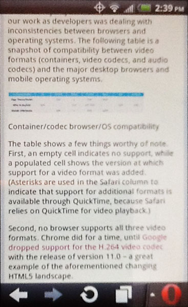
These screen shots show how each table appeared when viewed on an iPad and on an Android Evo using Opera. Click/tap for larger images.


In February .net Magazine posted an article, Deliver video seamlessly to desktop and mobile devices, which included two tables of browser and video codec support. These two tables were not marked up using a table, however.


Instead the tables were presented as images with no useful alt text. While the article used an HTML5 figure, there was nothing to present the contents of the tables as plain text.


The problem was exacerbated by the fact that when the page was viewed on mobile devices, the automatic down-sampling of the .net Magazine CMS (I am assuming here) for the mobile version of the article resulted in images that were completely illegible. A traditional HTML table would not have suffered from that problem.


I figured I was on to something when my tweet drew some comments, though I don't agree that it's just bad alt text:


@aardrian they could have easily made the same mistake without HTML5, and likely would have. That's just bad alt text :) /cc @rogerjohansson

— Derek Featherstone (@feather) February 10, 2012


To .net Magazine and the author's credit, the images were replaced on both the main site and the mobile site within about 18 days of me mentioning it (which you can follow in the comments).


Tables As Any Other Element


This screen shot shows the event schedule when viewed in a desktop browser. Click/tap for a larger image.


I suspect some tables are put together using other HTML elements just to show off that the developer can do it. After all, If developers were thinking about the structural and semantic meaning of the content, then they surely wouldn't use div and spans to mark up tabular data.


The web site for a two day responsive web design workshop, Build Responsively, includes a schedule on its Columbus event page. This schedule includes a column of times and a column of sessions. Each column has a heading and the rows have alternating background styles. In every visual sense, it's a table of data.


Semantically and structurally, however, that's not how it's coded (which I discovered when I attempted to print the page). It's a series of divs and spans inside an ordered list (I have also seen this done with definition lists). The first bullet even has the class "heading," which is probably a good clue that this entire list could be a table and that "heading" could be a th.


This code block shows the event schedule HTML for context:


      <ol>
<li class="heading">
<div class="time">Time</div>
<div class="session">Session</div>
</li>

<li>
<div class="time">
<time datetime="2012-07-09 08:00">8:00AM</time> - <time datetime="2012-07-09 09:00">9:00AM</time>
</div>
<span class="session">Registration, Coffee</span>
</li>

<li>
<div class="time">
<time datetime="2012-07-09 09:00">9:00AM</time> - <time datetime="2012-07-09 09:40">9:40AM</time>
</div>
<span class="session">Responsive Web Design, 101</span>
</li>

<li>
<div class="time">
<time datetime="2012-07-09 09:45">9:45AM</time> - <time datetime="2012-07-09 11:15">11:15AM</time>
</div>
<span class="session">Responsive Planning &amp; Design</span>
</li>

<li>
<div class="time">
<time datetime="2012-07-09 11:30">11:30AM</time> - <time datetime="2012-07-09 12:00">Noon</time>
</div>
<span class="session">Getting a Good Start</span>
</li>

<li>
<div class="time">
<time datetime="2012-07-09 12:00">Noon</time> - <time datetime="2012-07-09 13:00">1:00PM</time>
</div>
<span class="session">Lunch (provided)</span>
</li>

<li>
<div class="time">
<time datetime="2012-07-09 13:15">1:15PM</time> - <time datetime="2012-07-09 17:00">5:00PM</time>
</div>
<span class="session">Afternoon Session, The Nitty Gritty</span>
</li>

<li>
<div class="time">
<time datetime="2012-07-09 17:30">5:30PM</time> - <time datetime="2012-07-09 22:00">?</time>
</div>
<span class="session">Opening Night Party, Sponsored by GitHub!</span>
</li>
</ol>


You can see this site featured on PrintShame.


What You Can Do


With all the push for hand-crafted HTML and CSS and the strong desire to show off what developers can do using HTML5 and assorted tricks, take a look at any grids you find yourself marking up. If you find you have columns of data, rows of data, headings for rows or columns, or are using any CSS table display properties, then you just might need to use a table instead.


Update: January 3, 2012


The article HTML5 caption element and headings explains that with HTML5's acceptance of headings in captions on tables, it's now possible for your data tables to fit into the heading navigation when accessed via a screen reader.


Update: April 12, 2013


Léonie Watson has put together a quick overview on how to make your data tables accessible over at .net Magazine.


Update: October 21, 2013


Another example of doing it wrong, found in the wild:


No! This is *NOT* the way to build a responsive table. Poor semantics, no accessibility: http://t.co/gpRgpEFMge

— Russ (@russmaxdesign) October 21, 2013

Read More
Posted in accessibility, css, rant, standards | No comments
Older Posts Home
Subscribe to: Posts (Atom)

Popular Posts

  • New Google Analytics Features
    In the article " Google Analytics Now More Powerful, Flexible and Intelligent " from last Tuesday (yes, I know I'm behind on t...
  • Speaking: Accessible Web Apps & Standards
    I will be speaking twice in September, both of them sponsored by Infotech Niagara. If you're in the Buffalo area, these are great opport...
  • HTML5 Finally Gets... a Logo?
    Start Rant With all the debate about elements , attributes , semantic meaning and who really owns HTML5 , it's thrilling to see that t...
  • Speaking at WordCamp Buffalo 2013
    This Saturday I will be speaking at Buffalo's second WordCamp . Last year was a great day-long event filled with many good speakers (not...
  • Current CSS3, HTML5 Support
    The Tool Last week saw the launch of FindMeByIp.com , a very handy web site that displays a user's current IP address (along with a geog...
  • Copying Content Styled with Text-Transform
    Using the CSS property text-transform to automatically shift copy to uppercase has been popular for a while now, but a combination of a rec...
  • Come See Me: October 6
    I will be one of the panelists at the Business First Power Breakfast: Online Networks , this coming Tuesday, October 6, 2009 at 7:30am at S...
  • Accessibility Bookmarklets and Tools
    Testing accessibility on your web projects can be a tricky task if you have no firsthand experience with visual, audible, physical or even c...
  • Brightkite Yields to Foursquare, Gowalla, Etc.
    Brighkite has made an announcement today that affects me and a handful of other people (not counting all the people on Facebook whose timel...
  • Social Media Day 2011 in Buffalo #smdayBUF
    Last night marked the second Mashable-sponsored Social Media Day here in Buffalo. With 154 RSVPs for the event, the venue, The Eights Bist...

Categories

  • accessibility
  • Adobe
  • analytics
  • Apple
  • apps
  • ARIA
  • Bing
  • Blink
  • Brightkite
  • browser
  • Buzz
  • Chrome
  • clients
  • css
  • design
  • Facebook
  • Firefox
  • Flash
  • fonts
  • food
  • Foursquare
  • g11n
  • geolocation
  • globalization
  • Google
  • Gowalla
  • html
  • i18n
  • ICANN
  • infographic
  • Instagram
  • internationalization
  • internet
  • Internet Explorer
  • JavaScript
  • JAWS
  • Klout
  • L10n
  • law
  • localization
  • Lynx
  • Mapquest
  • Microsoft
  • mobile
  • Netscape
  • ning
  • Opera
  • patents
  • picplz
  • Plus
  • print
  • privacy
  • project management
  • QR
  • rant
  • RSS
  • Safari
  • SCVNGR
  • search
  • SEM
  • SEO
  • social media
  • Sony
  • speaking
  • standards
  • SVG
  • touch
  • translation
  • Twitter
  • typefaces
  • usability
  • UX
  • Verizon
  • video
  • W3C
  • WAI
  • WCAG
  • WebKit
  • whatwg
  • Wired
  • WOFF
  • xhtml
  • Yahoo
  • YouTube

Blog Archive

  • ▼  2013 (39)
    • ▼  December (1)
      • Web Development Advent Calendars for 2013
    • ►  November (7)
    • ►  September (4)
    • ►  July (3)
    • ►  June (2)
    • ►  May (5)
    • ►  April (3)
    • ►  March (6)
    • ►  February (2)
    • ►  January (6)
  • ►  2012 (63)
    • ►  December (2)
    • ►  November (4)
    • ►  October (5)
    • ►  September (5)
    • ►  August (4)
    • ►  July (6)
    • ►  June (7)
    • ►  May (7)
    • ►  April (8)
    • ►  March (5)
    • ►  February (3)
    • ►  January (7)
  • ►  2011 (67)
    • ►  December (5)
    • ►  November (7)
    • ►  October (5)
    • ►  September (4)
    • ►  August (8)
    • ►  July (3)
    • ►  June (8)
    • ►  May (3)
    • ►  April (1)
    • ►  March (6)
    • ►  February (6)
    • ►  January (11)
  • ►  2010 (100)
    • ►  December (8)
    • ►  November (7)
    • ►  October (5)
    • ►  September (10)
    • ►  August (7)
    • ►  July (11)
    • ►  June (12)
    • ►  May (6)
    • ►  April (8)
    • ►  March (10)
    • ►  February (5)
    • ►  January (11)
  • ►  2009 (51)
    • ►  December (9)
    • ►  November (6)
    • ►  October (21)
    • ►  September (13)
    • ►  August (2)
  • ►  2003 (3)
    • ►  October (1)
    • ►  January (2)
  • ►  2002 (9)
    • ►  December (1)
    • ►  June (3)
    • ►  April (1)
    • ►  March (3)
    • ►  January (1)
  • ►  2001 (1)
    • ►  February (1)
  • ►  2000 (4)
    • ►  October (1)
    • ►  July (1)
    • ►  June (1)
    • ►  January (1)
  • ►  1999 (7)
    • ►  November (1)
    • ►  September (2)
    • ►  August (2)
    • ►  July (1)
    • ►  June (1)
Powered by Blogger.

About Me

Unknown
View my complete profile