tech support 8

  • Subscribe to our RSS feed.
  • Twitter
  • StumbleUpon
  • Reddit
  • Facebook
  • Digg
Showing posts with label Opera. Show all posts

Tuesday, 10 September 2013

New iPad Browser: Coast by Opera

Posted on 07:07 by Unknown


Yesterday Opera announced the release of its newest browser, Coast, built specifically for iOS tablets (I would say just iPads, but if my fridge gets an iOS tablet UI then I'd be wrong and will have paid too much for a fridge).


Background


Recently Opera moved away from Presto as its rendering engine and hitched its future to Blink, the rendering engine born from WebKit that powers Chrome. Now instead of Opera worrying about the rendering engine, it is focusing on the user interface, the place where it can set itself apart from the other browsers.


Essentially Opera is removing the browser chrome (implying to the user that a web page is just an app) and adding gesture support. Given that Opera was the browser that introduced us to mouse gestures well over a decade ago, and given that a touch screen is an inherently gesture-based UI, this seems like a natural fit.


Bits for Developers


Sadly, my office wifi was down and I couldn't play with the browser immediately (my crusty iPad 2 is wifi only). So instead I took some time to read through the developer notes.


Tablet First


Overall Opera recommends general responsive design current best practices, though it promotes a tablet-first approach. Opera offers some CSS you can use to specifically target iPads Mini, 2, 3 and 4 (Retina and non-Retina), though it leans on vendor prefixes with only a brief note to also use other prefixes and unprefixed rules.


Responsive Images


It's also clear that Coast supports the new srcset option for responsive images. It even offers a code example: <img src="image.jpg" srcset="retina.jpg 2x">


Note: As Bruce was kind enough to inform me (because I missed it in the dev notes), responsive images will be supported only in iOS7 and up.


Update as of September 20, 2013


According to Opera, iOS7 did not come with a WebKit update. That means Coast cannot support responsive images via the srcset attribute without a polyfill. Nor can Safari, of course.


Tile Speed Dial Web App Image


Instead of "Speed Dial" icons/images, Coast now looks for a "web app image." If you don't have one, Coast will first look for a Windows 8 tile image, then an Apple touch icon, then a shortcut image, then just a favicon. You can, however, create your own 228 × 288 pixel image and stuff it into your site with the following HTML:


<link rel="icon" href="$URL" sizes="228x228">


User Agent String


Don't use this to do any browser sniffing. Browser sniffing bad. This is instead handy for recognizing it in your logs:


Mozilla/5.0 (iPad; CPU OS 6_1_3 like Mac OS X) AppleWebKit/536.26 (KHTML, like Gecko) Coast/1.0.2.62956 Mobile/10B329 Safari/7534.48.3.


General Review


Getting going is pretty easy, just start typing into the only field on the screen. As you type you can see a Google preview on the left, which you can tap at any time to go to Google, or a list of icons on the right which correspond to sites you might mean. The icons start out just displaying the first letter of the site, and then identify the site's tile or shortcut image.


Screen shot of Opera Coast navigate screen.
Note the handy ".com" and ".net" options that appear above the right end of the text box.


Once you are on a page, you can go back by swiping from the left, forward by swiping from the right, or reload the page by pulling down from the top — but not too far or you get the iOS menu instead.


Vine of me playing with back, forward and reload in Opera Coast.


Opera Coast skips tabs and windows altogether and, frankly, feels a lot more like Internet Explorer for Metro than other current tablet browsers. It's pretty easy to see the open "tabs," flip through them, get more details, and discard them. It's also incredibly easy to forget you have so many tabs open. I regularly found myself littered with tabs because of all the links opening new windows.


Testing Opera Coast window/tab management.


While in that tab view, you can also see how "safe" the page is and can get to options to share it, email it, print it, and so on.


Screen shot of Opera Coast safety and share information.
The arrow on the right gives you all the share options.


Opera Coast print dialog.
I don't have a printer installed, so I'd love to hear feedback on how Coast honors print styles.


Adding and removing a bookmark, tile, whatever, is pretty easy. It took a few swipe-fails, but I got the hang of it well enough to show the whole process in one uninterrupted Vine:


It takes a little getting used to, but it's not too hard


Gotchas


There were a few things that threw me off. Perhaps because I am a power user, perhaps because I only played with it for one evening.


Swipe History


The swipe for back/forth is handy, but conflicts with behavior I have already learned. In Chrome for Android, swiping left or right has the infuriating feature of bringing me to the next or previous tab in the stack order. For those rare sites that implement a slide that is swipe-friendly, imprecise swipes will move me back and forth in the history instead.


Web App Images


Using the browser in portrait view, the additional screens of tiles (speed dial icons if you are already familiar with Opera) aren't immediately apparent. It wasn't until I turned to landscape that I saw them. The tiny dots under the Coast icon weren't enough for me to intuit that. They also aren't nearly large enough to tap to jump to a specific screenful of tiles.


Hit Sizes


The 9-box grid at the center bottom as well as the three rectangles at the bottom right are the only real browser chrome in play as you surf. They are also maddeningly small to tap. And I have dainty, lady-like fingers, so I suspect it may cause consternation for others.


Address Bar


If I am on a site and I want to change the address of the current page (maybe I fat-fingered and got to a 404, or I know a super-secret URL), I could not find a way to bring up the address bar and change it. It also made it impossible to know the current page address at any time. As someone who regularly looks at the URL for familiar addresses, indications of scam sites, quick commitment to memory, and so on, this alone takes it out of the running as an everyday browser for me.


Email a Page


I did not care for the email feature one bit. Not only does it embed a screen shot of the page (with a Coast watermark), the screen shot won't display on other devices. Outlook blocked the image because the attachment ended in .com (not .png or .jpg). Had it not come from me, I wonder if Outlook would have blocked it as spam. My Android email client couldn't display it because there was no file extension to give it a clue.

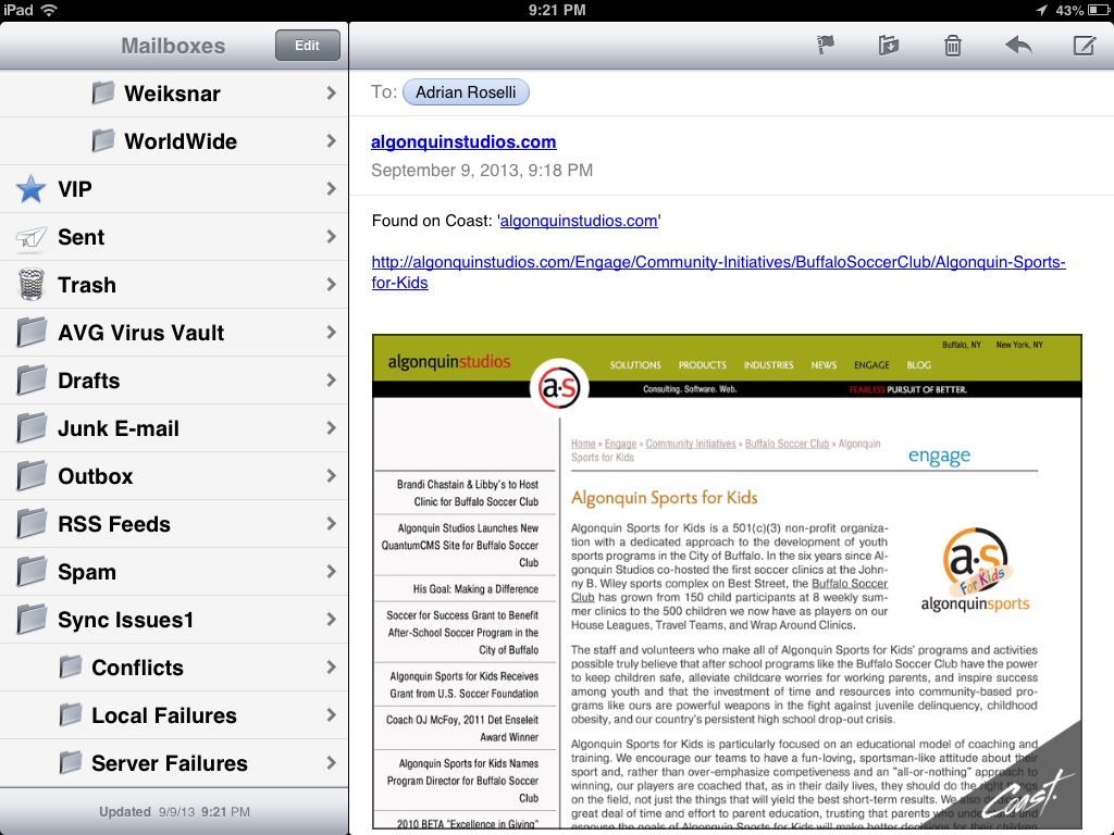


Screen shot of emailing a web page from Opera Coast.
What you see when you choose to email a web page from Opera Coast.


Screen shot of received email from Opera Coast.
Best case scenario of what the email recipient sees, though the attachment was blocked in Outlook and unusable in my Android email client.


Tweet a Page


Tweeting a page left me similarly dissatisfied. By default it includes a Twitpic screen shot of the current page with an Opera Coast watermark. When composing the tweet, I tapped the paperclip icon to see if it would do anything, but nothing happened. I opted not to tweet again.


Screen shot of tweeting a page from Opera Coast.
Tweeting a page from Opera Coast.


The resultant tweet:


Tweeting a web page from Opera Coast. Curious how it will come across. http://t.co/bdx3mcQxiO pic.twitter.com/eq3vRhFX5N

— Adrian Roselli (@aardrian) September 10, 2013


Wrap-up


Overall, I like the browser. I like what it's trying to do for consumers. As a power user, however, It's not a fit for me though I'd be interested in bringing it in front of some other members of my family.


I also didn't get to try out unsafe sites, printing pages, responsive images (need iOS7), or poorly-built sites. My opinion might change as I continue to play with the browser.


Open Question


There are a lot of Android tablets out there, not just the four screen size offerings from Apple. So how long before we can see Coast on my Nexus 7, if ever?


Updates


I'm adding notes throughout the day as they come up.


  • Feedback from users over at MacRumors.

  • Norwegians just launched the iPad browser Apple couldn’t build at BGR.

  • A Vine from Opera Coast showing how to move/rearrange groups of tiles/bookmarks at once.


Surprising no one, the following reviews from more mainstream sources completely fail to include any screen shots or videos that weren't pilfered from Opera. I only say that to remind you that by reading this post you have gotten the most in-depth review currently on the web and you should be excited and send me a thank you note and maybe read all my other posts and high-five me on the street.


These articles are, however, worth visiting just to see the comments and how others are reacting to it.


  • Opera Coast iPad Web Browser Treats Websites like Apps at Time.

  • Opera's iPad Coast browser debuts, packaging websites as apps at ZDNet.

  • With Coast, Opera reboots its browser for mobile future at Cnet.

  • Opera Coast: a Stripped-Down Browser Built Just for iPad at Gizmodo.

  • Opera Launches Coast, A Slick New WebKit-Based iPad Browser at TechCrunch.

  • Opera releases Coast, an iPad browser that turns the web into a home screen at The Verge.


Tips from Bruce:


Want to add a background image to your Coast home screen? Long press an image, set as background. Pull curled corner to remove it.

— bruce lawson (@brucel) September 9, 2013


If you don't see your new 228px site icon in Coast, empty cache by deleting yr old speeddial entry (drag to top of screen) & revisit yr site

— bruce lawson (@brucel) September 10, 2013


To clear history in Coast by Opera or change size of Speed Dial grid from 3x3 to 3x4, go to iPad settings > Coast

— bruce lawson (@brucel) September 12, 2013


Update: September 18, 2013


Opera has fielded some questions about Coast and collected them into two posts (so far):


  • Coast by Opera is only a few days old, but we’ve already gotten a lot of questions about how things work. Here’s some answers.

  • Nope, there are no tabs in Coast. That and a few more answers for this second set of FAQ.


Update: September 25, 2013


Another FAQ post from Coast:


  • Yes, you can see the URL and you can copy links in Coast. Our third set of FAQ


Read More
Posted in Apple, Blink, browser, mobile, Opera, standards, touch, UX | No comments

Friday, 24 May 2013

My Kingdom for Decimal Alignment on Numbers

Posted on 09:36 by Unknown


This post isn't proposing any solutions (although I do toss out a hack). This post is a rant that I hope helps influence browser makers.


Background


Much of my web work isn't for public facing web sites. Often it's for enterprise-level software that is deployed via the web and used in a web browser. I think any web developer who does anything beyond standard brochure-ware is ultimately in the same boat. Usually we need stylistic control over elements on the page that aren't typically considered exciting.


Once again I find myself working on a reporting feature for a large piece of software. Reports are typically grids (a table) made up of columns & rows with numbers, letters, icons, colors and so on. Clients are used to seeing these reports the same way they might see them in Excel, Crystal Reports, and similar tools.


These reports are formatted for quick visual scans to identify outliers and exceptions, so control over formatting is key to their effectiveness.


Example


Often these grids contain numbers of various lengths that include decimals. Often these decimal values aren't the same number of (significant) digits. Let me offer an example of wildly divergent numbers (I cannot show real client data):


Name Number Units
George 1,984.0 years
Arthur 42.000 ?
Ray 451.0 degrees
Marie 13.51 g·cm−3
Isaac 6.67384 (× 10-11) m3 kg-1 s-2
Sergei 289.8001 billions of dollars


It's standard practice to align numbers to the right. The problem is that some numbers have decimals lengths that don't match other numbers, thereby throwing off the formatting and making the entire column harder to read than necessary. Note that the biggest number is the same length as the smallest number.


CSS to the Rescue


CSS3 has a solution. The property text-align has an option to solve our problem. It can accept a one character string as the character on which to align the text.


Not just a decimal, but a string. This is great news for languages that use a comma instead of a period for decimals. It's great news for very large or very small values where perhaps you want to align on the multiplication sign instead.


This style will allow me to align on the decimals in my example table: text-align: "." right; (the keyword after the string still keeps my numbers aligned to the right, after the decimal is factored in)


Browser Support


Now the question comes down to browser support. What browsers support it? None.


A Hack


To achieve the effect I want, I would have to split my numbers into two columns, one for the whole number and one for the decimal value. Like in this hack:


Name Number Units
George 1,984 .0 years
Arthur 42 .000 ?
Ray 451 .0 degrees
Marie 13 .51 g·cm−3
Isaac 6 .67384 (× 10-11) m3 kg-1 s-2
Sergei 289 .8001 billions of dollars


This table isn't ideal. I have to clear out padding values, remove borders, and accept that my numbers are split. It is unnecessary work that could be avoided if the browser makers would just fully support an aspect of CSS3 that has been around for years and whose related styles already have seen support for even more years across prior CSS versions.


The extra styles, whether inline or with per-cell classes, also add to the overall page weight. HTML tables aren't exactly examples of slim mark-up to begin with, but this can bloat them even more.


This table is also an accessibility gotcha. Users with screen readers are used to a particular way tabular data is read, so this variation may not come across so clearly. Users who scale text may see odd baseline text alignment as text wrapping in other columns can throw off everything else.


It is likely that others who have needed to represent data with alignment on specific characters have just used images instead. That solution is far worse than even this hack, particularly from an accessibility perspective.


My Request to You


If you work for a browser maker, please bring this to someone's attention.


If you don't work for a browser maker, please share this (or your own examples) so that perhaps the browser makers will see there is a need, even if it's not as sexy as animations, transitions, WebGL, and so on.


Related


Even in the modern international web, the specification is sometimes too Anglo-centric, as in the case of the input type="number", which isn't as universal as hoped. You can read about the request to allow developers to set a pattern attribute on input type="number" to specify the thousand separator, decimal separator, decimal precision and if any special characters should be allowed.


There are also people calling for Mozilla to drop support for MathML, suggesting that people who don't use numbers in financial and scientific applications on a daily basis may not see the value in stronger support for number formatting.


Read More
Posted in browser, Chrome, css, Firefox, html, Internet Explorer, Opera, rant, Safari, standards | No comments

Thursday, 4 April 2013

Chrome: Blink and You Missed the News

Posted on 08:22 by Unknown


The new Blink logo.
It's old news by this Thursday morning, but in case you had not heard, Google is forking WebKit to make its own rendering engine, Blink. Opera will be using the Blink fork of WebKit as its rendering engine.


A combination of people who are far smarter, far more well connected, and in timezones that allow them to write about this sooner, along with all the Twitter chatter, has already hashed out the major details. As such, I will link to them below. I would be a terrible blogger if I didn't offer my opinion, however.


I will format this the way I did when I provided my in-depth analysis of Opera's move to WebKit (away from Presto) less than two months ago.


So what does this really mean?


For Developers


Any developer who is complaining that this means there is another browser/engine against which they will need to test has been doing it wrong.


Web developers should always test against different browsers, regardless of their engine. In particular, WebKit has so many nuanced implementations that not independently testing against each browser that uses WebKit belies either a lack of understanding of how WebKit is implemented or laziness.


If you aren't sure what is different between each WebKit implementation (Chrome, Safari, Android browser, Opera, etc.), I encourage you to read my post "WebKit Will and Won't Be the New IE," where I provide a high-level overview of these variances.


For Users


At this point it doesn't mean a whole lot.


Google will argue this is better for users. Apple will argue that Google took its ball and left. Opera won't be arguing. None of that impacts users because we have mostly done a good job of promoting standards-based development. I again refer you to "WebKit Will and Won't Be the New IE" for how poor testing can impact users, but that's not a function of the engines.


Because Apple only allows WebKit on iOS devices, and even then it restricts those browsers to a different JavaScript engine and thus a lesser experience, Chrome and Opera for iOS may still stay on WebKit. Over time as its harder to incorporate features from Blink back into the WebKit core, there may be feature divergence which may affect users.


That's just speculation on my part.


For Standards


For a specification to become a W3C recommendation, there must be two 100% complete and fully interoperable implementations, which basically means two browsers need to support it. When Opera announced the shuttering of Presto, that left Trident (Internet Explorer), Gecko (Mozilla), and WebKit (Safari and Chrome) as the remaining engines (of measurable size). Essentially, two out of the three of them had to agree to implement a feature.


With Blink, provided the W3C recognizes it as a stand-alone engine, there is now one more engine back in the mix, essentially returning the count to where it was in February before Presto's wind-down (to be fair to Presto, it's expected to exist in the wild until 2020, but with no new feature development).


I am hoping that this is a good thing for standards.


Blink won't be using vendor prefixes (even though it will have inherited some), so I consider that a step in the right direction. While I think this matters to developers, I think it matters even more to standards.


Technical Aside


From Peter-Paul Koch:


Chrome 28 will be the first stable release to use Blink; earlier versions will use WebKit. Opera and Yandex will start using Blink whenever they start using Chromium 28.


Related


First some bits from The Twitters:


Let's bring back the Netscape engine and call it Spacer! RT @codepo8: After blink Microsoft might bring out a new engine called marquee

— Adrian Roselli (@aardrian) April 4, 2013


And *this* is how you fork a repo.

— Sylvain Galineau (@sgalineau) April 3, 2013


Can the new Blink logo be >_<?

— Mike Taylor (@miketaylr) April 3, 2013


And now to the related links:


  • Blink: A rendering engine for the Chromium project, April 3, 2013.

  • Developer FAQ, The Chromium Projects.

  • Hello Blink, from Bruce Lawson (who clearly hates Morrissey doesn't care for most of Morrissey's solo work).

  • Hello, Blink! from Paul Lewis

  • Discussion on Hacker News about how Google controls WebKit.

  • Well, err, that solves the WebKit monoculture problem, from Jake Archibald.

  • Google Announces Blink, Its Own Rendering Engine For WebKit. at Read Write

  • Blink from Robert O'Callahan.

  • Discussion on Hacker News started from Apple's perspective.

  • Google going its own way, forking WebKit rendering engine at ars technica.

  • Just One WebKit from James Socol.

  • Why What You’re Reading About Blink Is Probably Wrong from Alex Russel.

  • Blink. Chrome’s new rendering engine from Eric Bidelman.

  • [webkit-dev] Cleaning House thread at the WebKit mailing list in the wake of the Blink news, along with the announcement on the list.

  • A Short Translation from Bullshit to English of Selected Portions of the Google Chrome Blink Developer FAQ from Rob Isaac.

  • Blink from Peter-Paul Koch.

  • Another first by Opera! from WebKit Memes.

  • Thoughts on Blink from Krzysztof Kowalczyk.

  • Welcoming Blink, Chromium’s new open source rendering engine from Peter Beverloo.


There's this one from 2010 by Haavard Moen that I thought worth highlighting: "Dear Google: Please fork WebKit."


Update, 5:35pm


A video Q&A from Google Developers about Blink (time markers available on the Chromium blog).


Read More
Posted in Apple, Blink, browser, Chrome, Google, Opera, Safari, standards, W3C, WebKit | No comments

Tuesday, 12 March 2013

WebKit Will and Won't Be the New IE

Posted on 15:03 by Unknown


Web developers have been looking to call everything the new Internet Explorer for a while now. With Opera's recent move to WebKit as its rendering engine (replacing Presto), even more developers are suggesting that WebKit is becoming the new IE.


I think they are right, but for the wrong reasons.


How WebKit Won't Be the New IE


nice! opera for android beta includes support for @ supports. AFAIK, the first WebKit-based browser to release with it.

— Tiffany B. Brown (@webinista) March 6, 2013


Unlike Trident (Internet Explorer's rendering engine), WebKit can be wielded in many different ways by many different browsers. It's less a singular rendering engine and more a collection of pieces and parts that can be assembled in different ways. The tweet above demonstrates that there can be different WebKit implementations.


You may argue that the example above is just a case of the first implementation of an update that will make it into all browsers that use WebKit. That may very well be true (we don't know yet), but there are many more examples of differences as Paul Irish painstakingly details in his post WebKit for Developers. I encourage you to read it because it's an almost hilarious dive into the rabbit hole of WebKit. The most salient and clear point is the bullet list of what is not shared in WebKit ports:


  • Anything on the GPU

    • 3D Transforms

    • WebGL

    • Video decoding


  • 2D drawing to the screen

    • Antialiasing approaches

    • SVG & CSS gradient rendering


  • Text rendering & hyphenation

  • Network stack (SPDY, prerendering, WebSocket transport)

  • A JavaScript engine

    • JavaScriptCore is in the WebKit repo. There are bindings in WebKit for both it and V8


  • Rendering of form controls

  • video & audio element behavior (and codec support)

  • Image decoding

  • Navigating back/forward

    • The navigation parts of pushState()


  • SSL features like Strict Transport Security and Public Key Pins


That amounts to quite a lot of potential variance between WebKit-powered browsers, which is how WebKit is not the new IE.


How WebKit Will Be the New IE


IE10 has been out mere hours, and I already see devs bragging about dropping IE9 support. Do these people build for users or ego?

— Adrian Roselli (@aardrian) February 27, 2013


Far too many developers are always looking for ways to justify testing less. It could be laziness, it could be lack of access to enough device configurations, it could be … well, frankly, I think it's the first one. My IE10 tweet above was based on watching people thrilled as much at taking a shot at Internet Explorer as they were at feeling they could test on one fewer browser.


Developers may use the common engine in one browser as justification for not testing on all the WebKit browsers, or they just may not know about the potential for dramatic differences between implementations. What happens when everyone builds for one awesome browser engine (or one perceived common engine)? We end up with a browser monoculture, devoid of testing for other variations.


As a web developer since the dawn of the web, I've seen it happen before. I remember surfing on Netscape only to find a site didn't take into account my screen colors or resolution, or on Internet Explorer only to find a site didn't take into account my laptop pixels-per-inch default. I was using the popular rendering engine of the day, but the assumption that all users on that engine would all have the same experience was wrong then, and it will be even more wrong now.


WebKit will become the new IE if web developers continue these false assumptions and fail to test other WebKit implementations. Developers will build for one implementation, test for it and maybe a couple variations, and call it a day.


Conclusion


My fear is that all the gains we've made in the last few years toward a more inter-operable standards-based web (leaving behind the Internet Explorer monoculture) will fall away as we unwittingly move toward a WebKit-tweaked yet non-multi-WebKit-inter-operable web.


In short, we'll test for one WebKit, not realize (or care) about all the other variations, and end up breaking the web all over again.


WebKit won't be the new IE, but WebKit will be the new IE.


Read More
Posted in browser, Chrome, Opera, rant, Safari, standards, WebKit | No comments

Wednesday, 13 February 2013

Opera: Presto! It's now WebKit

Posted on 07:34 by Unknown


Opera is replacing its Presto rendering engine with WebKit (Chromium, really, when you factor in the V8 JavaScript rendering engine). Big news as of this morning.


If you've been paying attention, it's not really that big or news. About a month ago a video was leaked showing Opera using WebKit (the video has since been pulled from YouTube). Within the last three weeks two of the Opera folks I follow on Twitter are suddenly no longer Opera folks (Tiffany Brown, Patrick Lauke). Heck, even Opera's founder sold off some shares yesterday. If you paid attention, you knew something was up.


All of that aside, what does this really mean?


For Developers


I feel most web developers already ignored Opera. For those developers they can continue to be lazy and ignore Opera.


For Users


The short term impact on users will be minimal. Users will upgrade, users will surf, users may notice some sites work or look a little better.


For users trapped on old Android devices with the Android stock browser (that never seems to upgrade), this could result in a better experience — assuming these users know about and download the Chromium-powered Opera.


For Standards


Opera has an impressive place in the mobile world, being at the top of the pile globally. Opera's participation in the standards process has been valuable, partly because its rendering engine has been used to help move the process forward thanks to early implementations, differences in implementations, and arguments over implementations.


While the standards evangelists at Opera may do a great job of contributing back to Chromium, Google may be the block from those changes being committed. Even when changes get to Chromium, there is no guarantee that they'll make it back into WebKit, which might involve getting past Apple. Only if those changes get into WebKit do they stand a chance of making it Apple's Safari.


From the co-chairman of the W3C CSS Working Group, Daniel Glazman:


For the CSS Working Group, that's an earthquake. One less testing environment, one less opportunity to discover bugs and issues. Let me summarize the new situation of the main contributors to the CSS Working Group:


  • Microsoft: Trident

  • Apple: WebKit

  • Google: WebKit

  • Opera: WebKit

  • Adobe: WebKit and their own Adobe Digital Editions rendering engine found in many ebook readers

  • Mozilla: Gecko

  • Disruptive Innovations: Gecko

  • HP: has delivered WebKit-based products in the past but is pretty browser-agnostic IMO

  • Rakuten: ADE and probably WebKit

  • Kozea: WeasyPrint

  • Qihoo 360 Technology Co: both Trident and WebKit

  • other Members of the Group: I don't know


Suddenly I feel like the US political term lead from behind is apt.


Some other reactions from the Twitters:


It’s becoming clear that WebKit:browsers::MS Word:word processors.

— Eric A. Meyer (@meyerweb) February 13, 2013


And all other engines perished to make way for the best, most popular one.It was called IE6 and the year was 2000…Remind you of something?

— Lea Verou (@LeaVerou) February 13, 2013


Related


...to the news about Presto


  • Opera Ice: New browser for Android and iPhone coming February uses WebKit (video), January 18, 2013 from Pocket-lint.

  • WebKit is not a cure-all, February 1, 2013 from Tiffany Brown, formerly with developer relations at Opera.

  • 300 million users and move to WebKit, February 13, 2013 from Opera itself.

  • And Then There Were Three, February 13, 2013 from Robert O'Callahan.

  • Strange day for the Open Web, February 13, 2012 from Daniel Glazou.

  • Jake Archibald gives his take over at Google+, February 13, 2013.

  • Opera switching to WebKit: thoughts and guesses, February 13, 2013 from Peter-Paul Koch.

  • The WebKit Culture & Web Rendering Engine Diversity, February 13, 2013 from Robert Nyman.

  • I will miss the “Douglas Crockford of browsers” February 13, 2013 from Christian Heilmann.

  • One less browser engine, February 13, 2012 from Tristan Nitot.

  • Opera and WebKit: a personal perspective, February 13, 2013 from Bruce Lawson (from Opera, the guy who wrote the announcement I link to at the start).

  • Hey Presto, Opera switches to WebKit, February 13, 2012 from Ars Technica.

  • Devs respond to Opera WebKit switch, February 13, 2013 from .net Magazine.

  • Presto Change-o, February 13, 2013 from Eric Meyer.

  • Bruce Lawson on Opera’s Move to WebKit, February 13, 2013 from A List Apart.

  • Hey -o-, let’s go!, February 13,2013 from David Storey.

  • Another chapter of a long goodbye? February 14, 2013 from Charles McCathie Nevile.

  • WebKit: An Objective View, February 14, 2013 from Robert Nyman and Rob Hawkes.

  • A few folks have asked me what I think of the news..., February 15, 2013 from John Lilly.


...to older bits


  • Browser Makers Caving to Vendor Prefix Misuse on this blog, Feb. 9, 2012.

  • CALL FOR ACTION: THE OPEN WEB NEEDS YOU *NOW*, February 9, 2012 from Daniel Glazou.

  • Reading List – Vendor prefixes, mobile, monoculture by Bruce Lawson, Feb. 13, 2012.

  • The iPhone monoculture by Peter-Paul Koch, Feb. 20, 2012.

  • Developers focus on the iPhone too much at .net Magazine, Feb. 21, 2012.

  • Report on the activity of companies in the WebKit project, February 6, 2013.

  • Don't Blame Opera, Blame Devs on this blog, April 27, 2012.


...And evidence that lazy developers can keep on keeping-on (from almost a year ago):


I don't include the -o- prefix because I don't test in Opera because it accounts for 0.3% of our visitors. Not because I'm lazy or inept.

— Stephanie Hobson (@stephaniehobson) April 26, 2012


Update, February 14, 2013


Since I posted this, some folks have asked just what Opera did that was so useful? This quote from David Storey's post outlines some of it pretty well:


Moving from HTML to CSS based layouts? Opera was perhaps the first to have a useable CSS engine. HÃ¥kon (father of CSS, and Opera CTO) often says it was the reason he started to believe a browser could be made in Norway, not just the USA, and joined Opera. AJAX? Opera reverse engineered this from MS’ ActiveX based approach and were the spec editors through Anne van Kesteren. HTML5? Started at Opera with Ian Hickson and others. Responsive web design? Media Queries came from Opera, and were implemented for years before showing up in other browsers. What about native video on the Web? Opera again.
Read More
Posted in browser, Chrome, Opera, Safari, standards, WebKit | No comments

Friday, 27 April 2012

Don't Blame Opera, Blame Devs

Posted on 04:33 by Unknown


Opera logo merged with Safari logo.On Wednesday news broke that Opera was going to support some Webkit CSS vendor prefixes. On its surface I thought this wasn't exactly big news. There was a good deal of hubbub about this back in February (Browser Makers Caving to Vendor Prefix Misuse) when word got out that Mozilla, Opera and Microsoft were all considering supporting the -webkit prefix.


Many standards-focused developers (including me) were horrified, even though this has been a concern for over two years (as I note in Perplexing Prefixes). Some of them even took action to either convince developers to fix their code, get like-minded developers to fix others' code, or petition browser makers not to cave.


I think it's fair to say that the first two tactics haven't worked. In light of that, it was just a matter of time before the browser makers would start supporting the dominant codebase — even if it's only dominant because of developer misuse.


Now Opera is catching a lot of heat from people for caving. Some are pointing to Microsoft's statement that it won't support the -webkit prefix as an example of how not to play the game. Others feel betrayed that Opera, often the most standards-compliant of all the browsers, would now make such a move. Few of these people consider the business case for Opera. Opera has dominated the mobile market, and when web sites don't render properly — because of a developer who is either not coding to standards or is not including the -o prefix alongside the -webkit prefix — users may move to the browser that doesn't look broken. Opera is making a business decision to protect itself.


Wednesday on Twitter I placed the blame at the feet of lazy web developers. I still feel that way. My previous posts on this topic have been clear on this. If web developers took the time to learn the specifications, look at code generated by editors (if they use them), tested in other browsers, and shed their myopic view of how people surf, we would not be in this position. Developers can fix the code, see errors when testing, and otherwise not cut corners. I suspect there are lots of developers who know this and lots more who can be educated by the names and voices on the web now.


And then I saw this, retweeted by Zeldman, possibly in a show of support:


I don't include the -o- prefix because I don't test in Opera because it accounts for 0.3% of our visitors. Not because I'm lazy or inept.

— Stephanie Hobson (@stephaniehobson) April 26, 2012


If her percentage is not hyperbole and applies to all the sites she manages, then the time it took her to see those numbers and produce that tweet is about how long it takes to open Opera and paste in a web address.


This is why the browser makers are caving. This attitude is pervasive. Hers is just one example. I have seen similar comments around the web, ranging from those who have no idea what browsers visit their sites to those who just don't care. Telling someone they are wrong, myopic, and definitely not serving the needs of their users, clients, or even the rest of the web, just causes that person to ignore you or lash out.


You can run the math yourself using the percentage in the tweet. Take a site with a million visitors and you'll see that 0.3% is 3,000 users. In accessibility circles, that's an unacceptable number of users to shut out. Imagine 0.3% is an acceptable number to ignore on a larger site, perhaps even as big as Facebook with 800 million users. At 0.3% that's 2.4 million users. At what number of users is 0.3% acceptable? How many developers of large sites feel bolstered by such an attitude, reinforcing their own poor habits?


The question to web developers really should be, how many users are you willing to sacrifice because you are too lazy to open a browser and at least look?


This example of webs.com shows that just opening the home page in Opera would have shown it's broken, meaning either they didn't look or they don't care. In Opera it looks like this (as compared to Safari), hiding its main sales pitch (the issue starts at line 86 of the webs.com CSS file):


Screen shots of webs.com as seen in Opera and Safari.


There just isn't an excuse. Stop blaming the browsers and the editors and instead review your code and test in browsers.


Related


  • Opera confirms WebKit prefix usage at .net Magazine. Read the comments, they include an Opera employee explaining the reasoning behind the -webkit support.

  • Opera's supporting of the -webkit- prefix by Niall McMahon.

  • A lively debate at Hacker News.

  • On vendor prefixes and WODs by Ian Devlin.

  • Opera Confirms WebKit Prefix Usage by Faruk AteÅŸ.

  • The Open Web and CSS prefixes by Daniel Glazman.


Posts that pre-date this news from Opera:


  • CSS vendor prefixes considered harmful, March 22, 2010 by Peter-Paul Koch.

  • Not Supported, March 22, 2010 by Jonathan Snook.

  • Coping with CSS vendor prefixes, March 22, 2010 by Stephen Hay.

  • CSS vendor prefixes redux, March 23, 2010 by Peter-Paul Koch.

  • Vendor Prefixes Are Hurting the Web, November 15, 2011 by Henri Sivonen.

  • CSS vendor prefixes, an answer to Henri Sivonen, November 16, 2011 by Daniel Glazman.

  • Vendor Prefixes Are A Rousing Success, November 18, 2011 by Alex Russell.

  • Perplexing Prefixes, November 22, 2011 by me.

  • The vendor prefix mess, February 9, 2012 by Peter-Paul Koch.

  • Browser Makers Caving to Vendor Prefix Misuse, February 9, 2012 by me.

  • Vendor prefixes are not developer-friendly, March 4th, 2012 by Paul Irish.


And a post that pre-dates all of this stuff:


  • To Hell with Bad Editors, February 28, 2001 (also at evolt.org) where 11 years ago I don't accept that browsers are the issue (To Hell With Bad Browsers), I put the blame squarely on developers. Apparently we are doomed to keep repeating the same mistakes.


Update 11:40am


Opera has posted the announcement about the vendor prefix changes: Opera Mobile Emulator build with experimental WebKit prefix support. If you read through it, you will see only 13 -webkit properties (shadow, transform, border, transition) which are just being aliased to existing -o prefixes. It looks like Opera is not trying to mimic how Webkit renders the styles, only map the prefixes to Opera's existing support.


Update April 30, 2012


More posts and articles have surfaced over the weekend and today. I link them here:


  • Concerns About Opera Rendering Webkit Properties by Ian Lunn.

  • On Opera’s Implementation of WebKit Aliasesby Peter Gasston.

  • Prefixes by Anne van Kesteren.

  • Opera Mini Now Has 169 Million Users, 56% Of Them Only Use The Mobile Web at TechCrunch.


Update May 2, 2012


  • Why O, why? Thoughts on Opera's Implementation of WebKit's Prefixes at WebKitbits.

  • Vendor Prefixes, the wider problem by Matt Wilcox.

  • CAFBank and Server Side User Agent Sniffing from Opera, showing how a bank ignores a 5-year-old request from users and Opera to stop explicitly blocking Opera. An example of blocking for no good (presented) reason.


Update July 6, 2012


Thiemo Mättig tried to comment below, but had trouble with the form. He let me know that he reached out to Webs.com to notify them of the bad CSS I mention above. All Webs.com did was add a solid background color, no -o- prefix and no unprefixed version.


@maettig Thanks for the notice

— Webs.com (@webs) May 2, 2012


@maettig This is not one of the browsers that we currently support at this time.

— Webs.com (@webs) May 14, 2012

Read More
Posted in browser, Chrome, css, Opera, rant, Safari, standards, usability, W3C | No comments

Wednesday, 28 September 2011

Amazon Silk, Yet Another Web Browser

Posted on 20:05 by Unknown


Amazon Silk logo.


Amazon's long-awaited tablet/e-reader was formally announced today, and the conversations about whether or not it will compete the iPad are underway. I don't much care about that. I am far more interested in the web browser that it includes.


Amazon Silk is a new web browser, built on Webkit, and that is really the news of interest here. Add to that Amazon's super-proxy approach to help users get content more quickly and efficiently and you've now got a new pile of potential chaos as a web developer. It's far too early to tell how this will shake out, but in a client meeting today I already had to address it, so I think it warrants a little context for the current state of browsers so we can consider potential developer impact.


Amazon posted a video on its brand new blog to provide an overview of Silk (with an obligatory Geocities reference):


The 400+ comments raise some questions that tend toward a common theme — in the absence of a technical explanation, when can we get our hands on an emulator? Granted, there are plenty of comments about privacy, security, and some wild speculation, but the theme is clear.


As a web developer, I can tell you that we all feel overburdened with the assault of browsers we have out there already. We can champion the ideal of targeting the specs, not the browser, but when the clients call to complain about a rendering difference, not even a problem, on another browser it can get pretty draining. As Silk comes to market we'll need to account for it, its hardware configurations, and its coming release versions (within reason, of course).


For some context about the burden we already have, yesterday Google Chrome developer Paul Irish wrote that, only taking into consideration Internet Explorer for desktop, we're already on track to need to support 76 versions of just Internet Explorer (including version 8) through 2020. There are some broad assumptions in his article regarding how people will use the IE document modes, but the potential is still there. Add to that the new release schedule of many browsers (Firefox has gone from version 5 to 7 in ~90 days), and then pile on the browsers available for mobile devices, and we're already at well beyond the number of variations of browsers that we had to support even in the heyday of the browser wars.


But Silk isn't just a web browser — it's got a super-charged proxy server that will compress images, compile JavaScript into its own machine-readable format, and batch files into a singular, smaller download. While this is nothing new (Opera Mini has done this for some time on mobile devices), Amazon's implementation raises the hairs on the back of my neck when I think about all the years I've had to troubleshoot web applications because proxy servers are caching files, munging JavaScript, brutalizing images, and generally gutting the real-time features that the web had been moving toward more and more. I don't know if this will happen with Amazon Silk, but given my experience with Opera, proxy servers, and users in general, I am filled with apprehension.


Related


Opera responded to the Amazon Silk announcement with its own explanation of how its own "cloud-compression" technology works:


Picture of web pages being process by HAL 9000 and delivered to Borat.


  • Amazon’s Silk Web Browser Adds New Twist to Old Idea at ars technica.

  • Amazon Launches Silk Web Browser for Tablets at Mashable.

  • Amazon Silk browser spins a faster mobile web, courtesy of cloud servers (video) at Engadget.

  • Opera: Amazon's Silk Browser is Flattering, But Five Years Late at PCMag.

  • Amazon's Silk Browser May Not Be Smooth When It Comes to Privacy at PCWorld.

  • Amazon's Silk browser one-ups Opera's approach to the Web at InfoWorld.

  • The Implications of Amazon's Silk Web Browser at ReadWriteWeb

Read More
Posted in browser, Chrome, Firefox, html, internet, Internet Explorer, mobile, Opera, standards, touch | No comments

Friday, 12 August 2011

Browsers as Wrestlers "Infographic"

Posted on 14:24 by Unknown


CBS-funded image of browsers wrestling.


Earlier this week CBS News ran the above image on its site in the Tech Talk section (within the topic Wired for Women, which doesn't seem to have anything to do with women) under the article An infographic! If web browsers were wrestlers... As is common nowadays, any illustration with numbers and witty (or not-so-witty) accompanying images is being called an infographic, and this is no exception. I do think the title is a bit tongue-in-cheek and CBS knows that this image isn't exactly fact-based.


The firm CBS hired to develop the graphic ranked each browser by market share, innovation, flexibility and speed — all the important factors. I disagree, however, that these are the important factors. Innovation means different things to different users, for example. As a web developer, I might like new HTML5 support, but my dad might prefer bigger buttons and less clutter. I have a different set of factors that I think are far more important:


  1. Performance: How well the browser can render a page without choking, whether by slowing down or introducing image artifacts, or just crashing.

  2. Standards Support: With the constant revisions to the still-in-development CSS3 and HTML5 specifications, along with related specs, this is even more important given the moving targets.

  3. Ease of Use: This includes accessibility and usability. Can my mom use the browser without having to call me? On top of that, how about a power user, how easy to use is it for that audience?

  4. Install Base: This is more than just who has chosen to download it, but should include who is forced to use it by corporate policy, lack of technical knowledge, hardware limitations, or public access.


CBS gave each browser a chance to respond/defend itself, specifically Firefox, Chrome, Internet Explorer, Opera, Rockmelt, and Safari. Opera even took it a step further and wrote up a response on its blog, Speed, Innovation, and Flexibility in the Ring.


I found another image that I think more accurately reflects the state of the battle between browsers (it rightly ignores Rockmelt and portrays Internet Explorer appropriately):


Image of two kids fighting (Chrome and Firefox) while one eats glue (Internet Explorer).


Credit for the above image goes to Galit Weisberg, from The Shoze Blog. Now go to TechCrunch and tell MG Siegler that he stole the image.


Update August 25, 2011


Bit Rebels took an old illustration of browsers as celebrities, posted it, and claimed it as an infographic: If Web Browsers Were Celebrities [Infographic]. It may be time for a web-wide infographic intervention.

Read More
Posted in browser, Chrome, Firefox, infographic, Internet Explorer, Opera, Safari | No comments

Wednesday, 24 November 2010

Current Internet Use, from Assorted Sources

Posted on 14:41 by Unknown
Image of this blog on a BlackBerry, showing a post with an image of this blog on an HTC phone.


Today Opera Software released data about how users of its Opera Mini mobile web browser use the web. Opera does this periodically to give some insight into how its users may be surfing, but what we don't know is how much Opera Mini users correspond to the web in general. Opera is certainly motivated to capture as much of the mobile market as it can given its low appearance numbers on desktops. Regardless, the title of the report really distills down Opera's findings: Generation Y chooses the mobile Web. You can get all the details from this and prior surveys at Opera's State of the Mobile Web site. Some of the highlights:


  • Almost 90% of respondents in the United States aged 18-27 have used their phones to share pictures. Of the profiled countries, Vietnam &8212; at 67% &7212; had the lowest use of mobile phones to share pictures.

  • Respondents in the United States are least likely to have asked someone out on a date via SMS (44%). Respondents in China (84%), Germany (84%) and Vietnam (83%) are most likely to have used SMS texts to ask someone out on a date.

  • Generation Y in both China and the United States share a disdain for printed newspapers. 53% of respondents in the United States and 57% of respondents in China rarely or never read physical newspapers.

  • Watch your privacy policies. Respondents in South Africa (49%) and the United States (44%) were somewhat to very uncomfortable sharing their personal information online.


Last week ReadWriteWeb reported that YouTube use on mobile devices has been on the rise — 75% of surveyed mobile YouTube users saying that their mobile device is the primary way of accessing YouTube (YouTube Mobile Use Exploding: 75% Report Mobile is Primary Way of Watching YouTube
). This number, however, should be considered in context. Only users of the mobile version of YouTube (typically the YouTube app installed on a phone) were surveyed, so you can expect a far larger percentage of respondents relying on the mobile version as opposed to the general public. This doesn't, for example, track the users who might come across a page on your site with your corporate YouTube video. Since YouTube is often used for casual surfing, not so much business use, it makes sense that a meme discussed over beers with friends might result in a smartphone popping out to track down the video everyone is referencing.


Brian Solis was kind enough to take the data from the Ad-ology report, Twitter Users in the United States, and distill it down to some manageable chunks of data in his post Who are All of These Tweeple? In short, Twitter users tend to range between 18 and 34 (which is a big range) are white and have at least some college education. Again, cross-referencing with the data we've gathered from other surveys, we see a continuation of some trends toward younger more savvy users. There aren't lots of surprises in the report, but there are some numbers that can at least provide a little more detail to what we already expect. For example:


57.7% of Twitter users use the Internet more than three hours per day for personal use (outside of school or work) and are considered "heavy Internet users."


Back in June Nielsen released a report with a telling title: Social Networks/Blogs Now Account for One in Every Four and a Half Minutes Online. Four of the most popular destinations on the web are Google, Facebook, Youtube and Wikipedia. All of these enjoy a lot of use from users on mobile devices (well, perhaps not so much Wikipedia, but people are still looking things up in bars after tracking down the YouTube video). While the article is silent on mobile use, a skilled reader can apply mobile trends to the overall traffic and begin to see part of the reason mobile has been climbing.


If you believe this article from June, Social Media is the 3rd Era of the Web, then you can expect to see the numbers of social media sites to continue to climb and ages of users continue to stay young, even as older users get on board. As part of that, mobile use will continue to climb as people want to stay socially connected wherever they are.


The trick among reports and studies is to figure out how the data was gathered, who performed the gathering, why they did it and who participated. If you can validate that a study has any merit, then you can start to cross-reference it with other reports and piles of data to tease out some meaning.


Related Links


  • Social Media is the 3rd Era of the Web, June 15, 2010 at Social Fresh.

  • Social Networks/Blogs Now Account for One in Every Four and a Half Minutes Online, June 15, 2010 at Nielsen Wire.

  • Who are All of These Tweeple? November 10, 2010 from Brian Solis

  • YouTube Mobile Use Exploding: 75% Report Mobile is Primary Way of Watching YouTube, November 12, 2010 at ReadWriteWeb.

  • Generation Y chooses the mobile Web, November 24, 2010 from Opera.


UPDATE


It seems the day after Thanksgiving is a good day for people to post more details about Internet use. I won't distill them here (I haven't had a chance to read them in detail), but here are a couple more chunks of stats and data to review while you digest.


  • Preview of Mobile Stats to End of Year 2010: 5.2 Billion subscribers, 350M people got their first phone this year, November 26, 2010 at Communities Dominate Brands.

  • The Great Wealth Divide in Internet Usage [STATS], November 25, 2010 at Mashable (who still refuse to properly date stamp their posts).

Read More
Posted in browser, internet, mobile, Opera, social media, Twitter, YouTube | No comments

Friday, 30 July 2010

Trying Google Font Previewer

Posted on 15:35 by Unknown

Screen shot of Google Font Previewer


I'm going to make the assumption that if you are reading this you have at least a passing interest in typography on the web and have heard about Google's new font preview tool. There are already plenty of articles talking about how easy it is, how Google hosts the typefaces, how licensing isn't an issue, and so on. Some of them are linked at the end of this article, so go read up. As such, let me just dive right into the piece I find most interesting — the implementation.


I started to play around with Google Font Previewer by dropping code samples onto my development site. I tried to see how many typefaces I could embed, how I could mesh the code into my site, how easy it would be, and how it would look in different browsers. The screen shot below (from Google Chrome) shows my site with three of the typefaces in place: Molengo for the overall copy, IM Fell DW Pica SC for the headlines, and Reenie Beanie for the banner text with my name. You won't see this on my live site because this is, after all, only a test and I am not writing a ransom note.


Screen shot of my (development) site with font styles.


In order to use these typefaces I needed to drop three references to the Google typefaces into the head of my document (one for each typeface):


<link href="//fonts.googleapis.com/css?family=Molengo:regular" rel="stylesheet" type="text/css">
<link href="//fonts.googleapis.com/css?family=Reenie+Beanie:regular" rel="stylesheet" type="text/css">
<link href="//fonts.googleapis.com/css?family=IM+Fell+DW+Pica+SC:regular" rel="stylesheet" type="text/css">


From there I simply found the appropriate selectors in my CSS file and added the following styles (you'll note that I edited them heavily from what the tool provides):


body {
font-family: 'Molengo', Trebuchet, sans-serif;
font-size: .82em;
font-weight: 400;
word-spacing: -0.1em;
line-height: 1.6em; }

h1 {
font-family: 'IM Fell DW Pica SC', serif;
font-size: 25px;
text-shadow: 2px 2px 2px #333;
line-height: 1em; }

#Banner p#Title {
font-family: 'Reenie Beanie', serif;
font-size: 100px;
font-weight: 600;
text-shadow: 4px 4px 4px #333;
line-height: 1em; }


You can see that I played around with font sizes (switching between using ems and pixels), font weight, drop shadows, and even adding an alternate font in case the user cannot see the selected typeface. I then loaded up my most current browsers on my Windows machine (my Mac and Ubuntu machines are hiding) and ran the site through each, comparing and contrasting. The image below shows a representative slice of the page with all three typefaces loaded in each browser. Click the image (or use whatever input device you prefer, such as your meatstick) to see the full-size screen shot. Browsers used in the test:


  • Internet Explorer 8

  • Chrome 5.0.375.99

  • Safari 5.0 (7533.16)

  • Firefox 3.6.7

  • Opera 10.6


Screen shot of my (development) site with font styles as seen by different browsers.


I noticed the browsers were generally consistent on the font scaling and weight, with minor differences in anti-aliasing and line-height. Shadows showed greater variance among the browsers. Opera seemed to have a whole different idea of font weight, size, and anti-aliasing, but wasn't so far out of the park that it was unusable. Most interesting was how punctuation was treated. Note how only Internet Explorer and Opera show the commas in the tag-line under my name, or after the word "project" in the first sentence. Chrome, Safari, and Firefox each lost the commas altogether. While I am comfortable with the other display differences, losing punctuation is a deal killer for me.


Overall, the Google Font Previewer is a great way to quickly select and style type, drop it into your pages, and get it done quickly enough to go get an ice cream before your Dallas reruns. However, take some time to clean up the CSS it provides so that it matches your site coding style and isn't full of unnecessary declarations (do you really need to define word-spacing if you aren't changing the browser defaults?). Consider adding other, standard typefaces into the list as back-ups. Once you've done that, make sure you fire up your newly-typographized page in a few different browsers and are comfortable with the results. Those punctuation marks can be a killer, so check those. Don't limit yourself to your own browsers, either. Go find some variety and give the page a spin in alternative browsers, older browsers, and even mobile devices. You just might find that you added a style that works well with current browsers, but blows up the version of Netscape 4.x sitting on your grandmama's old Centris 610.


Related


  • New Google Font Previewer - Webfonts Easier and More Fun

  • Google Font Previewer

  • Test Drive Your Type With Google Font Preview

  • HOW TO: Implement Google Font API on Your Website

  • Google Makes Custom Web Typography Ridiculously Easy

Read More
Posted in browser, Chrome, css, design, Firefox, fonts, Google, html, Internet Explorer, Opera, Safari, standards, typefaces, WOFF | No comments

Friday, 23 July 2010

Opera Rep Provides HTML5 Overview

Posted on 10:43 by Unknown

HTML5, CSS3Patrick H. Lauke is the Web Evangelist at Opera Software and ran the Accessibility Task Force for the Web Standards Project (WaSP). Last week (July 13) he gave a talk to the Institutional Web Management Workshop on HTML5. He lead viewers on a general history of HTML5, through an overview of the specification, and then plans for the future.


Slides from his presentation have been posted, along with a video of the entire presentation. Sadly, watching just the slides means you miss out on his narrative, and watching just the video means you miss out on the slides. That's why I've embedded both here. Because I had to scale them to fit in this layout, you may want to see the originals of each and view them side by side (links below).


His slides include code samples and URLs to check some of them out on your own. Even if you can't get the video to work, spend some time perusing the slides (especially slide #4, from Bruce Lawson, which shows what HTML5 is not). If you can see the video, stick around for questions at the end.


HTML5 and friends - Institutional Web Management Workshop 2010
View more presentations from Patrick Lauke.


The video is about 45 minutes and is peppered with lots of good insight. For example, he frames HTML5 as an extension of HTML4, providing more options and features. He points out that valid HTML4 or XHTML1 sites don't need to be re-coded, something that many web novices worry about and web jerks may try to trick clients into doing. He even discusses his own opinions on new elements and features, such as article and video path obfuscation (to keep people from bypassing YouTube-style overlay ads).


Source:


  • IWMW2010 - Patrick H. Lauke - HTML5 and friends (July 13, 2010) (watch the video, or download it in various formats).

  • HTML5 and friends - Institutional Web Management Workshop 2010 (the slide show from the talk).

Read More
Posted in accessibility, html, Opera, W3C, whatwg, xhtml | No comments
Older Posts Home
Subscribe to: Posts (Atom)

Popular Posts

  • New Google Analytics Features
    In the article " Google Analytics Now More Powerful, Flexible and Intelligent " from last Tuesday (yes, I know I'm behind on t...
  • Speaking: Accessible Web Apps & Standards
    I will be speaking twice in September, both of them sponsored by Infotech Niagara. If you're in the Buffalo area, these are great opport...
  • HTML5 Finally Gets... a Logo?
    Start Rant With all the debate about elements , attributes , semantic meaning and who really owns HTML5 , it's thrilling to see that t...
  • Speaking at WordCamp Buffalo 2013
    This Saturday I will be speaking at Buffalo's second WordCamp . Last year was a great day-long event filled with many good speakers (not...
  • Current CSS3, HTML5 Support
    The Tool Last week saw the launch of FindMeByIp.com , a very handy web site that displays a user's current IP address (along with a geog...
  • Copying Content Styled with Text-Transform
    Using the CSS property text-transform to automatically shift copy to uppercase has been popular for a while now, but a combination of a rec...
  • Come See Me: October 6
    I will be one of the panelists at the Business First Power Breakfast: Online Networks , this coming Tuesday, October 6, 2009 at 7:30am at S...
  • Accessibility Bookmarklets and Tools
    Testing accessibility on your web projects can be a tricky task if you have no firsthand experience with visual, audible, physical or even c...
  • Brightkite Yields to Foursquare, Gowalla, Etc.
    Brighkite has made an announcement today that affects me and a handful of other people (not counting all the people on Facebook whose timel...
  • Social Media Day 2011 in Buffalo #smdayBUF
    Last night marked the second Mashable-sponsored Social Media Day here in Buffalo. With 154 RSVPs for the event, the venue, The Eights Bist...

Categories

  • accessibility
  • Adobe
  • analytics
  • Apple
  • apps
  • ARIA
  • Bing
  • Blink
  • Brightkite
  • browser
  • Buzz
  • Chrome
  • clients
  • css
  • design
  • Facebook
  • Firefox
  • Flash
  • fonts
  • food
  • Foursquare
  • g11n
  • geolocation
  • globalization
  • Google
  • Gowalla
  • html
  • i18n
  • ICANN
  • infographic
  • Instagram
  • internationalization
  • internet
  • Internet Explorer
  • JavaScript
  • JAWS
  • Klout
  • L10n
  • law
  • localization
  • Lynx
  • Mapquest
  • Microsoft
  • mobile
  • Netscape
  • ning
  • Opera
  • patents
  • picplz
  • Plus
  • print
  • privacy
  • project management
  • QR
  • rant
  • RSS
  • Safari
  • SCVNGR
  • search
  • SEM
  • SEO
  • social media
  • Sony
  • speaking
  • standards
  • SVG
  • touch
  • translation
  • Twitter
  • typefaces
  • usability
  • UX
  • Verizon
  • video
  • W3C
  • WAI
  • WCAG
  • WebKit
  • whatwg
  • Wired
  • WOFF
  • xhtml
  • Yahoo
  • YouTube

Blog Archive

  • ▼  2013 (39)
    • ▼  December (1)
      • Web Development Advent Calendars for 2013
    • ►  November (7)
    • ►  September (4)
    • ►  July (3)
    • ►  June (2)
    • ►  May (5)
    • ►  April (3)
    • ►  March (6)
    • ►  February (2)
    • ►  January (6)
  • ►  2012 (63)
    • ►  December (2)
    • ►  November (4)
    • ►  October (5)
    • ►  September (5)
    • ►  August (4)
    • ►  July (6)
    • ►  June (7)
    • ►  May (7)
    • ►  April (8)
    • ►  March (5)
    • ►  February (3)
    • ►  January (7)
  • ►  2011 (67)
    • ►  December (5)
    • ►  November (7)
    • ►  October (5)
    • ►  September (4)
    • ►  August (8)
    • ►  July (3)
    • ►  June (8)
    • ►  May (3)
    • ►  April (1)
    • ►  March (6)
    • ►  February (6)
    • ►  January (11)
  • ►  2010 (100)
    • ►  December (8)
    • ►  November (7)
    • ►  October (5)
    • ►  September (10)
    • ►  August (7)
    • ►  July (11)
    • ►  June (12)
    • ►  May (6)
    • ►  April (8)
    • ►  March (10)
    • ►  February (5)
    • ►  January (11)
  • ►  2009 (51)
    • ►  December (9)
    • ►  November (6)
    • ►  October (21)
    • ►  September (13)
    • ►  August (2)
  • ►  2003 (3)
    • ►  October (1)
    • ►  January (2)
  • ►  2002 (9)
    • ►  December (1)
    • ►  June (3)
    • ►  April (1)
    • ►  March (3)
    • ►  January (1)
  • ►  2001 (1)
    • ►  February (1)
  • ►  2000 (4)
    • ►  October (1)
    • ►  July (1)
    • ►  June (1)
    • ►  January (1)
  • ►  1999 (7)
    • ►  November (1)
    • ►  September (2)
    • ►  August (2)
    • ►  July (1)
    • ►  June (1)
Powered by Blogger.

About Me

Unknown
View my complete profile