Baby Boomerangutuang, one of the Tick's students.
If you cut your teeth building for the web in the 90s and even into the 00s, then you probably learned to lay out your HTML pages using tables. As CSS support and techniques have caught up, tabled layouts have mostly gone the way of the font element.
There seems to be such a strong backlash against tables, however, that many developers won't even use them when it is both semantically and structurally appropriate — such as marking up tabular data.
The W3C HTML5 draft specification has a pretty simple way to qualify if a table is appropriate:
Thetableelement represents data with more than one dimension, in the form of a table.
To explain it another way, if you are representing columns and rows of data then you probably should be using a table. If you find you are using images or other elements, then you are likely doing it wrong.
In addition, representing tabular data using other elements means you may be preventing users of assistive software, who already have experience reading tables, from being able to access the information in the same way.
Examples of the two methods I see most frequently to incorrectly mark up tables follow.
Tables As Images
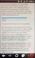
These screen shots show how each table appeared when viewed on an iPad and on an Android Evo using Opera. Click/tap for larger images.
In February .net Magazine posted an article, Deliver video seamlessly to desktop and mobile devices, which included two tables of browser and video codec support. These two tables were not marked up using a table, however.
Instead the tables were presented as images with no useful alt text. While the article used an HTML5 figure, there was nothing to present the contents of the tables as plain text.
The problem was exacerbated by the fact that when the page was viewed on mobile devices, the automatic down-sampling of the .net Magazine CMS (I am assuming here) for the mobile version of the article resulted in images that were completely illegible. A traditional HTML table would not have suffered from that problem.
I figured I was on to something when my tweet drew some comments, though I don't agree that it's just bad alt text:
@aardrian they could have easily made the same mistake without HTML5, and likely would have. That's just bad alt text :) /cc @rogerjohansson
— Derek Featherstone (@feather) February 10, 2012
To .net Magazine and the author's credit, the images were replaced on both the main site and the mobile site within about 18 days of me mentioning it (which you can follow in the comments).
Tables As Any Other Element
This screen shot shows the event schedule when viewed in a desktop browser. Click/tap for a larger image.
I suspect some tables are put together using other HTML elements just to show off that the developer can do it. After all, If developers were thinking about the structural and semantic meaning of the content, then they surely wouldn't use div and spans to mark up tabular data.
The web site for a two day responsive web design workshop, Build Responsively, includes a schedule on its Columbus event page. This schedule includes a column of times and a column of sessions. Each column has a heading and the rows have alternating background styles. In every visual sense, it's a table of data.
Semantically and structurally, however, that's not how it's coded (which I discovered when I attempted to print the page). It's a series of divs and spans inside an ordered list (I have also seen this done with definition lists). The first bullet even has the class "heading," which is probably a good clue that this entire list could be a table and that "heading" could be a th.
This code block shows the event schedule HTML for context:
<ol>
<li class="heading">
<div class="time">Time</div>
<div class="session">Session</div>
</li>
<li>
<div class="time">
<time datetime="2012-07-09 08:00">8:00AM</time> - <time datetime="2012-07-09 09:00">9:00AM</time>
</div>
<span class="session">Registration, Coffee</span>
</li>
<li>
<div class="time">
<time datetime="2012-07-09 09:00">9:00AM</time> - <time datetime="2012-07-09 09:40">9:40AM</time>
</div>
<span class="session">Responsive Web Design, 101</span>
</li>
<li>
<div class="time">
<time datetime="2012-07-09 09:45">9:45AM</time> - <time datetime="2012-07-09 11:15">11:15AM</time>
</div>
<span class="session">Responsive Planning & Design</span>
</li>
<li>
<div class="time">
<time datetime="2012-07-09 11:30">11:30AM</time> - <time datetime="2012-07-09 12:00">Noon</time>
</div>
<span class="session">Getting a Good Start</span>
</li>
<li>
<div class="time">
<time datetime="2012-07-09 12:00">Noon</time> - <time datetime="2012-07-09 13:00">1:00PM</time>
</div>
<span class="session">Lunch (provided)</span>
</li>
<li>
<div class="time">
<time datetime="2012-07-09 13:15">1:15PM</time> - <time datetime="2012-07-09 17:00">5:00PM</time>
</div>
<span class="session">Afternoon Session, The Nitty Gritty</span>
</li>
<li>
<div class="time">
<time datetime="2012-07-09 17:30">5:30PM</time> - <time datetime="2012-07-09 22:00">?</time>
</div>
<span class="session">Opening Night Party, Sponsored by GitHub!</span>
</li>
</ol>
You can see this site featured on PrintShame.
What You Can Do
With all the push for hand-crafted HTML and CSS and the strong desire to show off what developers can do using HTML5 and assorted tricks, take a look at any grids you find yourself marking up. If you find you have columns of data, rows of data, headings for rows or columns, or are using any CSS table display properties, then you just might need to use a table instead.
Update: January 3, 2012
The article HTML5 caption element and headings explains that with HTML5's acceptance of headings in captions on tables, it's now possible for your data tables to fit into the heading navigation when accessed via a screen reader.
Update: April 12, 2013
Léonie Watson has put together a quick overview on how to make your data tables accessible over at .net Magazine.
Update: October 21, 2013
Another example of doing it wrong, found in the wild:
No! This is *NOT* the way to build a responsive table. Poor semantics, no accessibility: http://t.co/gpRgpEFMge
— Russ (@russmaxdesign) October 21, 2013


0 comments:
Post a Comment