tech support 8

  • Subscribe to our RSS feed.
  • Twitter
  • StumbleUpon
  • Reddit
  • Facebook
  • Digg
Showing posts with label typefaces. Show all posts

Monday, 1 October 2012

Chromatic Type with Pseudo Elements

Posted on 04:11 by Unknown


Typography on the web has come a long way from the days of a handful of web-safe fonts, six sizes, and little other control. With the ability to embed custom typefaces in web pages and exert a great deal of control via CSS, it was a matter of time before old-world printing techniques for multi-colored text came to the web.


Over at Webfonts.info there is a tutorial, Layering type with CSS z-index, which shows how to achieve a multi-colored text effect by stacking the same piece of text on itself and applying a different font specifically meant for this kind of layering. The problem is that you have to duplicate the text for each layer, creating redundant text on the page that, without CSS, can look pretty odd (or sound pretty odd when read aloud by a screen reader). Discussing accessibility or SEO is outside of what I want to cover here, though.


The HTML


For my demo I am relying on CSS pseudo elements and generated content to duplicate the text for me up to two times. I also use the HTML5 data-* attribute to contain the same text value of the content itself. While I could use the title attribute, that would result in tool-tips appearing whenever you put your mouse over the text. For my demo I am using the following block of HTML:


<div>
<p class="chromatic" data-copy="Vote early &amp; vote often.">
Vote early &amp; vote often.
</p>
</div>


The CSS


I am using a new typeface family built from old wood type blocks and specifically built to be layered. More information on the typeface is at the end of this post.


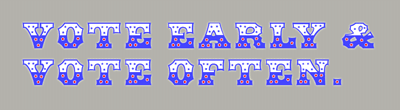
Example 1: Strike Up the Band


Picture of text in use
Click/tap/select to see demo page.


This example is intended to sit on a background made up of a texture or color different than you want for the text. I use the white fill as the lowest layer, then stack the blue border on top to trap the white text and add the red stars on top from there.


div {
position: relative;
margin: 0; }

div p.chromatic {
font-size: 600%;
margin: 0;
padding: 1em;
position: relative;
color: #fff;
font-family: 'hwt_american_solidregular'; }

.chromatic::before, .chromatic::after {
content: attr(data-copy);
position: absolute;
padding-right: 1em; }

.chromatic::before {
z-index: 3;
color: #00f;
font-family: 'hwt_american_outlineregular'; }

.chromatic::after {
z-index: 5;
left: 1em;
top: 1em;
color: #f00;
font-family: 'hwt_american_starsregular'; }


Example 2: That Old-Timey Feel


Picture of text in use

Picture of text in use
Click/tap/select to see demo page.


I am mimicking the mis-registration of old-timey print by off-setting the text and applying some transparency to show the texture underneath as well as the overlapping points of the "inks." I also use the distressed font for the letter fill.


When you hover over the text the alignment snaps into place, the letters become opaque, and I replace the distressed font with a solid fill.


div {
position: relative;
margin: 0; }

div p.chromatic {
font-size: 600%;
margin: 0;
padding: 1em;
position: relative;
color: rgba(255,255,255,.85);
font-family: 'hwt_american_shopwornregular'; }

.chromatic::before, .chromatic::after {
content: attr(data-copy);
position: absolute;
padding-right: 1em; }

.chromatic::before {
z-index: 3;
color: rgba(255,51,51,.9);
font-family: 'hwt_american_starsregular';
margin-left: -0.02em; }

.chromatic::after {
z-index: 5;
left: 1em;
top: 1em;
color: rgba(0,0,0,.5);
font-family: 'hwt_american_outlineregular';
margin-top: 0.02em; }

div:hover p {
color: rgba(255,255,255,1);
font-family: 'hwt_american_solidregular'; }

div:hover p::before {
color: rgba(255,0,0,1);
margin-left: 0; }

div:hover p::after {
color: rgba(0,0,0,1);
margin-top: 0; }


Example 3: Accounting for Different Backgrounds


Picture of text in use

Picture of text in use
Click/tap/select to see demo page.


Here I want the text fill to be the same color as the background, which allows me to use three different colors (black for the 3D effect, blue and red). On hover I change the background color of the container, which requires me to swap the bottom layer to the fill font and set it to white.


div {
position: relative;
margin: 0;
background-color: #fff; }

div:hover {
background-color: #000; }

div p.chromatic {
font-size: 600%;
margin: 0;
padding: 1em;
position: relative;
color: #000;
font-family: 'hwt_american_outlineregular'; }

.chromatic::before, .chromatic::after {
content: attr(data-copy);
position: absolute;
padding-right: 1em; }

.chromatic::before {
z-index: 3;
color: #00f;
font-family: 'hwt_american_stars_topregular'; }

.chromatic::after {
z-index: 5;
left: 1em;
top: 1em;
color: #f00;
font-family: 'hwt_american_stars_bottomRg'; }

div:hover p {
color: #fff;
font-family: 'hwt_american_solidregular'; }


Example 4: Using CSS for More Colors


Picture of text in use

Picture of text in use
Click/tap/select to see demo page.


Using some CSS drop shadows can help keep the text have more contrast with the background color or texture. On hover I turn the bottom stars red. While red usually looks terrible against blue, adding a white edge with CSS makes them stand out against the blue. It's a subtle effect that shows how you can use CSS in conjunction with chromatic typefaces to create even more effects.


div {
position: relative;
margin: 0; }

div p.chromatic {
font-size: 600%;
margin: 0;
padding: 1em;
position: relative;
color: #44f;
font-family: 'hwt_american_solidregular';
text-shadow: 0 0 0 transparent, 0 0 0 transparent, 0 0 0 transparent, 0 0 5px #fff; }

.chromatic::before, .chromatic::after {
content: attr(data-copy);
position: absolute;
padding-right: 1em; }

.chromatic::before {
z-index: 3;
color: #fff;
font-family: 'hwt_american_stars_topregular';
text-shadow: none; }

.chromatic::after {
z-index: 5;
left: 1em;
top: 1em;
color: #fff;
font-family: 'hwt_american_stars_bottomRg';
text-shadow: none; }

div:hover p::after {
color: #f00;
text-shadow: -1px -1px 0 #fff, 1px -1px 0 #fff, -1px 1px 0 #fff, 1px 1px 0 #fff; }


Example 5: Swap Fonts and CSS to Make It Pop


Picture of text in use

Picture of text in use
Click/tap/select to see demo page.


Using CSS to outline the text gives even more flexibility, so the hover effect with the 3D font and color swap makes the text pop.


div {
position: relative;
margin: 0; }

div p.chromatic {
font-size: 600%;
margin: 0;
padding: 1em;
position: relative;
color: #fff;
font-family: 'hwt_american_solidregular';
text-shadow: -1px -1px 0 #000, 1px -1px 0 #000, -1px 1px 0 #000, 1px 1px 0 #000; }

div:hover p {
color: #000;
font-family: 'hwt_american_outlineregular';
text-shadow: none; }

.chromatic::before, .chromatic::after {
content: attr(data-copy);
position: absolute;
padding-right: 1em; }

.chromatic::before {
z-index: 3;
color: #f00;
font-family: 'hwt_american_stars_topregular';
text-shadow: none; }

div:hover .chromatic::before {
color: #00f; }

.chromatic::after {
z-index: 5;
left: 1em;
top: 1em;
color: #00f;
font-family: 'hwt_american_stars_bottomRg';
text-shadow: none; }

div:hover .chromatic::after {
color: #f00; }


About American Chromatic


The typeface I used for this demo is HWT American Chromatic, a collaboration between the Hamilton Wood Type & Printing Museum in Two Rivers, Wisconsin and P22 Type Foundry in Buffalo, New York. Some detail about the typeface from the readme file:


The HWT American Chromatic set is a multilayered font set that will allow for thousands of possible color and pattern combinations. The original 19th Century Chromatic that this font set is based upon included 2 fonts. The HWT digital version includes 8. The alignment isconfigured to allow any combination of the 8 fonts to all align when identical text is set and arranged, one on top of the other.


American Chromatic was originally created by Wm. H. Page & Co. circa 1857-59. It was created as a two part chromatic where portions of each color would overlap to create a third color via the blending of semi-transparent inks. Chromatic wood type was an innovative approach to the limits of the technology of the time. To print them as shown in their specimen books required a highly skilled printer.


No, I wasn't paid or given a free font family to write this.


Read More
Posted in css, design, fonts, html, typefaces | No comments

Wednesday, 1 December 2010

Two Advent Calendars for Web Developers

Posted on 07:29 by Unknown


One of the best parts of December, regardless of whether you believe in Christmas or that it belongs in December, is the fun of the advent calendar. As a kid I used to look forward to jamming a new piece of creche-themed chocolate (chocolate stablehand, anyone?) into my mouth every morning before breakfast. Now that I am a little older and can wait until after breakfast, I can also appreciate more evolved advent calendars.


24 Ways


24 Ways logoToday marks the start of 24 Ways, an article-a-day site presenting web design and development posts from authors such as Dan Mall, Simon Collison, Richard Rutter, Cennydd Bowles, Sarah Parmenter, Veerle Pieters, etc. The site has been dispensing holiday nuggets ever December since 2005 and, based on past years (2005, 2006, 2007, 2008, 2009), this year will have some gems. Last year I had a write-up on 24 Ways as well (24 Ways Is Back Over 24 Days), and I can tell you that I have referred back to some of the posts often.


You can find daily updates right on the home page, or by following 24 Ways on Twitter (@24ways), Facebook and/or following the RSS feed in your favorite aggregator (full content of each article is in the feed).


This year 24 Ways is changing it up and also offering a printed annual with all the 2010 articles with all the proceeds from the sales to be given to UNICEF. The printed version of 24 Ways is only on sale during December 2010 (for £8) and will be printed at some point after that. You can read more and place an order at the 24 Ways Annual site.


Adfont Calendar


Adfont Calendar web page.


Fontdeck has created its own advent calendar, or its Adfont Calendar (see the image above). Each day a user can select the appropriate "drawer" to access another free web font special. Here's the cool part about it — these are web fonts.


Before you get too excited, it's clearly a sales promotion, but at least you get to try out some new typefaces and enjoy a discount to buy the whole thing. According to Fontdeck, all of their web fonts are free to trial for up to 20 visitors, but the fonts in the Adfont Calendar are also free to upgrade for use on a web site with up to 1 million page views. You will need to sign up for an account and provide Fontdeck with the URL of the site on which you will use the typeface. Once you do that, Fontdeck provides you with code to link to the CSS file and the appropriate CSS to use in your site.


Museo 900I signed up for today's free font, Museo 900. All I had to do was create my account and then click the big red "Purchase font licenses" option. Since it's a $0 annual license, I wasn't too concerned about clicking the button (but I shouldn't count on it lasting past December 1 of next year). I was presented with a block of text that, comfortingly, read:


Thank you! We've upgraded this account to unlimited use – now all your site visitors will see the fonts.


And that's it. It looks like it's good to go. Now, today's offering isn't exactly the typeface I would choose for my site, so I will be visiting daily to see what other typefaces open up this month.


If you are really itching to play around with web fonts and want more options, check out the article I wrote in July, Trying Google Font Previewer.

Read More
Posted in accessibility, css, fonts, html, standards, typefaces, WOFF | No comments

Friday, 30 July 2010

Trying Google Font Previewer

Posted on 15:35 by Unknown

Screen shot of Google Font Previewer


I'm going to make the assumption that if you are reading this you have at least a passing interest in typography on the web and have heard about Google's new font preview tool. There are already plenty of articles talking about how easy it is, how Google hosts the typefaces, how licensing isn't an issue, and so on. Some of them are linked at the end of this article, so go read up. As such, let me just dive right into the piece I find most interesting — the implementation.


I started to play around with Google Font Previewer by dropping code samples onto my development site. I tried to see how many typefaces I could embed, how I could mesh the code into my site, how easy it would be, and how it would look in different browsers. The screen shot below (from Google Chrome) shows my site with three of the typefaces in place: Molengo for the overall copy, IM Fell DW Pica SC for the headlines, and Reenie Beanie for the banner text with my name. You won't see this on my live site because this is, after all, only a test and I am not writing a ransom note.


Screen shot of my (development) site with font styles.


In order to use these typefaces I needed to drop three references to the Google typefaces into the head of my document (one for each typeface):


<link href="//fonts.googleapis.com/css?family=Molengo:regular" rel="stylesheet" type="text/css">
<link href="//fonts.googleapis.com/css?family=Reenie+Beanie:regular" rel="stylesheet" type="text/css">
<link href="//fonts.googleapis.com/css?family=IM+Fell+DW+Pica+SC:regular" rel="stylesheet" type="text/css">


From there I simply found the appropriate selectors in my CSS file and added the following styles (you'll note that I edited them heavily from what the tool provides):


body {
font-family: 'Molengo', Trebuchet, sans-serif;
font-size: .82em;
font-weight: 400;
word-spacing: -0.1em;
line-height: 1.6em; }

h1 {
font-family: 'IM Fell DW Pica SC', serif;
font-size: 25px;
text-shadow: 2px 2px 2px #333;
line-height: 1em; }

#Banner p#Title {
font-family: 'Reenie Beanie', serif;
font-size: 100px;
font-weight: 600;
text-shadow: 4px 4px 4px #333;
line-height: 1em; }


You can see that I played around with font sizes (switching between using ems and pixels), font weight, drop shadows, and even adding an alternate font in case the user cannot see the selected typeface. I then loaded up my most current browsers on my Windows machine (my Mac and Ubuntu machines are hiding) and ran the site through each, comparing and contrasting. The image below shows a representative slice of the page with all three typefaces loaded in each browser. Click the image (or use whatever input device you prefer, such as your meatstick) to see the full-size screen shot. Browsers used in the test:


  • Internet Explorer 8

  • Chrome 5.0.375.99

  • Safari 5.0 (7533.16)

  • Firefox 3.6.7

  • Opera 10.6


Screen shot of my (development) site with font styles as seen by different browsers.


I noticed the browsers were generally consistent on the font scaling and weight, with minor differences in anti-aliasing and line-height. Shadows showed greater variance among the browsers. Opera seemed to have a whole different idea of font weight, size, and anti-aliasing, but wasn't so far out of the park that it was unusable. Most interesting was how punctuation was treated. Note how only Internet Explorer and Opera show the commas in the tag-line under my name, or after the word "project" in the first sentence. Chrome, Safari, and Firefox each lost the commas altogether. While I am comfortable with the other display differences, losing punctuation is a deal killer for me.


Overall, the Google Font Previewer is a great way to quickly select and style type, drop it into your pages, and get it done quickly enough to go get an ice cream before your Dallas reruns. However, take some time to clean up the CSS it provides so that it matches your site coding style and isn't full of unnecessary declarations (do you really need to define word-spacing if you aren't changing the browser defaults?). Consider adding other, standard typefaces into the list as back-ups. Once you've done that, make sure you fire up your newly-typographized page in a few different browsers and are comfortable with the results. Those punctuation marks can be a killer, so check those. Don't limit yourself to your own browsers, either. Go find some variety and give the page a spin in alternative browsers, older browsers, and even mobile devices. You just might find that you added a style that works well with current browsers, but blows up the version of Netscape 4.x sitting on your grandmama's old Centris 610.


Related


  • New Google Font Previewer - Webfonts Easier and More Fun

  • Google Font Previewer

  • Test Drive Your Type With Google Font Preview

  • HOW TO: Implement Google Font API on Your Website

  • Google Makes Custom Web Typography Ridiculously Easy

Read More
Posted in browser, Chrome, css, design, Firefox, fonts, Google, html, Internet Explorer, Opera, Safari, standards, typefaces, WOFF | No comments

Tuesday, 5 January 2010

ALL-CAPS: Harder to Read?

Posted on 10:25 by Unknown

Susan Weinschenk, Ph.D. wanted to write an article about why it's harder to read text set in all-caps than text set as mixed case. The argument for this has centered around how people read words — recognizing a word shape from its letters, whereas an all-caps word has no unique shape. She started to research this idea for her article but could find little to support it. Her article, 100 Things You Should Know About People: #19 — It's a Myth That All Capital Letters Are Inherently Harder to Read, outlines a different method for how letters and word shape work to make it easier for people to read.

In her research she found that people respond to letters they recognize and anticipate, essentially recognizing letter sequences within a word, not the shape of the word. Because of the eye's jumpy nature, thanks to saccades (great article in an old Scientific American issue), your eyes essentially leap ahead a bit and leverage peripheral vision to recognize letters and, as a result, words. A reader can generally pick up 15 letters at a time this way.

From here she argues that text set in all-caps isn't harder to read by its nature, readers just don't have much experience with it. Readers will still take longer to read it, so there is no reason to assume the difference in speed is a myth. They can be trained, however, to bring that speed up.

There is a contrary viewpoint to this, however. A dyslexic writer at the Daily Kos has posted her own plea for writers (blog commentors, etc.) to avoid using all-caps in their comments, posts, articles, etc. This writer claims that she relies on the shape of a word:

However letters mean little to me still I read by a form of pictogram system. Every word has a shape therefore I read the word by its visual form and not its content. [...] [W]hen someone writes in all caps I just cannot see the shape of the intended word [...] I know quite a few dyslexics of varying severity and know that word form is important to many.

In short, while it may be possible to train a reader to recognize all-caps, you certainly won't train your users to do it. Nor do you want to be the application, web site, book, journal, etc. that drives people away in such a misguided attempt. Even if you did manage to train your readers, you would clearly be leaving some selection of dyslexic users out in the cold, perhaps not to return (or worse, to recommend against reading to all their friends).

Architects and engineers who are used to reading all-caps may be excluded from the first part, but I am in no position to form a focus group to test that theory for the scope of this brief piece.

Read More
Posted in accessibility, design, fonts, typefaces, usability, UX, WCAG | No comments

Wednesday, 9 December 2009

Bulletproof @font-face Syntax (reprint)

Posted on 08:23 by Unknown

Paul Irish has gone ahead and created a block of CSS that we can reliably embed into our pages that will import .eot and .ttf/.otf font files. In his article Bulletproof @font-face syntax, he breaks down the various options and their support, providing arguments for and against each. In the end, he provides what he considers the best method to declare your @font-face styles in your CSS:

@font-face {
font-family: 'Graublau Web';
src: url('GraublauWeb.eot');
src: local('Graublau Web Regular'), local('Graublau Web'),
url('GraublauWeb.otf') format('opentype');
}

If you can support (generate) WOFF or SVG typefaces, then he provides a slightly expanded block of code that can support Chrome 4 and Firefox 3.6 (neither of which has been released yet):

@font-face {
font-family: 'Graublau Web';
src: url('GraublauWeb.eot');
src: local('Graublau Web Regular'), local('Graublau Web'),
url("GraublauWeb.woff") format("woff"),
url("GraublauWeb.otf") format("opentype"),
url("GraublauWeb.svg#grablau") format("svg");
}
Read More
Posted in browser, fonts, standards, typefaces, WOFF | No comments

Wednesday, 21 October 2009

Firefox 3.6 to Support Web Open Font Format

Posted on 14:34 by Unknown

Mozilla's developer blog today posted that they have added support for the Web Open Font Format (WOFF) to Firefox 3.6. Firefox 3.5 gave us support for linking to TrueType and OpenType fonts, but this takes it a step further to support a format that is more robust for two key reasons:

  1. WOFF is a compressed format, resulting in files smaller than an equivalent TrueType or OpenType font.
  2. It avoids DRM and domain labels by containing meta data about its source, garnering support from typeface designers and foundries.

If you want to see this in action, you'll need to grab a Firefox 3.6 nightly build until the full release is out the door. If you should feel compelled to do that, the nice folks at Mozilla have provided a sample block of CSS that uses the @font-face rule to link to a WOFF font:

@font-face {
font-family: GentiumTest;
src: url(fonts/GenR102.woff) format("woff"),
url(fonts/GenR102.ttf) format("truetype");
}

body {
font-family: GentiumTest, Times, Times New Roman, serif;
}
Structured this way, browsers that support the WOFF format will download the WOFF file. Other browsers that support @font-face but don’t yet support the WOFF format will use the TrueType version. (Note: IE support is a bit trickier, as discussed below). As WOFF is adopted more widely the need to include links to multiple font formats will diminish.

If you are fortunate enough to have a build of Firefox 3.6 already up and running on your machine, go to a test page using ff Meta set up by the nice folks at edenspiekermann (if part of the name is familiar, Erik Spiekerman is the designer of the Meta family, and if the typeface is familiar, it's what we use at Algonquin Studios). The image below shows how that page looks in Firefox 3.6 using ff Meta (left side) and how it looks rendered in Internet Explorer 8 (right side).

Screen shot showing page with ff Meta typeface on one half, not on the other.

Because IE8 only supports the EOT format, the blog offers some code to account for IE8 in the CSS. Because IE8 doesn't understand the format hints, it will parse the hints as part of the URL, resulting in requests to the server for files that don't exist. The end user will see things just fine because of the EOT reference, but your logs will show some odd 404s as a result of this technique. The Mozilla post has more details on this and some other issues. The code to do this:

@font-face {
font-family: GentiumTest;
src: url(fonts/GenR102.eot); /* for IE */
}

@font-face {
font-family: GentiumTest;
/* Works only in WOFF-enabled browsers */
src: url(fonts/GenR102.woff) format("woff");
}

The main Mozilla blog has a post today listing the supporting organizations with the following endorsement:

We endorse the WOFF specification, with default same-origin loading restrictions, as a Web font format, and expect to license fonts for Web use in this format.

Updates

  • font_dragr: a drag and drop preview tool for fonts
  • after Firefox 3.6 – new font control features for designers
Read More
Posted in css, Firefox, fonts, Internet Explorer, standards, typefaces, WOFF | No comments
Older Posts Home
Subscribe to: Posts (Atom)

Popular Posts

  • New Google Analytics Features
    In the article " Google Analytics Now More Powerful, Flexible and Intelligent " from last Tuesday (yes, I know I'm behind on t...
  • Speaking: Accessible Web Apps & Standards
    I will be speaking twice in September, both of them sponsored by Infotech Niagara. If you're in the Buffalo area, these are great opport...
  • HTML5 Finally Gets... a Logo?
    Start Rant With all the debate about elements , attributes , semantic meaning and who really owns HTML5 , it's thrilling to see that t...
  • Speaking at WordCamp Buffalo 2013
    This Saturday I will be speaking at Buffalo's second WordCamp . Last year was a great day-long event filled with many good speakers (not...
  • Current CSS3, HTML5 Support
    The Tool Last week saw the launch of FindMeByIp.com , a very handy web site that displays a user's current IP address (along with a geog...
  • Copying Content Styled with Text-Transform
    Using the CSS property text-transform to automatically shift copy to uppercase has been popular for a while now, but a combination of a rec...
  • Come See Me: October 6
    I will be one of the panelists at the Business First Power Breakfast: Online Networks , this coming Tuesday, October 6, 2009 at 7:30am at S...
  • Accessibility Bookmarklets and Tools
    Testing accessibility on your web projects can be a tricky task if you have no firsthand experience with visual, audible, physical or even c...
  • Brightkite Yields to Foursquare, Gowalla, Etc.
    Brighkite has made an announcement today that affects me and a handful of other people (not counting all the people on Facebook whose timel...
  • Social Media Day 2011 in Buffalo #smdayBUF
    Last night marked the second Mashable-sponsored Social Media Day here in Buffalo. With 154 RSVPs for the event, the venue, The Eights Bist...

Categories

  • accessibility
  • Adobe
  • analytics
  • Apple
  • apps
  • ARIA
  • Bing
  • Blink
  • Brightkite
  • browser
  • Buzz
  • Chrome
  • clients
  • css
  • design
  • Facebook
  • Firefox
  • Flash
  • fonts
  • food
  • Foursquare
  • g11n
  • geolocation
  • globalization
  • Google
  • Gowalla
  • html
  • i18n
  • ICANN
  • infographic
  • Instagram
  • internationalization
  • internet
  • Internet Explorer
  • JavaScript
  • JAWS
  • Klout
  • L10n
  • law
  • localization
  • Lynx
  • Mapquest
  • Microsoft
  • mobile
  • Netscape
  • ning
  • Opera
  • patents
  • picplz
  • Plus
  • print
  • privacy
  • project management
  • QR
  • rant
  • RSS
  • Safari
  • SCVNGR
  • search
  • SEM
  • SEO
  • social media
  • Sony
  • speaking
  • standards
  • SVG
  • touch
  • translation
  • Twitter
  • typefaces
  • usability
  • UX
  • Verizon
  • video
  • W3C
  • WAI
  • WCAG
  • WebKit
  • whatwg
  • Wired
  • WOFF
  • xhtml
  • Yahoo
  • YouTube

Blog Archive

  • ▼  2013 (39)
    • ▼  December (1)
      • Web Development Advent Calendars for 2013
    • ►  November (7)
    • ►  September (4)
    • ►  July (3)
    • ►  June (2)
    • ►  May (5)
    • ►  April (3)
    • ►  March (6)
    • ►  February (2)
    • ►  January (6)
  • ►  2012 (63)
    • ►  December (2)
    • ►  November (4)
    • ►  October (5)
    • ►  September (5)
    • ►  August (4)
    • ►  July (6)
    • ►  June (7)
    • ►  May (7)
    • ►  April (8)
    • ►  March (5)
    • ►  February (3)
    • ►  January (7)
  • ►  2011 (67)
    • ►  December (5)
    • ►  November (7)
    • ►  October (5)
    • ►  September (4)
    • ►  August (8)
    • ►  July (3)
    • ►  June (8)
    • ►  May (3)
    • ►  April (1)
    • ►  March (6)
    • ►  February (6)
    • ►  January (11)
  • ►  2010 (100)
    • ►  December (8)
    • ►  November (7)
    • ►  October (5)
    • ►  September (10)
    • ►  August (7)
    • ►  July (11)
    • ►  June (12)
    • ►  May (6)
    • ►  April (8)
    • ►  March (10)
    • ►  February (5)
    • ►  January (11)
  • ►  2009 (51)
    • ►  December (9)
    • ►  November (6)
    • ►  October (21)
    • ►  September (13)
    • ►  August (2)
  • ►  2003 (3)
    • ►  October (1)
    • ►  January (2)
  • ►  2002 (9)
    • ►  December (1)
    • ►  June (3)
    • ►  April (1)
    • ►  March (3)
    • ►  January (1)
  • ►  2001 (1)
    • ►  February (1)
  • ►  2000 (4)
    • ►  October (1)
    • ►  July (1)
    • ►  June (1)
    • ►  January (1)
  • ►  1999 (7)
    • ►  November (1)
    • ►  September (2)
    • ►  August (2)
    • ►  July (1)
    • ►  June (1)
Powered by Blogger.

About Me

Unknown
View my complete profile