tech support 8

  • Subscribe to our RSS feed.
  • Twitter
  • StumbleUpon
  • Reddit
  • Facebook
  • Digg
Showing posts with label UX. Show all posts

Sunday, 1 December 2013

Web Development Advent Calendars for 2013

Posted on 05:46 by Unknown

Photo of an advent calendar with a leg lamp, potted ivy, and small statue of Ganesha.
Ganesha may or may not be stealing chocolate from the advent calendar.


For a few years now web developers around the world have celebrated Saturnalia Christmas with advent calendars covering topics related to the web. Some come and go, but you'll probably recognize a few regulars on this list.


I may have missed some, so please pass them along if you know of any. For those I know are not returning, I have listed them at the end.


1. 24 Ways


24 Ways, the one that most of this think about for web development calendars, is back again. It's been going strong since 2005 and based on its history this year should have some good articles.


2. Perl Advent Calendar


Perl Advent Calendar goes all the way back to 2000 (and back then looked a bit more like a traditional advent calendar, too) and has been dispensing tips for Perl developers ever since.


3. 24 Jours de Web


24 Jours de Web is starting its second year as an advent calendar for web folk. Written in French, it is clearly primarily targeted at French speakers, but a round of Google Translate will open it up to far more readers (like me).


4. UXmas


UXmas is an advent calendar aimed at the user experience community. Coming from Australia, American readers may be thrown just a bit by the schedule. The calendar promises everything from sketches, to articles, to tools, to videos.


5. Webkrauts


Webkrauts has an all German advent calendar, and it also dates back to 2005. It covers general web topics, but being in all-German readers like me will benefit from a Google Translate version of the page.


6. 12 Devs of Xmas


12 Devs of Xmas will also start the day after Christmas and go for 12 days from then. When all the other calendars have wrapped up, you'll still have one to read. The site is silent on its return, but this tweet suggests it's gotten writers and has a plan.


7. Freelancember


Freelancember 2013 is targeted squarely at freelancers. Its daily entries will consist of downloadable gifts in the form of PDF worksheets. Think of this as less about web-tech and more about MadLibs for projects. It has last year's calendar there as well, and so far (as of December 1) I cannot tell the calendar will just be a repeat of last year.


8. Mozilla Developer Network Holidays calendar


Mozilla Developer Network Holidays calendar includes brief links to resources or demos and suggests that you can edit them (if they are MDN resources). It doesn't link to previous years, but you can just hack the URL.


9. SysAdvent


SysAdvent is targeted to systems administrators, but there is a some cross-over to web developers. It has posts dating back to 2008 (and yet I missed it in last year's collection), so there is plenty of good material there if you're too impatient to wait for each day to be revealed.


10. Web Accessibility Advent Calendar 2013


Web Accessibility Advent Calendar 2013 is in Japanese, and thanks to the wonderful powers of Google Translate, I can tell you that it is a calendar to make the talk about Web accessibility (based on this statement: Webアクセシビリティに関する話題でつくるカレンダーです。). If you know Japanese, I welcome any corrections. The site Adventar.org appears to host other advent calendars, some about web technologies, some about ramen.


Not Returning


A handful of calendars aren't returning this year (so far), but in most cases content from previous years is still available. These include Font Deck's Adfont Calendar (which also skipped 2012), the Fronteers advent calendar (in Dutch, and also skipped 2012), Web Advent (it's taking a year off), Performance Calendar, HTML & CSS Advent (this is the 2012 calendar), She Said It (no access to old calendar), 12 Days of Podcasts (or at least there is no indication on its site or Twitter).


Not Web Related


ScienceGeek Advent Calendar Extravaganza is not web-related at all, and frankly it isn't promoted nor is it tagged (although I linked to “special” since that tag had the first day and nothing else). It is, however, probably going to be neat stuff given the first day is a giant image of the Christmas Tree Cluster.

Read More
Posted in accessibility, css, design, fonts, html, internet, mobile, standards, usability, UX | No comments

Friday, 22 November 2013

Print Styles Are Media Queries

Posted on 13:07 by Unknown


I have alluded to this point in the past. Usually when I get off on a rant about print styles, I lump it into the overall process of making responsive sites and I use media query formatting in my examples. But I haven't just flat-out said that print styles are media queries.


I believe I always assumed that the reader would just understand that in the context of my writing, in using print styles on sites, and understanding that print is a medium in which web pages have been displayed for years.


Peter-Paul Koch (@ppk on Twitter) has spent years tracking browser support for even some of the most minute features. From way back in the evolt.org days I've watched him dive into testing without concern for his own wellbeing (browsers have sharp edges). Most recently he put out calls on the Twitters for web developers to fill out a survey about how they use media queries.


I did not grab a screen shot of the survey, but he asked the following two questions (which you can glean from the raw results):


  1. Which media queries have you used AT ALL in practical projects in the past year?

  2. Which media queries have you used in MORE THAN HALF of your practical projects in the past year?


He presented the following options:


  1. width

  2. height

  3. device-width

  4. device-height

  5. device-pixel-ratio

  6. resolution

  7. orientation

  8. aspect-ratio

  9. device-aspect-ratio

  10. Other


You'll note that “print” is not an option. Despite that, 1% of his respondents to the questions (of the 33 and 23, respectively, that chose “other”) wrote in “print,” because that's what this chart indicates in his write-up (Media query/RWD/viewport survey results):


Media query use
Media query Regular use Occasional use
width 84% 7%
device-width 32% 15%
device-pixel-ratio 25% 18%
height 17% 16%
orientation 13% 20%
resolution 9% 5%
device-height 7% 7%
aspect-ratio 3% 4%
device-aspect-ratio 3% 3%
print
1% 1%


I want to be clear, I am not faulting PPK. His survey was very much about the work he's been doing lately understanding how viewports, pixel densities, and screen sizes are reported across the current landscape (jungle) of devices. Instead, I am happy that 1% of his 1,251 respondents consider print to be a media query and took the time to make it a write-in answer.


Now I just wonder how long before the other 99% would do the same. Or even for the much smaller percentage who write media query tutorials, examples, libraries, CMSes, and so on.


@ppk I’m really sad there are only 1% print MQs…

— Nicolas Hoizey (@nhoizey) November 22, 2013


Related


If you want to learn how print media queries can be useful to you, please follow the links below (which themselves contain many more links). “The more you know.”


  • My WordCamp Buffalo 2013 Presentation: Making Your Site Printable, Sept. 14, 2013.

  • My Presentation Slides: Making Your Site Printable, May 19, 2013.

  • Tracking When Users Print Pages, Mar. 26, 2013.

  • Calling QR in Print CSS Only When Needed, Mar. 8, 2013.

  • My Print Styles Article in .net Magazine, Jul. 18, 2012.

  • Announcing PrintShame.com, Apr. 9, 2012.

  • More Evidence of the Need for Print Styles, Apr. 6, 2012.

  • Test in Lynx and Print, It's Your Job, Dec. 12, 2011.

  • More Samples of Responsive Web Design ≠ Print, Oct. 13, 2011.

  • Print Styles Forgotten by Responsive Web Developers (at evolt.org), Oct. 4, 2011.

Read More
Posted in css, print, standards, usability, UX | No comments

Wednesday, 13 November 2013

Captions in Everyday Use

Posted on 11:35 by Unknown


Yesterday Henny Swan asked a simple question on the Twitters:


I'm curious to know, who uses subtitles on web content (X device) who's not deaf or hard of hearing? For example I did when breastfeeding.

— Henny (@iheni) November 12, 2013


Adam Banks put together a Storify of the responses that show there are plenty of use cases for those not hard of hearing to get value from closed captioning.


In general, any context where either the audio track is loud enough that the viewer doesn't want to disrupt those nearby, or the background noise is too much to hear the audio track clearly, is a case where captions have value for all users. Other cases that popped up include multi-tasking or working with a new language or just tough accents.


In short, closed captions have value for all users.


There is also no reason to panic about providing them, particularly if you use a video service that can do them for you. For example, back in 2010 YouTube committed to enabling auto-captioning for everyone, and Google has documents to help plus tutorials from others, such as this step-by-step or or this video.


Image of the captions in use on President Obama's speech about the Chile earthquake.


Of course, as I was writing this post, Henny posted her own reference to the Twitter conversation: The weird and wonderful reasons why people use subtitles / captions


The Storify of responses I mentioned above is embedded here to spare you all the hassle of clicking the link and to bloat my page with unnecessary script blocks:


Update: November 14, 2013


While I was writing this, Dave Rupert was putting together a very neat experiment, Caption Everything: Using HTML5 to create a real-time closed captioning system.


It's a neat proof-of-concept to show how real-time closed captioning is a possibility with current technology, albeit imprecise and cumbersome. If nothing else, hopefully it can bring more attention to a technique that, as demonstrated above, can benefit all users in everyday situations.


It's such a nifty experiment, I am embedding it here (remember, this isn't mine, this is Dave Rupert's code):


See the Pen Closed Captioning with HTML5 by Dave Rupert (@davatron5000) on CodePen


Read More
Posted in accessibility, i18n, internationalization, localization, translation, usability, UX, video, YouTube | No comments

Tuesday, 12 November 2013

WayBack Machine Handler for Your 404 Pages

Posted on 08:15 by Unknown


Image cheerily stolen from the Internet Archive blog post.
Last week I mentioned that the Internet Archive WayBack Machine had released a feature to allow custom URLs for on-demand archiving. That wasn't the only coolr feature it announced.


Another nifty feature that the Internet Archive offers is the ability to enhance your 404 pages. You can provide a visitor to a missing page with a link to that page in the WayBack Machine: Free “404: File Not Found” Handler for Webmasters to Improve User Experience


A nice feature of this service is that if there is no page with the current URL (that the user requested) in the WayBack Machine archive, then no link will appear and your 404 page will appear unblemished.


While some businesses might not want to direct people to an archived version of a bio for a long-gone staff member, or perhaps product details that are no longer correct, there is plenty of value for governments, not-for-profits, and other organizations who, ostensibly, shouldn't be removing any information. Organizations whose sites undergo regular upheavals, whether by changing the entire site structure, changing platforms, or generally just not building redirections during normal content restructuring, can offer a better experience to users.


The code is pretty simple (though I recommend against the self-closing div in the Internet Archive example, as some WYSIWYG editors will create the closing tag and wrap it around the script block):


<div id="wb404"></div>
<script src="https://archive.org/web/wb404.js"></script>


Granted, it relies on client-side script, and there is a chance some browser configurations will block it, but the benefit may outweigh those concerns.


To test it, I hopped into our web content management system at Algonquin Studios (QuantumCMS) and dropped that code block into the content area of the generic 404 page. Then I scoured the site for a page that we hadn't updated or redirected during one of our site overhauls and that also existed in the WayBack Machine.


Until I can get around to redirecting that missing page, you can see the effects of the 404 handler from the Internet Archive. If you are reading this after I made that redirection, here's a screen shot of how the link appears on the page:


Screen shot of the 404 page with the WayBack Machine link (the Redeemer animated GIF has nothing to do with the WayBack Machine).


That's it. Simple, straightforward, and potentially very useful to your visitors.


Update: November 13, 2013


Thanks to the story Conservatives erase Internet history, we know that the Internet Archive's WayBack Machine can be pretty easily cleared of historic pages just by updating a site's robots.txt file. While I would expect that the effect should only kick in from the date of the edit of the robots.txt file forward, that doesn't appear to be how it works.


I guess this casual tweet from my one of my partners at Algonquin Studios was more prescient than I thought, though in the opposite direction:


@aardrian unless Wayback captures that legally indefensible policy that made you take down the page. Or a hacked version of the site.

— stevenraines (@stevenraines) November 13, 2013


Read More
Posted in usability, UX | No comments

Friday, 27 September 2013

Slides: Responsive Web Design Primer

Posted on 10:47 by Unknown


Yesterday I had the pleasure of visiting the University at Buffalo (my alma mater) to give a presentation for its CIT professional development series. I got to talk about responsive design.


Knowing in advance that the room would have technical and non-technical users I went for a code-free presentation. One thing I learned is that code would have been useful, so if you're looking for any in here you won't find it.


I understand there is video from the event, and as soon as I have it I'll share it here as well. In the meantime, enjoy the slides without any context. Which may be more entertaining than my typically awful attempts at humor.


Responsive Design Overview for UB CIT from Adrian

Read More
Posted in accessibility, css, design, html, mobile, print, project management, speaking, standards, touch, usability, UX | No comments

Tuesday, 10 September 2013

New iPad Browser: Coast by Opera

Posted on 07:07 by Unknown


Yesterday Opera announced the release of its newest browser, Coast, built specifically for iOS tablets (I would say just iPads, but if my fridge gets an iOS tablet UI then I'd be wrong and will have paid too much for a fridge).


Background


Recently Opera moved away from Presto as its rendering engine and hitched its future to Blink, the rendering engine born from WebKit that powers Chrome. Now instead of Opera worrying about the rendering engine, it is focusing on the user interface, the place where it can set itself apart from the other browsers.


Essentially Opera is removing the browser chrome (implying to the user that a web page is just an app) and adding gesture support. Given that Opera was the browser that introduced us to mouse gestures well over a decade ago, and given that a touch screen is an inherently gesture-based UI, this seems like a natural fit.


Bits for Developers


Sadly, my office wifi was down and I couldn't play with the browser immediately (my crusty iPad 2 is wifi only). So instead I took some time to read through the developer notes.


Tablet First


Overall Opera recommends general responsive design current best practices, though it promotes a tablet-first approach. Opera offers some CSS you can use to specifically target iPads Mini, 2, 3 and 4 (Retina and non-Retina), though it leans on vendor prefixes with only a brief note to also use other prefixes and unprefixed rules.


Responsive Images


It's also clear that Coast supports the new srcset option for responsive images. It even offers a code example: <img src="image.jpg" srcset="retina.jpg 2x">


Note: As Bruce was kind enough to inform me (because I missed it in the dev notes), responsive images will be supported only in iOS7 and up.


Update as of September 20, 2013


According to Opera, iOS7 did not come with a WebKit update. That means Coast cannot support responsive images via the srcset attribute without a polyfill. Nor can Safari, of course.


Tile Speed Dial Web App Image


Instead of "Speed Dial" icons/images, Coast now looks for a "web app image." If you don't have one, Coast will first look for a Windows 8 tile image, then an Apple touch icon, then a shortcut image, then just a favicon. You can, however, create your own 228 × 288 pixel image and stuff it into your site with the following HTML:


<link rel="icon" href="$URL" sizes="228x228">


User Agent String


Don't use this to do any browser sniffing. Browser sniffing bad. This is instead handy for recognizing it in your logs:


Mozilla/5.0 (iPad; CPU OS 6_1_3 like Mac OS X) AppleWebKit/536.26 (KHTML, like Gecko) Coast/1.0.2.62956 Mobile/10B329 Safari/7534.48.3.


General Review


Getting going is pretty easy, just start typing into the only field on the screen. As you type you can see a Google preview on the left, which you can tap at any time to go to Google, or a list of icons on the right which correspond to sites you might mean. The icons start out just displaying the first letter of the site, and then identify the site's tile or shortcut image.


Screen shot of Opera Coast navigate screen.
Note the handy ".com" and ".net" options that appear above the right end of the text box.


Once you are on a page, you can go back by swiping from the left, forward by swiping from the right, or reload the page by pulling down from the top — but not too far or you get the iOS menu instead.


Vine of me playing with back, forward and reload in Opera Coast.


Opera Coast skips tabs and windows altogether and, frankly, feels a lot more like Internet Explorer for Metro than other current tablet browsers. It's pretty easy to see the open "tabs," flip through them, get more details, and discard them. It's also incredibly easy to forget you have so many tabs open. I regularly found myself littered with tabs because of all the links opening new windows.


Testing Opera Coast window/tab management.


While in that tab view, you can also see how "safe" the page is and can get to options to share it, email it, print it, and so on.


Screen shot of Opera Coast safety and share information.
The arrow on the right gives you all the share options.


Opera Coast print dialog.
I don't have a printer installed, so I'd love to hear feedback on how Coast honors print styles.


Adding and removing a bookmark, tile, whatever, is pretty easy. It took a few swipe-fails, but I got the hang of it well enough to show the whole process in one uninterrupted Vine:


It takes a little getting used to, but it's not too hard


Gotchas


There were a few things that threw me off. Perhaps because I am a power user, perhaps because I only played with it for one evening.


Swipe History


The swipe for back/forth is handy, but conflicts with behavior I have already learned. In Chrome for Android, swiping left or right has the infuriating feature of bringing me to the next or previous tab in the stack order. For those rare sites that implement a slide that is swipe-friendly, imprecise swipes will move me back and forth in the history instead.


Web App Images


Using the browser in portrait view, the additional screens of tiles (speed dial icons if you are already familiar with Opera) aren't immediately apparent. It wasn't until I turned to landscape that I saw them. The tiny dots under the Coast icon weren't enough for me to intuit that. They also aren't nearly large enough to tap to jump to a specific screenful of tiles.


Hit Sizes


The 9-box grid at the center bottom as well as the three rectangles at the bottom right are the only real browser chrome in play as you surf. They are also maddeningly small to tap. And I have dainty, lady-like fingers, so I suspect it may cause consternation for others.


Address Bar


If I am on a site and I want to change the address of the current page (maybe I fat-fingered and got to a 404, or I know a super-secret URL), I could not find a way to bring up the address bar and change it. It also made it impossible to know the current page address at any time. As someone who regularly looks at the URL for familiar addresses, indications of scam sites, quick commitment to memory, and so on, this alone takes it out of the running as an everyday browser for me.


Email a Page


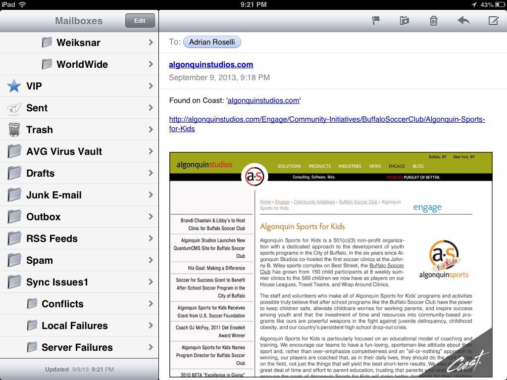
I did not care for the email feature one bit. Not only does it embed a screen shot of the page (with a Coast watermark), the screen shot won't display on other devices. Outlook blocked the image because the attachment ended in .com (not .png or .jpg). Had it not come from me, I wonder if Outlook would have blocked it as spam. My Android email client couldn't display it because there was no file extension to give it a clue.


Screen shot of emailing a web page from Opera Coast.
What you see when you choose to email a web page from Opera Coast.


Screen shot of received email from Opera Coast.
Best case scenario of what the email recipient sees, though the attachment was blocked in Outlook and unusable in my Android email client.


Tweet a Page


Tweeting a page left me similarly dissatisfied. By default it includes a Twitpic screen shot of the current page with an Opera Coast watermark. When composing the tweet, I tapped the paperclip icon to see if it would do anything, but nothing happened. I opted not to tweet again.


Screen shot of tweeting a page from Opera Coast.
Tweeting a page from Opera Coast.


The resultant tweet:


Tweeting a web page from Opera Coast. Curious how it will come across. http://t.co/bdx3mcQxiO pic.twitter.com/eq3vRhFX5N

— Adrian Roselli (@aardrian) September 10, 2013


Wrap-up


Overall, I like the browser. I like what it's trying to do for consumers. As a power user, however, It's not a fit for me though I'd be interested in bringing it in front of some other members of my family.


I also didn't get to try out unsafe sites, printing pages, responsive images (need iOS7), or poorly-built sites. My opinion might change as I continue to play with the browser.


Open Question


There are a lot of Android tablets out there, not just the four screen size offerings from Apple. So how long before we can see Coast on my Nexus 7, if ever?


Updates


I'm adding notes throughout the day as they come up.


  • Feedback from users over at MacRumors.

  • Norwegians just launched the iPad browser Apple couldn’t build at BGR.

  • A Vine from Opera Coast showing how to move/rearrange groups of tiles/bookmarks at once.


Surprising no one, the following reviews from more mainstream sources completely fail to include any screen shots or videos that weren't pilfered from Opera. I only say that to remind you that by reading this post you have gotten the most in-depth review currently on the web and you should be excited and send me a thank you note and maybe read all my other posts and high-five me on the street.


These articles are, however, worth visiting just to see the comments and how others are reacting to it.


  • Opera Coast iPad Web Browser Treats Websites like Apps at Time.

  • Opera's iPad Coast browser debuts, packaging websites as apps at ZDNet.

  • With Coast, Opera reboots its browser for mobile future at Cnet.

  • Opera Coast: a Stripped-Down Browser Built Just for iPad at Gizmodo.

  • Opera Launches Coast, A Slick New WebKit-Based iPad Browser at TechCrunch.

  • Opera releases Coast, an iPad browser that turns the web into a home screen at The Verge.


Tips from Bruce:


Want to add a background image to your Coast home screen? Long press an image, set as background. Pull curled corner to remove it.

— bruce lawson (@brucel) September 9, 2013


If you don't see your new 228px site icon in Coast, empty cache by deleting yr old speeddial entry (drag to top of screen) & revisit yr site

— bruce lawson (@brucel) September 10, 2013


To clear history in Coast by Opera or change size of Speed Dial grid from 3x3 to 3x4, go to iPad settings > Coast

— bruce lawson (@brucel) September 12, 2013


Update: September 18, 2013


Opera has fielded some questions about Coast and collected them into two posts (so far):


  • Coast by Opera is only a few days old, but we’ve already gotten a lot of questions about how things work. Here’s some answers.

  • Nope, there are no tabs in Coast. That and a few more answers for this second set of FAQ.


Update: September 25, 2013


Another FAQ post from Coast:


  • Yes, you can see the URL and you can copy links in Coast. Our third set of FAQ


Read More
Posted in Apple, Blink, browser, mobile, Opera, standards, touch, UX | No comments

Friday, 12 July 2013

My Carousel Use Stats

Posted on 09:14 by Unknown


Screen shot of the carousel on the Algonquin Studios home page.


I started this post way back in March after reading Brad Frosts' bit on carousels. Then I let it sit unfinished. With the buzz around ShouldIUseACarousel.com this week, I figured I'd finish it up. The data is old, although I offer updated numbers at the bottom.


The Process


I looked at all the visits to my home page between February 1 and March 3 to get 30 days of data. Of those visits to the home page, 83% of the time the home page was the landing page. I figured if a smaller percentage of initial visits to our site came via the home page then I would not read too much into the value of these numbers as the user might have already been through enough of the site to get what he or she wanted, but 83% is a pretty big number.


The home page has many content areas, but by far the most prominent is our carousel. During the time frame tested, there were 5 different carousel images with accompanying text. Each one has its own Google Analytics event tracker so I can tell which carousel item has been clicked.


For those playing at home, and using Google Analytics, it's as simple as adding an onclick to your anchor: a href="/Products" onclick="_gaq.push(['_trackEvent', 'Slider', 'Columns']);". In this case I am tracking a custom event named "Slider" with the value of "Columns" (so I know which specific image/slide was chosen).


The Results


In the 30 days I tested, the carousel links were clicked less than 1% of the time the home page was visited — 0.8% to be slightly more precise.


Every other element on the home page received at least twice as much activity, with the tabs getting used nearly 10% of the time. Site-wide, the skip navigation link got clicked (tapped, followed) half again as much as the carousel at 1.2%.


To qualify this a bit, the carousel wasn't intended to serve as our only call to action on the home page. It's more about presenting a message to help brand the company as part of our new marketing push. Adding this tracking feature has allowed us to track how the carousel gets used, if at all, and which images/messages are more compelling.


The Latest Results


For this updated version of my draft post I looked at the last 30 days again (June 11 to July 11, 2013) to see what activity we've had on the carousel. The last 30 days are a good fit since we haven't been showing off the features of the slider to clients (which results in activity that is a function of people playing, not truly discovering and naturally using).


For the last 30 days, the number of clicks on the carousel is much lower. 0.2% of unique visitors clicked a carousel slide. For every 500 unique visits to the site, someone clicks on the carousel. Interestingly, this is the same number of people who print pages from our site and lower than the "skip navigation" activity in the same time period.


About the Carousel


Our site is a great place for us to experiment with the carousel since we can quickly refactor it, tweak it, replace it, and so on. Since its launch 7 months ago I have made a number of tweaks to the technology and we have played around with the messages to see what sticks.


We're revisiting the design of the carousel now to see how its relative size and different images and messages can affect its use. At some point it may go away, but not until I've had a chance to gather lots of data.


The carousel itself is both swipe-friendly and keyboard-friendly, uses a linear flow with a clear start and end, has indicators to show where a user is in the overall collection (also allowing a user to jump to a specific slide), and pauses when there is any action taken on the carousel (hover, click, tap, etc.). I built it to also serve images at appropriate sizes for appropriate devices, something which I am regularly tweaking. The base for this is the Royal Slider.


Related


  • ShouldIUseACarousel.com

  • Accessibility expert warns: stop using carousels, July 11, 2013.

  • Carousels, January 23, 2013.

  • Carousel Interaction Stats, January 22, 2013.

  • Auto-Forwarding Carousels and Accordions Annoy Users and Reduce Visibility, January 19, 2013.

  • Don’t Use Automatic Image Sliders or Carousels, Ignore the Fad, September 27, 2012.

  • That big sliding banner? Yeah, it’s rubbish, September 6, 2012.

  • 5 Big Usability Mistakes Designers Make on Carousels, August 2, 2011.


Read More
Posted in accessibility, analytics, design, mobile, rant, touch, usability, UX | No comments

Sunday, 19 May 2013

My Presentation Slides: Making Your Site Printable

Posted on 15:06 by Unknown


On Friday, May 17 I had the pleasure of speaking for the first time at Stir Trek, a one-day conference in Columbus, Ohio, that drew over 1,200 attendees (and I understand sold out in just a few minutes). Apparently the name is a reference to the MIX developer conference, for which they were unable to obtain license to use a variation on the name.


I also had the pleasure of presenting for the first time on best practices for making your web site printable, built from my own professional experience, my PrintShame site, and an article I wrote for .net Magazine, among other resources (also linked in the presentation).


With 40 great speakers across 8 different tracks, there was quite a lot on offer throughout the day. Considering the other presentations held at the same time as mine, I was thrilled to get any audience and more excited to see that those who attended saw value in the topic and asked great questions throughout.


As promised in the session, I have made my slides available online via SlideShare and embedded them here:


Well after the talk I got even more questions and feedback on the session, which I truly appreciated. Since there is no official survey for attendees to give feedback on a speaker, I am hoping any attendees will feel comfortable tweeting about it or leaving a comment here. So far I have gotten one great bit of feedback on Twitter:


Lest anyone think I'm just terminally negative, @aardrian had a REALLY GOOD talk on accessibility. And printability.

— David Longshore (@DavidLongshore) May 17, 2013


(I worked in some accessibility tips during my presentation.)


All other feedback is welcome (including if I was loud enough when the lavalier microphone failed).


While in Columbus I also had the pleasure of having a nice dinner (I arrived too late to make the speaker dinner), visiting the North Market, and, as part of the conference, getting to see a double feature of Iron Man 3 and Star Trek: Into Darkness. All around a good time which I look forward to repeating next year.


Read More
Posted in css, html, print, QR, speaking, standards, UX | No comments

Thursday, 7 March 2013

Observing Users with Mobile Devices

Posted on 10:21 by Unknown


Nuns taking photos of each other at the Peak on Hong Kong island with their Hello Kitty iPad (which could result in a niche Tumblr).


I had the pleasure of traveling to Hong Kong for the UXHK conference just last week (the conference was the week prior, but I stayed around to be a tourist). While there I decided to spend some time observing how people used their mobile devices and what devices they used. Far from scientific and probably highly tainted by my own assumptions, it was still an interesting experiment.


When I got back I stumbled across some articles discussing how people use their mobile devices and was pleased to find a lot of commonality.


My Own Observations


It seemed like everyone in Hong Kong was using a smartphone. Not everyone was, but given how often my movement on densely-packed streets was stymied because a texting twenty-something or an elderly Bejeweled player was slowly meandering through the chaos, it certainly felt that way.


What I did track is that once on the MTR (the Hong Kong subway), about 8 out of 10 people pulled out a smartphone and started to do something. Occasionally it was someone using it to talk, but usually it was some awkward one-handed wholly-attention-grabbing activity. For the cases where I could see, a bit more than half the people appeared to be playing games. Age did not seem to be a determining factor for games versus non-games. For the remainder, I saw lots of what may have been texting or tweeting. I am guessing this because I primarily saw people selecting Chinese characters as part of some sort of text-based input for an app.


I was most struck by how few iPhones I saw. It felt that most of the people who I took to be locals were using Android devices. I was also surprised at the number of phablets (large smartphones, but not large enough to be tablets) I saw. In particular, every time I looked I saw at least one Samsung Galaxy Note II.


Among tourists I saw a different breakdown. I am guessing who the tourists were, but camera-toting white people seemed an easy fit, with tourist traps, accents, and personal gear helping to suggest others. I saw many iPhones in their midst, and more than a few tourists taking photos with their iPads, Smart Covers dangling in the breeze.


The Apple store in Hong Kong. 5 people were taking photos as I walked by: 1 was using a digital camera, 1 was using an iPad, the other 3 were using Android phones.


How Do Users Really Hold Mobile Devices?


Over at the UX Matters site, Steven Hoober asked How Do Users Really Hold Mobile Devices? His approach was similar to mine in that he and his team observed users "in the wild," but they actually tracked data points as they went (instead of relying on memory, as I did). They get some interesting results in their observations:


In over 40% of our observations, a user was interacting with a mobile phone without inputting any data via key or screen.


The users who we observed touching their phone’s screens or buttons held their phones in three basic ways:


  • one handed—49%

  • cradled—36%

  • two handed—15%


Pie chart of breakdown of how users hold mobile phones.


While I don't have numbers from my own casual observations to back up my opinions (they are just opinions, after all), I feel like the breakdown for how people held their phones when using touch input was similar to what I saw. However, I saw nowhere near 40% of smartphone users talking/listening to their phones.


One thing this study cannot capture is how people hold their phones for more specific tasks. For example, I saw lots of people taking photos with their phones, phablets, and tablets. Other than awkward arms-length self-portraits (with either the front- or rear-facing camera), I always saw them use both hands. This doesn't surprise me and it's probably not worth measuring, but it would be interesting if it turned out that my assumption was totally wrong.


Observations on use of mobile devices at airports and train stations


Maish Nichani and Bernie Quah at Pebble Road illustrated some casual observations on use of mobile devices at airports and train stations. While this isn't a scientific study, it's interesting to see that the poses seem to be universal.


For my observations, which were primarily on busy sidewalks, at subway stations and on the subway trains themselves, there would be additional sketches. Even the train sketches don't all apply (densely-packed subways are a bit different than trains with enough room you can sit sideways and that have access to power outlets). I spent far less time observing at the Hong Kong airport because I was either arriving and trying to get clear, or departing and trying to find food.


Illustration of mobile user sitting sideways on train seat next to power outlet.


Your Own Observations


These two articles illustrate how easy it can be to see how people interact with their mobile devices. An advantage to this passive approach is that you catch people behaving as they normally do, without subconsciously modifying their behavior because they are being observed. Anybody who has run any kind of user group testing knows that can be a problem.


A disadvantage to this observational approach is that you don't know what people are doing — you have no context. While you might be able to quickly tell when someone is taking a photo, it's harder to tell if someone is checking in on Foursquare, playing Tetris, texting, tweeting, or looking up directions to a restaurant. This lack of context will always make your observations useful in only the most basic way.


Regardless, these observations might be enough for you to devise your own testing methodology as you build apps, make mobile-friendly sites, develop interfaces in general, or even work on hardware.


Tangentially Related


All those nifty touch-screen laptops have their own interesting challenges. Not only are they touch screen, they are mouse- and keyboard-driven at the same time. Boris Smus shows examples of how user expectations may pan out in Interactive Touch Laptop Experiments.

Read More
Posted in mobile, touch, usability, UX | No comments

Monday, 4 March 2013

UX Hong Kong 2013 Recap

Posted on 13:39 by Unknown


Panoramic view from second row (1st was reserved) at #UXHK. See the check-in at Foursquare.


I had the pleasure of returning to Hong Kong in late February to attend the third (my first) UX Hong Kong two day conference. A combination of speakers, subject matter, my desire to return to Hong Kong, and timing came together to make this conference a good fit.


Day One


Morning Session


The first half of the first day was a series of six speakers (Michael Davis-Burchat, Jeff Gothelf, Timothy Loo, Will Evans, Marcel Takagi, and Josh Seiden) who each had about 15 minutes to seemingly pitch their half-day workshops the following day (for which attendees had already signed up). The benefit for attendees is that they received an overview of each of the sessions and got some of the highlights as a result.


It also felt to me that the conference was taking a decidedly process-oriented focus on UX, specifically around agile, lean, scrum, and related practices.


Timothy Loo spoke about an overall company-wide UX strategy, framing it in examples of business and brand strategies. Jeff Gothelf addressed agile and lean processes and how to apply them to UX. Marcel Takagi spoke about regional experiences in Asia, balancing local needs with universal design. Josh Seiden spoke about how to apply Agile to existing and new businesses. Will Evans introduced me to the Cynefin model, and I think confused some non-native speakers by using "ontologies" and "epistomology" in his presentation. Michael Davis Burchat discussed simplified research and studies to apply reason to the overall process.


Afternoon Session


The afternoon discussion group I selected was "Making a User-Centered Product Company," led by Andrew Mayfield. He started off by having our individual tables (now our group) come up with a definition of "minimally viable product." In fact, for each question he asked, he had our groups come up with definitions and he would simply validate our statements. When he started asking about stand-up meetings, I realized I was in an Agile discussion group (it became clear when I noted that stand-up meetings have existed for decades and he had to qualify that he meant a particular kind of stand-up meeting).


While I felt the session was more about Agile than UX, and the web site did not make any mention of Agile for this session, I had some very good discussions with the folks at my table. Partly because none of them were sold on looking solely at the process. We spoke about what we each did at our jobs and how and what aspects of UX we felt we touched on a day-to-day basis.


Miscellany


For breaks and lunch, there was a nice selection of foods and drinks, even if there weren't enough chairs or tables. Conversations with other attendees were easy, and as the seemingly token American, it was a great opportunity for me to get face-to-face insights on all sorts of software and web topics from the other side of the world.


The post-conference mixer, which I accidentally attended because I just kept chatting with people, was well attended. It helped that it was held in the same atrium as the meal and was the only way out of the building.


During #uxhk mixer, so many folks I met had multinational background—born in one country, raised in another, work in another, etc… Nifty.

— Adrian Roselli (@aardrian) February 22, 2013


Day Two


Morning Session


I attended "Lean UX: Agility Through Cross-Functional Collaboration" by Jeff Gothelf (slides from the same presentation he gave in May 2012) partly because when I signed up I thought it was the only Agile session and I wanted to see how a specific process had been applied to UX. I figured seeing UX in a different way might give me more insight into its application. It turns out with the seemingly Agile focus for the conference, I had already received my introduction to that process.


This session seemed to target the Lean start-up model in particular, which may work well for granular features and products that are well-suited to a two-week sprint cycle. Applying this to a multi-month or multi-year project seems a bit trickier and even Jeff acknowledged that the Lean process may not easily slide into a long-term project or a waterfall model.


During the course of the session, he provided us with a general set of steps to follow and gave us an example product to which we could apply it. The steps were:


  1. Goal setting

  2. Declare assumptions

  3. Hypothesis

    • "We believe that [building this feature] for [this audience] will achieve [this outcome]."


  4. Identify smallest thing to do test that hypothesis (minimally viable product or experiment)


Interestingly, this entire process seems to closely resemble the rapid prototyping approach we have been practicing at Algonquin Studios since the start of the company 15 years ago, itself borrowed from many smarter people before us. When I made this connection in my head, the session ended up applying very neatly to my world.


Afternoon Session


My afternoon discussion group was "UX Strategy: Redesining Business" by Tim Loo (Slideshare of his presentation). Being the last session on the last day, some folks were getting a little antsy to head out, and the session was clearly running over its allotted time, which didn't help. However, when we were focused our group had some great discussions about how to get UX into our existing business models.


The UX strategy Tim presented seemed straightforward, if wordy: "Long-term vision, roadmaps and key performance indicators to align every customer touch-point with your brand position and business strategy."


He presented a general framework for this strategy, challenges to UX acceptance, and then ran us through a "shit-storming" session, where we mapped pain-points for users. In particular we logged an emotion someone might feel when using a product along with what caused it and used those to help prioritize what we would address.


Conveniently, this session wasn't bogged down in a process, but it was a little tricky to understand how to plan for particular outcomes (emotions, customer stories) instead of outputs (features, bug fixes).


Wrap-up


There are some wrap-up pages made up of tweets, pictures and posts. One is Lanyrd's Coverage of UX Hong Kong 2013 and another is Eventifier's collection. Other than Tim Loo's slides, I found no others online. I opted to exclude the sketch notes that popped up because they didn't seem to capture what I thought were the salient points of the presentations.

Read More
Posted in UX | No comments

Thursday, 17 January 2013

App Store Meta Tags

Posted on 07:29 by Unknown

Screen shot of Dominos home page on Nexus 7.
Why yes, Dominos, I'd love to tap again to get your real home page to order a pizza when I could have done it right here, below your over-sized app pitch that could be done in a tiny ribbon.


This may be old news to some of you, but I haven't found a place that collects this in one spot.


One of the most offensive experience I have when surfing a site on my mobile devices is being forced to click through an advertisement for the site's app in the iTunes store (even moreso when I am surfing on a non-iOS device). There is a fair number of sites I have tapped away from because of this (I also don't expect to be served the page I came to see, but instead shunted to the mobile home page).


If yours is one of those sites, whether promoting your entire user experience or just a product, there is a less offensive way to present your pitch to users on iOS and Windows Phone.


iOS 6


Safari on iOS 6 and later devices can promote your app with a standardized banner. Essentially you stuff a custom meta tag into your page that references your App Store ID. If the user already has the app installed, then the ad becomes a launcher instead.


The code is pretty simple:


<meta name="apple-itunes-app" content="app-id=myAppStoreID, affiliate-data=myAffiliateData, app-argument=myURL">


  • app-id is required and references your app's identifier.

  • affiliate-data is optional and uses your iTunes affiliate string.

  • app-argument is also optional and can allow users who have your app installed to jump to a specific place in your app.


More details at Apple's developer site: Promoting Apps with Smart App Banners


Windows 8


Microsoft offers a similar feature for users of Windows 8 in non-desktop mode who are also using Internet Explorer. I have not tried it, so I cannot explain how this works as the user changes modes nor how it works with the "charms" feature of Windows 8.


This code is relatively simple as well, though it requires two meta tags and supports up to five:


<meta name="msApplication-ID"content="microsoft.build.App"/>

<meta name="msApplication-PackageFamilyName"content="microsoft.build_8wekyb3d8bbwe"/>


  • msApplication-ID is required and references your app's identifier.

  • msApplication-PackageFamilyName is required and contains the package family name created by Visual Studio.

  • msApplication-Arguments is optional and lets you pass arguments to your app.

  • msApplication-MinVersion is optional and can direct users with an old version to the Windows Store.

  • msApplication-OptOut< is optional and allows pages to opt out of installing the app, switching to the app, or both./li>


More details at Microsoft Developer Network: Connect your website to your Windows Store app (Windows)


Google Play, BlackBerry App World, Etc.


In addition to Google Play, BlackBerry App World, I looked for similar features for the Firefox OS and Ubuntu Mobile stores. I know there are other mobile platforms out there for which I did not look.


If you know of other apps tores that offer similar features, please let me know so I can update this post.


Related


There are other places where custom meta tags are used to display targeted content. One example is used for Twitter Cards and another example is used with Google News. While you can build support for them, neither Twitter nor Google is going to use them unless you have been vetted in advance.


Updated: January 29, 2013


I wrote a version of this post with an example at the Algonquin Studios blog. I'm pasting the example in here...


Real-World Example


One of our spin-off companies, SWRemote, has an app available for iPads. There is value in promoting the app to visitors of the site but not in blocking their access to the site content with a splash page or an extra click, especially if they are not on iPads. The SWRemote web site is powered by QuantumCMS (yes, I am promoting our web content management system), which makes it about 30 seconds of effort to add the necessary meta tag to the site.


Screen shot of the QuantumCMS custom meta tag screen.


If you are already a client of ours on QuantumCMS, all you have to do is choose Site Configuration from the Settings menu and pop into the Marketing tab. This is the screen that allows you to add custom meta tags. Press the Advanced button and you are off to the races. In the Name field, for this example, I just entered “apple-itunes-app” and in the Content field I provided the custom ID for the app appended to “app-id=.” As soon as I hit Save the web site was showing the app bar to visitors:


Site on the iPad3 without the app installed.
Site on the iPad3 with the app installed.
Screen shots of the SWRemote site on an iPad3 both with the app installed and without it installed, showing how the bar changes its message.


Oddly, even though the app runs on the iPad Mini, which is running iOS6, the app bar never appeared on the site when viewed on the iPad Mini. On an iPhone 5, the app bar started to appear and then disappeared — probably as the device recognized that there is no iPhone version of the app.


If/when there is an app available for Windows Phone, the process to add this feature will be the same, allowing the site to promote both apps dependent on the audience. QuantumCMS helps make the process easier, with no need to code any changes to your site templates.


Update, March 8, 2013


What he said:


I think "Download our app!" is the new "Skip intro…"

— Jeffrey Veen (@veen) March 8, 2013


Update, April 24, 2013


There is a recap of recent rants over at .net Magazine in the article "Devs rally against mobile web doorslams."


Update: June 12, 2013


Google has just announced that it may penalize sites that promote apps with those awful interstitials. Yet Google offers no solution (as you see above) for Android apps through the Google Play store. You can get more detail in my post "Google Needs to Provide Android App Interstitial Alternative."

Read More
Posted in Apple, apps, browser, html, Internet Explorer, Microsoft, mobile, Safari, UX | No comments

Friday, 11 January 2013

Letting Mobile Users See Desktop View of RWD Site

Posted on 11:22 by Unknown


Bruce Lawson tweeted out a seemingly random musing today that I have pondered myself — what if, while on a mobile device and surfing a RWD web site, I want the desktop version of a site?


There are many reasons as a user that this might be the case, ranging from poor development practices that hide chunks of content you need to see to just wanting to know what it looks like.


Clearly it's enough of a use case that mobile browsers such as Opera Mobile, Chrome, Firefox, and so on, have a feature to request the "desktop" version of a site from a menu built into the browser.


Except that feature doesn't work with a RWD-powered site because media queries, typically based on viewport width, are used to deliver styles for traditional desktop window sizes. The browser feature only sends a different user agent string (bypassing terrible user agent sniffing) but doesn't do much else. Your 320-pixel-wide device is still 320 pixels wide, and the media queries know it.


Until the mobile browser makers report a false viewport (or, rather, assume one when choosing CSS from a set of media queries), we're kind of stuck. While I have many ideas on how that might work, that won't address the issue today.


While I had bandied about an idea to address this on the redesign of my site a couple years ago, it took a client request last year to get my team the time to finally code a solution.


There are some core steps the hammer out in the logic of any solution:


  1. Put a link on the page to view the desktop layout. I prefer to have it in the raw HTML over writing it in with script.

  2. In the more mobile-friendly CSS files allow this link to display. In the more desktop-friendly CSS files hide the link.

  3. Either using a round-trip to the server or client-side script, remove the media query logic and serve up the "desktop" CSS.

  4. Warning for Europeans: cookies. Set a cookie with that preference for the user. Whether it is for the current session, forever, or somewhere in between is worth an internal discussion.

  5. Now display a link to view the "mobile" version of the site. Again, this can be done with or without script.

  6. If the user clicks the link to see the mobile version, re-instate all your media queries, clear the cookie and pretend nothing happened.


This process is a bit oversimplified, but it covers the broad strokes.


There are some hurdles, of course. Your users might not understand what you mean by "desktop" or even "mobile." You could make the link to get out of one of the views too hard to find. You could bump up against expectations set by the mobile browser feature to request the desktop site. If you serve mobile styles to IE6 users, you could confound them if you don't clear the link from the page for them. And so on.


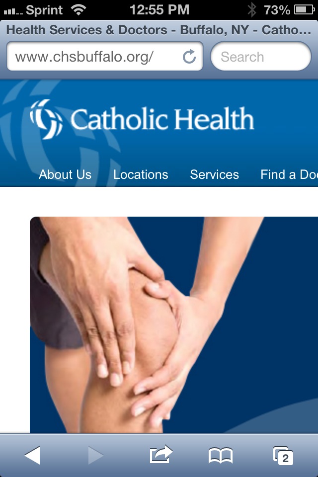
You can play around with what we implemented for our client at CHSBuffalo.org. View the source to see the styles and script. There is obviously logic on the server side, but you can make up your own for your own server platform.


These screen shots should give you an idea of what to expect when you visit the site:


The CHSBuffalo.org site as seen on an iPhone and on a Nexus 7, all styling determined by media queries.


The CHSBuffalo.org site as seen on an iPhone and on a Nexus 7 after clicking "View desktop layout" (with the zoom as the user would initially see it). The link to return to the mobile layout is at the top, though not as obvious as it could be.


This is what the user on an iPhone sees as soon as the desktop view loads—note the link to return to the mobile view is nowhere to be found. We did a poor job there and will have to fix it. Don't make the same mistake if you try this.


Related


  • Turning off responsive web design, January 12, 2013 from Bruce Lawson.

  • Opt-Out Responsive Design? September 12, 2012 at CSS-Tricks.com.

  • Creating a faux ‘View full site’ button for responsive sites, May 26th, 2012 at NeilCarpenter.com.

  • View Full Site Link for Responsive Web Design, April 12, 2012 at CreativeAndCode.com.


Update: March 25, 2013


In this post, Roger Johansson shows code the code behind making his similar technique work: Letting users disable responsive layout.


Update: March 29, 2013


Two more posts popped up this week around the idea of disabling responsive design, both of them looking a bit at the larger issue and then proposing an icon to toggle a design between responsive and non responsive: Thoughts on Toggling a Responsive Design On and Off by Jordan Moore and A suggestion for Responsive Design toggle icons by Andy Clarke.


I'm of the opinion that icons only mean something to a sub-set of users, so relying on them may be inadequate. I still like plain text.


Update: May 3, 2013


An article over at SitePoint asks "Should Users Have the Option to Switch Off Responsive Design?" The author tends to think that such an option is superfluous and many of the commentors agree. Many others point to bad RWD implementations as a reason to offer the option (though the developers of those bad RWD examples probably wouldn't care about letting users disable it). An interesting read if only to see more opinions.

Read More
Posted in browser, css, JavaScript, mobile, standards, touch, usability, UX | No comments

Monday, 7 January 2013

Google Maps: Misbehaving with UA Sniffing

Posted on 14:17 by Unknown


Here's the TL;DR: Google Maps sniffs a browser's user agent string. If it finds Internet Explorer on Windows Phone, then it kicks it over to the m.google.com mobile home page.


So let's be clear. It's 2013 and one of the biggest companies on the internet is using a sniffer to redirect users on a browser and platform that it sees as competition.


Google's general claim is that the mobile version of Google Maps is optimized for WebKit browsers (such as Google Chrome) and therefore Google doesn't support non-WebKit browsers. Even though Google Maps works fine on Firefox mobile (which supports panning, but not pinch-to-zoom) and Opera Mobile (which sometimes supports panning, but not pinch-to-zoom), neither of which uses the Webkit engine. It even renders using Opera Mini, although I can't get it do anything. I can't test Internet Explorer on Windows Phone because I don't have it.


I can, however, test Google's browser sniffer by changing the user agent string in my browser to report itself as Windows Phone and watch my request for maps.google.com get redirected to m.google.com, the Google mobile home page. This tells me that Google isn't performing feature detection (such as touch events or multi-touch support), but is instead damning the browser by name alone.


This is the lesson Google is teaching young web developers who don't understand how flawed this approach is (contrary to its own instructions on best practices from less than a month ago). Google Maps happily lets me have a sub-par experience in Opera Mobile or Firefox mobile. It even lets me have a broken experience in Opera Mini. But Internet Explorer on Windows Phone? Google Maps just boots those users.


Reports I have read (and watched) on assorted articles online suggest that Google Maps works reasonably well on IE on Windows Phone (supporting panning and pinch-to-zoom). As such, I don't buy Google's argument that it wants to prevent users from having a poor experience—there is already evidence that a large number of users (more than use Windows Phone) are having a poor experience.


From Google:


The mobile web version of Google Maps is optimized for WebKit browsers such as Chrome and Safari. However, since Internet Explorer is not a WebKit browser, Windows Phone devices are not able to access Google Maps for the mobile web.


…Because we actively block them, should be how that quote ended.


So why is Google really doing this? Is it because it's fun to pick on Microsoft? Is it because Google thought it could get away with it? Is it to make the Windows Phone experience less appealing than Android's? Is it because Google doesn't like Microsoft's touch events specification (and how well it's been received) at the W3C? Is it because of recent court cases between Google and Microsoft?


In this case I don't much care. I care instead about the terrible example Google is setting for web developers.


Background


  • Google Maps Has Never Been Accessible On Internet Explorer Mobile Now Blocked on Windows Phone (Updated), January 4, 2013.

  • Now Google is blocking Windows Phones from accessing maps.google.com, January 4, 2013.

  • Many Windows Phone users report being cut off from Google Maps (update), January 4, 2013.


  • Google Maps never supported Internet Explorer on Windows Phone 8, and it likely never will, January 5, 2013.

  • Shenanigans: Google Maps redirect issue on Windows Phones is a matter of competition, not compatibility, January 5, 2013.

  • This is Why You Can't Access Google Maps on Windows Phone, January 5, 2013.


  • Google Admits It Was Deliberately Blocking Windows Phone Users From Google Maps, January 6, 2013.

  • Google says Maps redirect on Windows Phone was a product decision, and will be removed, January 6, 2013.

  • Windows Phone Doesn't Support Google Maps Because Google Doesn't Want It To, January 6, 2013.


  • Google Maps, Windows Phone, and an avoidable mess, January 7, 2013.


My Related Posts


  • Let's Treat Old Browser Users Better, July 5, 2012.

  • Another Anti-IE Gimmick, June 14, 2012.

  • Exclusion Is a Feature Now, May 10, 2012.

  • The Return of “Best Viewed in…”, March 4, 2012.

  • Detecting Mobile Devices — Don't Bother, October 11, 2011.

Read More
Posted in browser, geolocation, Google, internet, Microsoft, mobile, rant, standards, usability, UX | No comments
Older Posts Home
Subscribe to: Posts (Atom)

Popular Posts

  • New Google Analytics Features
    In the article " Google Analytics Now More Powerful, Flexible and Intelligent " from last Tuesday (yes, I know I'm behind on t...
  • Speaking: Accessible Web Apps & Standards
    I will be speaking twice in September, both of them sponsored by Infotech Niagara. If you're in the Buffalo area, these are great opport...
  • HTML5 Finally Gets... a Logo?
    Start Rant With all the debate about elements , attributes , semantic meaning and who really owns HTML5 , it's thrilling to see that t...
  • Speaking at WordCamp Buffalo 2013
    This Saturday I will be speaking at Buffalo's second WordCamp . Last year was a great day-long event filled with many good speakers (not...
  • Current CSS3, HTML5 Support
    The Tool Last week saw the launch of FindMeByIp.com , a very handy web site that displays a user's current IP address (along with a geog...
  • Copying Content Styled with Text-Transform
    Using the CSS property text-transform to automatically shift copy to uppercase has been popular for a while now, but a combination of a rec...
  • Come See Me: October 6
    I will be one of the panelists at the Business First Power Breakfast: Online Networks , this coming Tuesday, October 6, 2009 at 7:30am at S...
  • Accessibility Bookmarklets and Tools
    Testing accessibility on your web projects can be a tricky task if you have no firsthand experience with visual, audible, physical or even c...
  • Brightkite Yields to Foursquare, Gowalla, Etc.
    Brighkite has made an announcement today that affects me and a handful of other people (not counting all the people on Facebook whose timel...
  • Social Media Day 2011 in Buffalo #smdayBUF
    Last night marked the second Mashable-sponsored Social Media Day here in Buffalo. With 154 RSVPs for the event, the venue, The Eights Bist...

Categories

  • accessibility
  • Adobe
  • analytics
  • Apple
  • apps
  • ARIA
  • Bing
  • Blink
  • Brightkite
  • browser
  • Buzz
  • Chrome
  • clients
  • css
  • design
  • Facebook
  • Firefox
  • Flash
  • fonts
  • food
  • Foursquare
  • g11n
  • geolocation
  • globalization
  • Google
  • Gowalla
  • html
  • i18n
  • ICANN
  • infographic
  • Instagram
  • internationalization
  • internet
  • Internet Explorer
  • JavaScript
  • JAWS
  • Klout
  • L10n
  • law
  • localization
  • Lynx
  • Mapquest
  • Microsoft
  • mobile
  • Netscape
  • ning
  • Opera
  • patents
  • picplz
  • Plus
  • print
  • privacy
  • project management
  • QR
  • rant
  • RSS
  • Safari
  • SCVNGR
  • search
  • SEM
  • SEO
  • social media
  • Sony
  • speaking
  • standards
  • SVG
  • touch
  • translation
  • Twitter
  • typefaces
  • usability
  • UX
  • Verizon
  • video
  • W3C
  • WAI
  • WCAG
  • WebKit
  • whatwg
  • Wired
  • WOFF
  • xhtml
  • Yahoo
  • YouTube

Blog Archive

  • ▼  2013 (39)
    • ▼  December (1)
      • Web Development Advent Calendars for 2013
    • ►  November (7)
    • ►  September (4)
    • ►  July (3)
    • ►  June (2)
    • ►  May (5)
    • ►  April (3)
    • ►  March (6)
    • ►  February (2)
    • ►  January (6)
  • ►  2012 (63)
    • ►  December (2)
    • ►  November (4)
    • ►  October (5)
    • ►  September (5)
    • ►  August (4)
    • ►  July (6)
    • ►  June (7)
    • ►  May (7)
    • ►  April (8)
    • ►  March (5)
    • ►  February (3)
    • ►  January (7)
  • ►  2011 (67)
    • ►  December (5)
    • ►  November (7)
    • ►  October (5)
    • ►  September (4)
    • ►  August (8)
    • ►  July (3)
    • ►  June (8)
    • ►  May (3)
    • ►  April (1)
    • ►  March (6)
    • ►  February (6)
    • ►  January (11)
  • ►  2010 (100)
    • ►  December (8)
    • ►  November (7)
    • ►  October (5)
    • ►  September (10)
    • ►  August (7)
    • ►  July (11)
    • ►  June (12)
    • ►  May (6)
    • ►  April (8)
    • ►  March (10)
    • ►  February (5)
    • ►  January (11)
  • ►  2009 (51)
    • ►  December (9)
    • ►  November (6)
    • ►  October (21)
    • ►  September (13)
    • ►  August (2)
  • ►  2003 (3)
    • ►  October (1)
    • ►  January (2)
  • ►  2002 (9)
    • ►  December (1)
    • ►  June (3)
    • ►  April (1)
    • ►  March (3)
    • ►  January (1)
  • ►  2001 (1)
    • ►  February (1)
  • ►  2000 (4)
    • ►  October (1)
    • ►  July (1)
    • ►  June (1)
    • ►  January (1)
  • ►  1999 (7)
    • ►  November (1)
    • ►  September (2)
    • ►  August (2)
    • ►  July (1)
    • ►  June (1)
Powered by Blogger.

About Me

Unknown
View my complete profile