tech support 8

  • Subscribe to our RSS feed.
  • Twitter
  • StumbleUpon
  • Reddit
  • Facebook
  • Digg
Showing posts with label touch. Show all posts

Friday, 27 September 2013

Slides: Responsive Web Design Primer

Posted on 10:47 by Unknown


Yesterday I had the pleasure of visiting the University at Buffalo (my alma mater) to give a presentation for its CIT professional development series. I got to talk about responsive design.


Knowing in advance that the room would have technical and non-technical users I went for a code-free presentation. One thing I learned is that code would have been useful, so if you're looking for any in here you won't find it.


I understand there is video from the event, and as soon as I have it I'll share it here as well. In the meantime, enjoy the slides without any context. Which may be more entertaining than my typically awful attempts at humor.


Responsive Design Overview for UB CIT from Adrian

Read More
Posted in accessibility, css, design, html, mobile, print, project management, speaking, standards, touch, usability, UX | No comments

Tuesday, 10 September 2013

New iPad Browser: Coast by Opera

Posted on 07:07 by Unknown


Yesterday Opera announced the release of its newest browser, Coast, built specifically for iOS tablets (I would say just iPads, but if my fridge gets an iOS tablet UI then I'd be wrong and will have paid too much for a fridge).


Background


Recently Opera moved away from Presto as its rendering engine and hitched its future to Blink, the rendering engine born from WebKit that powers Chrome. Now instead of Opera worrying about the rendering engine, it is focusing on the user interface, the place where it can set itself apart from the other browsers.


Essentially Opera is removing the browser chrome (implying to the user that a web page is just an app) and adding gesture support. Given that Opera was the browser that introduced us to mouse gestures well over a decade ago, and given that a touch screen is an inherently gesture-based UI, this seems like a natural fit.


Bits for Developers


Sadly, my office wifi was down and I couldn't play with the browser immediately (my crusty iPad 2 is wifi only). So instead I took some time to read through the developer notes.


Tablet First


Overall Opera recommends general responsive design current best practices, though it promotes a tablet-first approach. Opera offers some CSS you can use to specifically target iPads Mini, 2, 3 and 4 (Retina and non-Retina), though it leans on vendor prefixes with only a brief note to also use other prefixes and unprefixed rules.


Responsive Images


It's also clear that Coast supports the new srcset option for responsive images. It even offers a code example: <img src="image.jpg" srcset="retina.jpg 2x">


Note: As Bruce was kind enough to inform me (because I missed it in the dev notes), responsive images will be supported only in iOS7 and up.


Update as of September 20, 2013


According to Opera, iOS7 did not come with a WebKit update. That means Coast cannot support responsive images via the srcset attribute without a polyfill. Nor can Safari, of course.


Tile Speed Dial Web App Image


Instead of "Speed Dial" icons/images, Coast now looks for a "web app image." If you don't have one, Coast will first look for a Windows 8 tile image, then an Apple touch icon, then a shortcut image, then just a favicon. You can, however, create your own 228 × 288 pixel image and stuff it into your site with the following HTML:


<link rel="icon" href="$URL" sizes="228x228">


User Agent String


Don't use this to do any browser sniffing. Browser sniffing bad. This is instead handy for recognizing it in your logs:


Mozilla/5.0 (iPad; CPU OS 6_1_3 like Mac OS X) AppleWebKit/536.26 (KHTML, like Gecko) Coast/1.0.2.62956 Mobile/10B329 Safari/7534.48.3.


General Review


Getting going is pretty easy, just start typing into the only field on the screen. As you type you can see a Google preview on the left, which you can tap at any time to go to Google, or a list of icons on the right which correspond to sites you might mean. The icons start out just displaying the first letter of the site, and then identify the site's tile or shortcut image.


Screen shot of Opera Coast navigate screen.
Note the handy ".com" and ".net" options that appear above the right end of the text box.


Once you are on a page, you can go back by swiping from the left, forward by swiping from the right, or reload the page by pulling down from the top — but not too far or you get the iOS menu instead.


Vine of me playing with back, forward and reload in Opera Coast.


Opera Coast skips tabs and windows altogether and, frankly, feels a lot more like Internet Explorer for Metro than other current tablet browsers. It's pretty easy to see the open "tabs," flip through them, get more details, and discard them. It's also incredibly easy to forget you have so many tabs open. I regularly found myself littered with tabs because of all the links opening new windows.


Testing Opera Coast window/tab management.


While in that tab view, you can also see how "safe" the page is and can get to options to share it, email it, print it, and so on.


Screen shot of Opera Coast safety and share information.
The arrow on the right gives you all the share options.


Opera Coast print dialog.
I don't have a printer installed, so I'd love to hear feedback on how Coast honors print styles.


Adding and removing a bookmark, tile, whatever, is pretty easy. It took a few swipe-fails, but I got the hang of it well enough to show the whole process in one uninterrupted Vine:


It takes a little getting used to, but it's not too hard


Gotchas


There were a few things that threw me off. Perhaps because I am a power user, perhaps because I only played with it for one evening.


Swipe History


The swipe for back/forth is handy, but conflicts with behavior I have already learned. In Chrome for Android, swiping left or right has the infuriating feature of bringing me to the next or previous tab in the stack order. For those rare sites that implement a slide that is swipe-friendly, imprecise swipes will move me back and forth in the history instead.


Web App Images


Using the browser in portrait view, the additional screens of tiles (speed dial icons if you are already familiar with Opera) aren't immediately apparent. It wasn't until I turned to landscape that I saw them. The tiny dots under the Coast icon weren't enough for me to intuit that. They also aren't nearly large enough to tap to jump to a specific screenful of tiles.


Hit Sizes


The 9-box grid at the center bottom as well as the three rectangles at the bottom right are the only real browser chrome in play as you surf. They are also maddeningly small to tap. And I have dainty, lady-like fingers, so I suspect it may cause consternation for others.


Address Bar


If I am on a site and I want to change the address of the current page (maybe I fat-fingered and got to a 404, or I know a super-secret URL), I could not find a way to bring up the address bar and change it. It also made it impossible to know the current page address at any time. As someone who regularly looks at the URL for familiar addresses, indications of scam sites, quick commitment to memory, and so on, this alone takes it out of the running as an everyday browser for me.


Email a Page


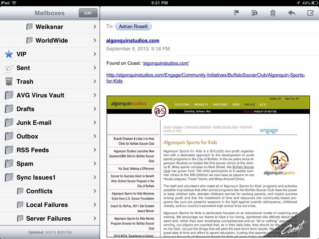
I did not care for the email feature one bit. Not only does it embed a screen shot of the page (with a Coast watermark), the screen shot won't display on other devices. Outlook blocked the image because the attachment ended in .com (not .png or .jpg). Had it not come from me, I wonder if Outlook would have blocked it as spam. My Android email client couldn't display it because there was no file extension to give it a clue.


Screen shot of emailing a web page from Opera Coast.
What you see when you choose to email a web page from Opera Coast.


Screen shot of received email from Opera Coast.
Best case scenario of what the email recipient sees, though the attachment was blocked in Outlook and unusable in my Android email client.


Tweet a Page


Tweeting a page left me similarly dissatisfied. By default it includes a Twitpic screen shot of the current page with an Opera Coast watermark. When composing the tweet, I tapped the paperclip icon to see if it would do anything, but nothing happened. I opted not to tweet again.


Screen shot of tweeting a page from Opera Coast.
Tweeting a page from Opera Coast.


The resultant tweet:


Tweeting a web page from Opera Coast. Curious how it will come across. http://t.co/bdx3mcQxiO pic.twitter.com/eq3vRhFX5N

— Adrian Roselli (@aardrian) September 10, 2013


Wrap-up


Overall, I like the browser. I like what it's trying to do for consumers. As a power user, however, It's not a fit for me though I'd be interested in bringing it in front of some other members of my family.


I also didn't get to try out unsafe sites, printing pages, responsive images (need iOS7), or poorly-built sites. My opinion might change as I continue to play with the browser.


Open Question


There are a lot of Android tablets out there, not just the four screen size offerings from Apple. So how long before we can see Coast on my Nexus 7, if ever?


Updates


I'm adding notes throughout the day as they come up.


  • Feedback from users over at MacRumors.

  • Norwegians just launched the iPad browser Apple couldn’t build at BGR.

  • A Vine from Opera Coast showing how to move/rearrange groups of tiles/bookmarks at once.


Surprising no one, the following reviews from more mainstream sources completely fail to include any screen shots or videos that weren't pilfered from Opera. I only say that to remind you that by reading this post you have gotten the most in-depth review currently on the web and you should be excited and send me a thank you note and maybe read all my other posts and high-five me on the street.


These articles are, however, worth visiting just to see the comments and how others are reacting to it.


  • Opera Coast iPad Web Browser Treats Websites like Apps at Time.

  • Opera's iPad Coast browser debuts, packaging websites as apps at ZDNet.

  • With Coast, Opera reboots its browser for mobile future at Cnet.

  • Opera Coast: a Stripped-Down Browser Built Just for iPad at Gizmodo.

  • Opera Launches Coast, A Slick New WebKit-Based iPad Browser at TechCrunch.

  • Opera releases Coast, an iPad browser that turns the web into a home screen at The Verge.


Tips from Bruce:


Want to add a background image to your Coast home screen? Long press an image, set as background. Pull curled corner to remove it.

— bruce lawson (@brucel) September 9, 2013


If you don't see your new 228px site icon in Coast, empty cache by deleting yr old speeddial entry (drag to top of screen) & revisit yr site

— bruce lawson (@brucel) September 10, 2013


To clear history in Coast by Opera or change size of Speed Dial grid from 3x3 to 3x4, go to iPad settings > Coast

— bruce lawson (@brucel) September 12, 2013


Update: September 18, 2013


Opera has fielded some questions about Coast and collected them into two posts (so far):


  • Coast by Opera is only a few days old, but we’ve already gotten a lot of questions about how things work. Here’s some answers.

  • Nope, there are no tabs in Coast. That and a few more answers for this second set of FAQ.


Update: September 25, 2013


Another FAQ post from Coast:


  • Yes, you can see the URL and you can copy links in Coast. Our third set of FAQ


Read More
Posted in Apple, Blink, browser, mobile, Opera, standards, touch, UX | No comments

Friday, 12 July 2013

My Carousel Use Stats

Posted on 09:14 by Unknown


Screen shot of the carousel on the Algonquin Studios home page.


I started this post way back in March after reading Brad Frosts' bit on carousels. Then I let it sit unfinished. With the buzz around ShouldIUseACarousel.com this week, I figured I'd finish it up. The data is old, although I offer updated numbers at the bottom.


The Process


I looked at all the visits to my home page between February 1 and March 3 to get 30 days of data. Of those visits to the home page, 83% of the time the home page was the landing page. I figured if a smaller percentage of initial visits to our site came via the home page then I would not read too much into the value of these numbers as the user might have already been through enough of the site to get what he or she wanted, but 83% is a pretty big number.


The home page has many content areas, but by far the most prominent is our carousel. During the time frame tested, there were 5 different carousel images with accompanying text. Each one has its own Google Analytics event tracker so I can tell which carousel item has been clicked.


For those playing at home, and using Google Analytics, it's as simple as adding an onclick to your anchor: a href="/Products" onclick="_gaq.push(['_trackEvent', 'Slider', 'Columns']);". In this case I am tracking a custom event named "Slider" with the value of "Columns" (so I know which specific image/slide was chosen).


The Results


In the 30 days I tested, the carousel links were clicked less than 1% of the time the home page was visited — 0.8% to be slightly more precise.


Every other element on the home page received at least twice as much activity, with the tabs getting used nearly 10% of the time. Site-wide, the skip navigation link got clicked (tapped, followed) half again as much as the carousel at 1.2%.


To qualify this a bit, the carousel wasn't intended to serve as our only call to action on the home page. It's more about presenting a message to help brand the company as part of our new marketing push. Adding this tracking feature has allowed us to track how the carousel gets used, if at all, and which images/messages are more compelling.


The Latest Results


For this updated version of my draft post I looked at the last 30 days again (June 11 to July 11, 2013) to see what activity we've had on the carousel. The last 30 days are a good fit since we haven't been showing off the features of the slider to clients (which results in activity that is a function of people playing, not truly discovering and naturally using).


For the last 30 days, the number of clicks on the carousel is much lower. 0.2% of unique visitors clicked a carousel slide. For every 500 unique visits to the site, someone clicks on the carousel. Interestingly, this is the same number of people who print pages from our site and lower than the "skip navigation" activity in the same time period.


About the Carousel


Our site is a great place for us to experiment with the carousel since we can quickly refactor it, tweak it, replace it, and so on. Since its launch 7 months ago I have made a number of tweaks to the technology and we have played around with the messages to see what sticks.


We're revisiting the design of the carousel now to see how its relative size and different images and messages can affect its use. At some point it may go away, but not until I've had a chance to gather lots of data.


The carousel itself is both swipe-friendly and keyboard-friendly, uses a linear flow with a clear start and end, has indicators to show where a user is in the overall collection (also allowing a user to jump to a specific slide), and pauses when there is any action taken on the carousel (hover, click, tap, etc.). I built it to also serve images at appropriate sizes for appropriate devices, something which I am regularly tweaking. The base for this is the Royal Slider.


Related


  • ShouldIUseACarousel.com

  • Accessibility expert warns: stop using carousels, July 11, 2013.

  • Carousels, January 23, 2013.

  • Carousel Interaction Stats, January 22, 2013.

  • Auto-Forwarding Carousels and Accordions Annoy Users and Reduce Visibility, January 19, 2013.

  • Don’t Use Automatic Image Sliders or Carousels, Ignore the Fad, September 27, 2012.

  • That big sliding banner? Yeah, it’s rubbish, September 6, 2012.

  • 5 Big Usability Mistakes Designers Make on Carousels, August 2, 2011.


Read More
Posted in accessibility, analytics, design, mobile, rant, touch, usability, UX | No comments

Wednesday, 22 May 2013

IE10, Metro, and Media Queries

Posted on 13:42 by Unknown

IE10 in desktop view.
IE10 in Metro view.
The image on the left is IE10 in desktop view, on the right is IE10 in Metro view, both on the same device and at the same dimensions and screen resolution.


I worked pretty hard on our corporate site to test on as many devices and browsers as possible, trying to ensure that my media queries were solid and I was staying cutting edge without being bleeding edge. You might recall that I am already not a fan of testing in Internet Explorer emulation modes, but now I think I need to get the hardware to go along with my IE testing.


I recently picked up a Windows 8 tablet, making sure it had both the desktop and the (formerly-named) Metro interface. I set about testing the Algonquin Studios site in Internet Explorer 10 in both modes and was surprised to see that in the tablet / Metro mode my media queries were being mostly ignored (the site is built mobile first, so it honored the desktop queries). I took some screen captures and reached out to the Twitters for help.


Roger Johansson was kind enough to help:


@aardrian You may need @-ms-viewport {width:device-width;zoom:1.0; }

— Roger Johansson (@rogerjohansson) May 22, 2013


This sounded familiar but I did some digging (now that I had some direction) and came across this note in a six-month-old MSDN article:


By default, Internet Explorer automatically scales content when the window is narrower than 1024px. This primarily includes the snapped state and portrait mode. If the @-ms-viewport rule is specified, it overrides default scaling.


In cases where scaling is not needed or desired, the device-width keyword can be used. This keyword signifies that the page is optimized to work well regardless of the dimensions of the window.


When using this keyword, make sure that the page continues to work well in a variety of window sizes, including the narrow snapped state and portrait modes.


My tablet's width is 768 pixels, so it definitely fell under the 1,024 pixels that trigger scaling. This note, however, doesn't provide any context for how this only affects IE10 in Metro mode, because the media queries clearly work fine when using IE10 in the desktop mode.


I excluded the zoom:1.0; from Roger's tweet, popped open my CSS file, and added @-ms-viewport { width: device-width; } right to the top of the file, outside of any media queries. I deployed it and all was well (I actually went through a full testing pass, test deploy, and the likes, but that part of the story isn't very interesting).


Perhaps everyone else already knows this and I am incredibly late to the game, but just in case there's someone who is stuck or doesn't have access to the right IE10 configuration, I hope this helps.


The lesson I learned here is that if I want to properly test Internet Explorer 10, I can't rely on a desktop installation on Windows 7 or Windows 8, I need to also test in the Metro interface and, ideally, on the appropriate hardware as well. Looking at my logs, I see more than a few users who have come to the site with an IE10/Win8 configuration who may very well have thought the site was not responsive.


For those interested, this screen capture shows my home page after deploying the CSS update:


IE10 in Metro view, after the CSS update
IE10 in Metro view, after the CSS update. You can see that my media queries have fired.


Update: May 24, 2013


Thanks to Matt Stow's comment below (which demonstrated my clear lack of Google-fu), I now know of some resources online that have been down this path and also addressed the best approach to supporting Windows 8 Snap Mode (example of Snap Mode below if you are unfamiliar with this). It turns out that Windows Phone 8 has a bug which makes my solution inadequate, although there is a scripting fix in Matt Stow's article which you can layer on top of this. On to the links:


  • IE10 Snap Mode and Responsive Design, OCtober 17, 2012 by Tim Kadlec.

  • Windows Phone 8 and Device-Width, January 14, 2013 by Tim Kadlec.

  • Responsive Design in IE10 on Windows Phone 8, January 6 2013 by Matt Stow.


Screen shot of Windows 8 Snap Mode in use.

This screen shot shows the Snap Mode of Windows 8. As you can see, while playing my virtual accordion I decided that I absolutely had to also surf my company web site, which renders quite nicely thanks to the fix I implemented at the start of this article.


Update: October 15, 2013


Matt Stow reports that Microsoft has fixed the Windows Phone 8 viewport issue.

Read More
Posted in css, Internet Explorer, mobile, standards, touch | No comments

Thursday, 7 March 2013

Observing Users with Mobile Devices

Posted on 10:21 by Unknown


Nuns taking photos of each other at the Peak on Hong Kong island with their Hello Kitty iPad (which could result in a niche Tumblr).


I had the pleasure of traveling to Hong Kong for the UXHK conference just last week (the conference was the week prior, but I stayed around to be a tourist). While there I decided to spend some time observing how people used their mobile devices and what devices they used. Far from scientific and probably highly tainted by my own assumptions, it was still an interesting experiment.


When I got back I stumbled across some articles discussing how people use their mobile devices and was pleased to find a lot of commonality.


My Own Observations


It seemed like everyone in Hong Kong was using a smartphone. Not everyone was, but given how often my movement on densely-packed streets was stymied because a texting twenty-something or an elderly Bejeweled player was slowly meandering through the chaos, it certainly felt that way.


What I did track is that once on the MTR (the Hong Kong subway), about 8 out of 10 people pulled out a smartphone and started to do something. Occasionally it was someone using it to talk, but usually it was some awkward one-handed wholly-attention-grabbing activity. For the cases where I could see, a bit more than half the people appeared to be playing games. Age did not seem to be a determining factor for games versus non-games. For the remainder, I saw lots of what may have been texting or tweeting. I am guessing this because I primarily saw people selecting Chinese characters as part of some sort of text-based input for an app.


I was most struck by how few iPhones I saw. It felt that most of the people who I took to be locals were using Android devices. I was also surprised at the number of phablets (large smartphones, but not large enough to be tablets) I saw. In particular, every time I looked I saw at least one Samsung Galaxy Note II.


Among tourists I saw a different breakdown. I am guessing who the tourists were, but camera-toting white people seemed an easy fit, with tourist traps, accents, and personal gear helping to suggest others. I saw many iPhones in their midst, and more than a few tourists taking photos with their iPads, Smart Covers dangling in the breeze.


The Apple store in Hong Kong. 5 people were taking photos as I walked by: 1 was using a digital camera, 1 was using an iPad, the other 3 were using Android phones.


How Do Users Really Hold Mobile Devices?


Over at the UX Matters site, Steven Hoober asked How Do Users Really Hold Mobile Devices? His approach was similar to mine in that he and his team observed users "in the wild," but they actually tracked data points as they went (instead of relying on memory, as I did). They get some interesting results in their observations:


In over 40% of our observations, a user was interacting with a mobile phone without inputting any data via key or screen.


The users who we observed touching their phone’s screens or buttons held their phones in three basic ways:


  • one handed—49%

  • cradled—36%

  • two handed—15%


Pie chart of breakdown of how users hold mobile phones.


While I don't have numbers from my own casual observations to back up my opinions (they are just opinions, after all), I feel like the breakdown for how people held their phones when using touch input was similar to what I saw. However, I saw nowhere near 40% of smartphone users talking/listening to their phones.


One thing this study cannot capture is how people hold their phones for more specific tasks. For example, I saw lots of people taking photos with their phones, phablets, and tablets. Other than awkward arms-length self-portraits (with either the front- or rear-facing camera), I always saw them use both hands. This doesn't surprise me and it's probably not worth measuring, but it would be interesting if it turned out that my assumption was totally wrong.


Observations on use of mobile devices at airports and train stations


Maish Nichani and Bernie Quah at Pebble Road illustrated some casual observations on use of mobile devices at airports and train stations. While this isn't a scientific study, it's interesting to see that the poses seem to be universal.


For my observations, which were primarily on busy sidewalks, at subway stations and on the subway trains themselves, there would be additional sketches. Even the train sketches don't all apply (densely-packed subways are a bit different than trains with enough room you can sit sideways and that have access to power outlets). I spent far less time observing at the Hong Kong airport because I was either arriving and trying to get clear, or departing and trying to find food.


Illustration of mobile user sitting sideways on train seat next to power outlet.


Your Own Observations


These two articles illustrate how easy it can be to see how people interact with their mobile devices. An advantage to this passive approach is that you catch people behaving as they normally do, without subconsciously modifying their behavior because they are being observed. Anybody who has run any kind of user group testing knows that can be a problem.


A disadvantage to this observational approach is that you don't know what people are doing — you have no context. While you might be able to quickly tell when someone is taking a photo, it's harder to tell if someone is checking in on Foursquare, playing Tetris, texting, tweeting, or looking up directions to a restaurant. This lack of context will always make your observations useful in only the most basic way.


Regardless, these observations might be enough for you to devise your own testing methodology as you build apps, make mobile-friendly sites, develop interfaces in general, or even work on hardware.


Tangentially Related


All those nifty touch-screen laptops have their own interesting challenges. Not only are they touch screen, they are mouse- and keyboard-driven at the same time. Boris Smus shows examples of how user expectations may pan out in Interactive Touch Laptop Experiments.

Read More
Posted in mobile, touch, usability, UX | No comments

Friday, 11 January 2013

Letting Mobile Users See Desktop View of RWD Site

Posted on 11:22 by Unknown


Bruce Lawson tweeted out a seemingly random musing today that I have pondered myself — what if, while on a mobile device and surfing a RWD web site, I want the desktop version of a site?


There are many reasons as a user that this might be the case, ranging from poor development practices that hide chunks of content you need to see to just wanting to know what it looks like.


Clearly it's enough of a use case that mobile browsers such as Opera Mobile, Chrome, Firefox, and so on, have a feature to request the "desktop" version of a site from a menu built into the browser.


Except that feature doesn't work with a RWD-powered site because media queries, typically based on viewport width, are used to deliver styles for traditional desktop window sizes. The browser feature only sends a different user agent string (bypassing terrible user agent sniffing) but doesn't do much else. Your 320-pixel-wide device is still 320 pixels wide, and the media queries know it.


Until the mobile browser makers report a false viewport (or, rather, assume one when choosing CSS from a set of media queries), we're kind of stuck. While I have many ideas on how that might work, that won't address the issue today.


While I had bandied about an idea to address this on the redesign of my site a couple years ago, it took a client request last year to get my team the time to finally code a solution.


There are some core steps the hammer out in the logic of any solution:


  1. Put a link on the page to view the desktop layout. I prefer to have it in the raw HTML over writing it in with script.

  2. In the more mobile-friendly CSS files allow this link to display. In the more desktop-friendly CSS files hide the link.

  3. Either using a round-trip to the server or client-side script, remove the media query logic and serve up the "desktop" CSS.

  4. Warning for Europeans: cookies. Set a cookie with that preference for the user. Whether it is for the current session, forever, or somewhere in between is worth an internal discussion.

  5. Now display a link to view the "mobile" version of the site. Again, this can be done with or without script.

  6. If the user clicks the link to see the mobile version, re-instate all your media queries, clear the cookie and pretend nothing happened.


This process is a bit oversimplified, but it covers the broad strokes.


There are some hurdles, of course. Your users might not understand what you mean by "desktop" or even "mobile." You could make the link to get out of one of the views too hard to find. You could bump up against expectations set by the mobile browser feature to request the desktop site. If you serve mobile styles to IE6 users, you could confound them if you don't clear the link from the page for them. And so on.


You can play around with what we implemented for our client at CHSBuffalo.org. View the source to see the styles and script. There is obviously logic on the server side, but you can make up your own for your own server platform.


These screen shots should give you an idea of what to expect when you visit the site:


The CHSBuffalo.org site as seen on an iPhone and on a Nexus 7, all styling determined by media queries.


The CHSBuffalo.org site as seen on an iPhone and on a Nexus 7 after clicking "View desktop layout" (with the zoom as the user would initially see it). The link to return to the mobile layout is at the top, though not as obvious as it could be.


This is what the user on an iPhone sees as soon as the desktop view loads—note the link to return to the mobile view is nowhere to be found. We did a poor job there and will have to fix it. Don't make the same mistake if you try this.


Related


  • Turning off responsive web design, January 12, 2013 from Bruce Lawson.

  • Opt-Out Responsive Design? September 12, 2012 at CSS-Tricks.com.

  • Creating a faux ‘View full site’ button for responsive sites, May 26th, 2012 at NeilCarpenter.com.

  • View Full Site Link for Responsive Web Design, April 12, 2012 at CreativeAndCode.com.


Update: March 25, 2013


In this post, Roger Johansson shows code the code behind making his similar technique work: Letting users disable responsive layout.


Update: March 29, 2013


Two more posts popped up this week around the idea of disabling responsive design, both of them looking a bit at the larger issue and then proposing an icon to toggle a design between responsive and non responsive: Thoughts on Toggling a Responsive Design On and Off by Jordan Moore and A suggestion for Responsive Design toggle icons by Andy Clarke.


I'm of the opinion that icons only mean something to a sub-set of users, so relying on them may be inadequate. I still like plain text.


Update: May 3, 2013


An article over at SitePoint asks "Should Users Have the Option to Switch Off Responsive Design?" The author tends to think that such an option is superfluous and many of the commentors agree. Many others point to bad RWD implementations as a reason to offer the option (though the developers of those bad RWD examples probably wouldn't care about letting users disable it). An interesting read if only to see more opinions.

Read More
Posted in browser, css, JavaScript, mobile, standards, touch, usability, UX | No comments

Friday, 3 August 2012

CSS-only Radial Menu Experiments

Posted on 08:33 by Unknown


I have been working on a slow and plodding redesign of my personal site and am playing around with some navigation ideas.


I wanted to create a JavaScript-free and image-free radial menu, an idea I toyed with a couple years ago and abandoned due to the lack of CSS support to do what I wanted in current browsers at the time. I decided to give it another shot last weekend while recovering from being pleasant for two days.


If you aren't familiar with radial menus or are curious about why they are popping up as a topic lately, check out Josh Clark's Touch Means a Renaissance for Radial Menus. You can expect to see them more as Windows 8 is released in a couple months.


I threw together a simple five item navigation list, attached no classes or IDs, and decided to see how far I could get before it became untenable (or I got bored).


Single Level CSS-only Radial Menu


.html {
background-color: #6D695C;
background-image: url(data:image/png;base64,iVBORw0KGgoAAAANSUhEUgAAABAAAAAQCAMAAAAoLQ9TAAAACVBMVEUAAAAAAAAAAACDY+nAAAAAA3RSTlMmDQBzGIDBAAAAG0lEQVR42uXIIQEAAADCMHj/0NdkQMws0HEeAqvwAUGJthrXAAAAAElFTkSuQmCC); }

body{
margin: 0;
font-family: Arial, Helvetica, sans-serif;
/*font-size: 2.5em;*/ }

nav {
width: 5em;
height: 8em;
float: right;
padding: 0;
overflow: hidden; }

nav:hover {
background-color: rgba(0, 0, 0, 0.4);
width: 16em;
height: 15em;
border-radius: 0 0 0 15em; }

body {
background-color: #eee; }

nav h1 {
position: relative;
top: -.75em;
right: -.5em;
margin: 0;
background-color: #000;
color: #000;
z-index: 1;
font-size: 2em;
line-height: 100%;
width: 1em;
padding: 1em .5em 1.25em 1em;
border-radius: 3.0em 0 0 3.0em;
-webkit-transform: rotate(-45deg);
-moz-transform: rotate(-45deg);
-ms-transform: rotate(-45deg);
-o-transform: rotate(-45deg);
transform: rotate(-45deg);
overflow: hidden; }

nav h1::before {
content: "\AB";/*&#171; «*/
/*content: "\21D0";*//*&#8656; ⇐*/
color: #fff;
-webkit-transform: rotate(-45deg);
transform: rotate(-45deg); }

nav:hover h1 {
display: none; }

nav ol {
margin: 0;
padding: 0;
list-style-type: none; }

a {
display: block;
position: absolute;
top: -10em;
right: 0em;
border-radius: 4em;
border: .15em solid #fff;
padding: 1.5em 0;
width: 4.5em;
text-align: center;
box-shadow: .45em 0 1.5em rgba(50, 50, 50, 0.75);
-webkit-transition: all 0.2s ease-in;
-moz-transition: all 0.2s ease-in;
-ms-transition: all 0.2s ease-in;
-o-transition: all 0.2s ease-in;
transition: all 0.2s ease-in; }

nav:hover a {
/*display: block;*/ }

a:link, a:hover, a:focus, a:active, a:visited {
text-decoration: none;
color: #ddd;
background-color: #000; }

a:hover, a:focus, a:active {
background-color: #222;
color: #fff;
text-shadow: 0em 0em 0.2em rgba(255, 255, 255, 0.8);}

nav:hover li:nth-child(1) a {
right: 13.5em;
top: .2em; }

nav:hover li:nth-child(2) a {
right: 12em;
top: 4.75em; }

nav:hover li:nth-child(3) a {
right: 9.0em;
top: 8.5em; }

nav:hover li:nth-child(4) a {
right: 4.75em;
top: 11em; }

nav:hover li:nth-child(5) a {
right: 0;
top: 12em; }
Check out this Pen!


View this directly on the Codepen site.


Note the style for the body. If you uncomment the style /*font-size: 2.5em;*/, you will see that entire menu scales up. You can put any text size in there you want and the menu will scale up and down. All the sizing (text, borders, positioning, padding, etc.) is based off ems, which makes it easier to scale each part of the menu proportionally.


You may note that I put an onclick = "void(0);" on the h1. Without this, the menu just wouldn't work on iOS. Otherwise I am relying on my Android devices to read a touch as a hover.


You may also see that there is an image on the page. This is a striped background that made it easier for me to see where elements aligned. It is not used in the menu itself, but I do like how it looks so I kept it.


I opted for CSS positioning changes instead of CSS animations since the support is consistent. The menu works in IE9, though without animations. Since the menu uses HTML5 elements, and since it is an experiment, I am not testing older than IE9 (yet).


Then I was curious how hard it would be to add another level into the menu and how it would feel as a user…


Two Level CSS-only Radial Menu


<!-- Original pen (~July 2012) lost by CodePen, this is a recreation with their assistance to get the old code. -->
<nav role="navigation">
<h1 onclick = "void(0);">Menu</h1>
<ol>
<li><a href="#">Bio</a>
<ol onclick = "void(0);">
<li><a href="#">Bio One</a></li>
<li><a href="#">Bio Two</a></li>
<li><a href="#">Bio 3</a></li>
</ol>
</li>
<li><a href="#">Blog</a></li>
<li><a href="#">Books</a></li>
<li><a href="#">Articles</a></li>
<li><a href="#">Contact</a></li>
</ol>
</nav>

<!--
The onclick attributes are to allow Safari on iOS to see these otherwise non-clickable elements as clickable so it can then apply the hover styles as if they were clicks.
-->
Check out this Pen!


View this directly on the Codepen site.


I forked the single-level menu and put another level under the first item ("Bio"). With only three items it was still time consuming to style the positioning of elements and get the animation look that I wanted.


I also had to put an onclick = "void(0);" into the nested ol in order for iOS to recognize it as a clickable element. Sadly, that means that "Bio 3" always gets the focus on touch devices because it's at the top of the stack when the focus is applied through a tap.


On desktop browsers however, it works well.


Wrap-up


Drawbacks for both of these menus are many. For example, using my positioning method it can be very hard to calculate where additional menus should appear, making this tedious to code into a CMS. The menu items also all rely on very short navigation text in order to fit into the almost-circular navigation items. The collective shadows from nested items make for an interesting shadow stack obscuring subsequent menu items.


However, given the real-life feedback I've gotten I figured there might be some ideas or code chunks others might find useful. Even better would be if someone gets inspired to take this to the next level and clean it up, fixing my own shorthand tricks and making it more robust.


Corrections, suggestions, feedback, and forking are all welcome.

Read More
Posted in css, design, html, mobile, standards, touch, usability, UX | No comments

Saturday, 3 March 2012

Ongoing Misunderstanding of Flash and HTML5

Posted on 11:05 by Unknown


The latest article that uses absolutes and broad generalizations to imply an otherwise non-existent struggle between Flash and HTML5 is from UX Booth, "What the Demise of Flash Means for the User Experience." To be fair to this article, I see regular missives on Flash vs. HTML5 and this particular UX Booth article is just an example of many of them in one easy to cite place.


The opening gives away the false premises for the rest of the piece:


Adobe's decision to cease development of the mobile Flash platform and increase their investment in HTML5-related efforts created perhaps the final piece of conclusive evidence that HTML5 is the current go-to technology for creating ubiquitous user experiences regardless of device.


First I have to accept that the author is talking about more than the HTML5 specification and is also referring to CSS3, JavaScript, and the W3C specifications that are related to HTML5. This lack of clear delineation chips away at the argument.


Adobe has held that the fragmentation of mobile devices is too hard to keep up with on its own. Flash will still exist for mobile wrapped in AIR applications instead, and Flash is not going away from the desktop. Adobe's decision to increase investment in HTML5 (via Edge and to a lesser extent Muse) is mostly unrelated since there is a market for an HTML5 authoring tool independent of Flash.


Not only is this neither conclusive nor the final piece of evidence that HTML5 is the current go-to technology, this is anecdotal evidence at best. In addition, HTML5 itself is nowhere near complete and the element often regarded as the Flash-killer, canvas, isn't anywhere near as robust as Flash and still lacks strong scripting or styling support in the specs.


I think it's fair to challenge the claim that HTML5 creates "ubiquitous user experiences regardless of device" when you consider all the polyfills and shims that need to be implemented to create similar experiences on a few devices. It's also fair to say that my netbook does not handle some of the related HTML5 specifications the same as my tablet or mobile phone, partly due to various levels of hardware and browser support. Let's not even get into video and audio codecs or the touch events specification (neither of which are part of the core HTML5 specification).


HTML5 excels at giving users a delightfully inconsistent experience on any device through the concepts of "graceful degradation" and "progressive enhancement."


Those terms pre-date HTML5 and I can do both with HTML4 and CSS2. The author continues on and cites responsive design as a feature of HTML5, even though my own site is an example of an HTML4 site using responsive design to adapt to assorted displays.


Additionally, more than 90 percent of all smartphones and tablets are HTML5-enabled, which means that all the benefits of HTML5 can be utilized today to provide impressive mobile websites.


The author's math doesn't bear out the assertion — by the author's numbers, 10% are not HTML5-enabled and so cannot benefit from HTML5. For the other 90% that are, even they cannot enjoy all (author's word) the benefits of HTML5 today.


Making or upgrading to an HTML5 site can be as minimal as simply using HTML5's doctype [...]


The implication here is that simply changing a doctype gets you all the benefits of HTML5, when in reality you still have the same HTML, CSS and script.


The post never does answer its own question — what does the demise of Flash mean for the user experience? From the article, more HTML5 use. In itself that doesn't tell me how the user experience is affected, just how developers are affected. If the developer does a good job, the user experience doesn't need to change. The user shouldn't need to worry about the underlying technology.


Too many HTML5 articles and posts today, like this one, work to promote the markup language (and usually CSS3 and JavaScript, even if they don't know it) by contrasting it against another technology that is falling away or is just a popular target of derision. The pro-HTML5 cheering is easy when another technology has already been recognized as out-of-date, but this doesn't do anything to advance HTML5 and its related specifications.


I'd love to see more practical discussions of what HTML5 (and related specs) can do today along with all the nifty experiments that are moving the collection of specifications along.


Update: May 8, 2012


The BBC makes this same set of mistakes in its piece Coding the future: HTML5 takes the internet by storm.

Read More
Posted in Adobe, browser, css, Flash, html, JavaScript, mobile, rant, standards, touch, usability, UX, W3C | No comments

Wednesday, 28 September 2011

Amazon Silk, Yet Another Web Browser

Posted on 20:05 by Unknown


Amazon Silk logo.


Amazon's long-awaited tablet/e-reader was formally announced today, and the conversations about whether or not it will compete the iPad are underway. I don't much care about that. I am far more interested in the web browser that it includes.


Amazon Silk is a new web browser, built on Webkit, and that is really the news of interest here. Add to that Amazon's super-proxy approach to help users get content more quickly and efficiently and you've now got a new pile of potential chaos as a web developer. It's far too early to tell how this will shake out, but in a client meeting today I already had to address it, so I think it warrants a little context for the current state of browsers so we can consider potential developer impact.


Amazon posted a video on its brand new blog to provide an overview of Silk (with an obligatory Geocities reference):


The 400+ comments raise some questions that tend toward a common theme — in the absence of a technical explanation, when can we get our hands on an emulator? Granted, there are plenty of comments about privacy, security, and some wild speculation, but the theme is clear.


As a web developer, I can tell you that we all feel overburdened with the assault of browsers we have out there already. We can champion the ideal of targeting the specs, not the browser, but when the clients call to complain about a rendering difference, not even a problem, on another browser it can get pretty draining. As Silk comes to market we'll need to account for it, its hardware configurations, and its coming release versions (within reason, of course).


For some context about the burden we already have, yesterday Google Chrome developer Paul Irish wrote that, only taking into consideration Internet Explorer for desktop, we're already on track to need to support 76 versions of just Internet Explorer (including version 8) through 2020. There are some broad assumptions in his article regarding how people will use the IE document modes, but the potential is still there. Add to that the new release schedule of many browsers (Firefox has gone from version 5 to 7 in ~90 days), and then pile on the browsers available for mobile devices, and we're already at well beyond the number of variations of browsers that we had to support even in the heyday of the browser wars.


But Silk isn't just a web browser — it's got a super-charged proxy server that will compress images, compile JavaScript into its own machine-readable format, and batch files into a singular, smaller download. While this is nothing new (Opera Mini has done this for some time on mobile devices), Amazon's implementation raises the hairs on the back of my neck when I think about all the years I've had to troubleshoot web applications because proxy servers are caching files, munging JavaScript, brutalizing images, and generally gutting the real-time features that the web had been moving toward more and more. I don't know if this will happen with Amazon Silk, but given my experience with Opera, proxy servers, and users in general, I am filled with apprehension.


Related


Opera responded to the Amazon Silk announcement with its own explanation of how its own "cloud-compression" technology works:


Picture of web pages being process by HAL 9000 and delivered to Borat.


  • Amazon’s Silk Web Browser Adds New Twist to Old Idea at ars technica.

  • Amazon Launches Silk Web Browser for Tablets at Mashable.

  • Amazon Silk browser spins a faster mobile web, courtesy of cloud servers (video) at Engadget.

  • Opera: Amazon's Silk Browser is Flattering, But Five Years Late at PCMag.

  • Amazon's Silk Browser May Not Be Smooth When It Comes to Privacy at PCWorld.

  • Amazon's Silk browser one-ups Opera's approach to the Web at InfoWorld.

  • The Implications of Amazon's Silk Web Browser at ReadWriteWeb

Read More
Posted in browser, Chrome, Firefox, html, internet, Internet Explorer, mobile, Opera, standards, touch | No comments

Saturday, 26 February 2011

Don't Choose Between Mobile Web and Mobile Apps

Posted on 14:03 by Unknown


Image of mobile phone showing this site.
When Adobe released InDesign it included a novel feature that was otherwise unheard of to the average agency — the ability to import content into its page templates from XML data. Having developed a web content management system (QuantumCMS for those of you interested in hiring us), we had selected XML as an output option for content, allowing us to deliver that content into any medium that could support XML (such as web pages via XSLT). The idea we proposed to our agency clients was simple: author your content in one place, one data store, and push it out to the web, print, and other media.


None of them got it. Fear of the technology and comfort with an existing platform made it impossible for them to step back and evaluate whether there was a good business case in play. This approach (or lack thereof) is not limited to agencies. Unskilled web developers spent years building text-only versions of sites, feeling terribly proud of themselves when they realized they could wrap different templates around the same content instead of maintaining duplicate sites. Even now in 2011 I still see web developers take advantage of clients by selling the text-only site as an add-on service.


We're in the same place in the world of mobile. Organizations and developers (clients and vendors) are struggling with the right way to deploy their products to the masses (customers, end users). For reasons perhaps grounded in technology assumptions (preferences, fears, lack of understanding) they tend to look at two options for mobile — apps and web. Assuming that there are only two options is the first mistake they make.


With the recent marketing push over HTML5, CSS3, new APIs (such as geolocation) coupled with the most compliant browsers we've seen in years appearing on mobile in far greater percentages than desktop, we have a viable platform on which to develop web-based experiences that are functional and effective. The idea that a developer can develop one web-based application and deploy to the web, to iPhone, Android, Palm, Blackberry and Windows Mobile devices should be a compelling reason to consider that a starting point.


There are many things, however, that we cannot yet do via the web, such as access your mobile phone's camera, or take advantage of more robust touch-based interfaces. These are features best utilized directly through the mobile device, ideally via its API.


It is possible to develop an app for a mobile phone that is nothing more than an embedded web browser (by instantiating the default browser) along with elements that access the phone's hardware features. You risk the loss of a more robust user interface for your web-based content, but you gain the benefit of developing simpler apps for each platform while retaining control over your core service and content in your own hosted environment.


With the new payment models that are shaking out in the mobile apps market, the web-first approach might be a more appropriate way to build your business model. Given the uproar over Apple's recent requirement that subscription-based app developers offer subscription options through the Apple app store (and at no cheaper on their own sites), in exchange for a hefty 30% cut, relying on the mobile device itself to deliver your content becomes a suddenly more costly solution. Instead, just having a mobile-friendly site can be sufficient to handle sign-ins and subscriptions, which also carries over to other devices (iPad, Android) and platforms (desktop, tablets).


Certainly not everything can be deployed via the web. A music service, for example, is tough to do even with excellent support for the unfinished HTML5 audio element. But looking at a web-first or hybrid approach allows you to reduce your development and deployment costs as you support fewer platforms, and share your content with nearly any web-enabled device.


Related


  • The False Dichotomy of Native vs. Web Apps

  • How HTML5 Is Aiding in Cross-Platform Development

  • Is Developing a Mobile App Worth the Cost?


Posts on this blog that help lay some of the groundwork of these thoughts.


  • W3C Starts Mobile Web App Standards Roadmap

  • Apps Are Not Killing the Web

  • W3C Releases Mobile Web App Best Practices

  • Targeting the Mobile Web

  • Current(ish) Smartphone Use

  • More on Hover vs. Touch

  • UX Challenges in Touch Interfaces (at evolt.org)

  • Luke Wroblewski on Mobile First


There is so much content out there about the Apple app store rules that, while I had planned to write post about it on my own, I felt that adding to the noise wouldn't help. Instead here are some of the links I cultivated for the post I never wrote.


  • Apple’s Big Subscription Bet: Brilliant, Brazen, Or Batsh*t Crazy?

  • Apple new subscription rules now upsetting developers, too

  • Readability’s App Store Rejection Portends a Cloudy Future For Developer

  • An Open Letter to Apple

  • Opinion: Apple's subscription policy is a poisoned Apple

  • Why you should fight Apple’s Subscription Extortion


Update: March 11, 2011


If you read An Open Letter to Apple from Readability, then you know that it submitted an app to the Apple App Store that was in limbo. The issue came down to the Readability business model (70% of subscriptions to writers) bumping up with Apple's new store rules (30% to Apple). Even though Readability already had a mobile version of the site, on Wednesday Readability released updated apps for multiple devices that are really just wrappers for web content. In the end, this can bypass the Apple App Store if Readability can deploy it all via the web, removing the need to use an in-app purchase that pushes 30% directly to Apple. Yesterday ZDNet covered this in the article Readability goes HTML 5 on iOS, expect others to follow, where I think you can see others are starting to see the viability of the business and technology model, partly spurred by Apple's new pricing model.


Read More
Posted in apps, browser, html, mobile, rant, standards, touch | No comments

Saturday, 5 February 2011

Apps Are Not Killing the Web

Posted on 19:54 by Unknown


iPad in use with a meatstick.


Forrester Research is an oft-cited source by businesses when making decisions or declarations about trends and technologies. In many circles Forrester is something of a de facto standard for analysis. As such I fully expect to start dealing with a recent statement from its CEO claiming that the web is dead when I sit down to talk with clients.


On Thursday morning at the DeSilva + Phillips Media Dealmakers Summit, George F. Colony, CEO of Forrester Research was on a panel discussing the future of media in light of tablets and e-readers. Expanding on an answer to a question he fielded, Colony said, We think the Web is dead.


When he says we, he means the folks at Forrester. Back in October another Forrester staffer was quoted as writing that the golden age of the Web is coming to an end. This was in an article by The New York Times covering the hub-bub about Wired Magazine's over-hyped death of the web article. Wired's article relied heavily, but not totally, on a graph showing the decline of the web as we know it, but Boing Boing quickly refactored that graph with a more accurate visualization using the same numbers. You might recall that I wrote up my own response to Wired's argument in my post Enough about the Death of the Web


In May of 2009 Forrester also claimed that the smartphone was dead. To be fair, the full title of the study was The Smartphone Is Dead: Long Live Smart Phones and Smart Gadgets, showing that Forrester didn't really think the concept of the smart phone was dead, but that it was no longer worth breaking into its own category given the ubiquity of capable phones and devices. That may very well be the logic the Forrester CEO was using in his comments, although I don't think so.


The web is not dying (again). If anything, the advent of tablet and tablet-like devices coupled with support for HTML5 and CSS3 (really just CSS3) in the browsers that are coming on those devices (Webkit-powered Safari and Chrome on iPads, iPhones, and Android devices) is going to ensure that the web will be around for quite a while longer. The Webkit engine (along with the mobile version of Opera that many are grabbing) does a good job of supporting the newest still-in-development standards, creating opportunities for far more interactivity and style than could be achieved in browsers targeting just CSS2.


Angry Birds is a great example of an app that you cannot replicate as easily in HTML/CSS, if at all. But so many other apps are geared toward media, such as eReaders and photo sharing utilities, that delivering much of that content through a browser is a more cost-effective approach. For example, an app like Picplz has to be built separately for both iPhone and Android devices in order to use the cameras built into each. The method you use to browse your photo, profile, and the photos of others, however, is delivered through an embedded browser. This allows the app developers to focus on the features unique to each device while the universal elements are maintained back on their web server, removing the need to push an updated app to users for each minor tweak.


Soon we can expect that an app delivering content of any sort will really be a wrapper for a web browser, handling just the interaction with the hardware and operating system that is necessary for things like user validation, preferences, and so on. This will reduce the cost of app development as the heavy lifting is done via the web server and CSS3 (HTML5 if you've bought into the hype). You can expect to see RIM and Microsoft move to catch up by deploying more capable browsers to lower the bar for app developers to deploy to Blackberry and Windows Mobile devices. This closes the gap in available apps for each device, making them more appealing to more users.


This approach also supports users who don't have these new devices, allowing your typical desktop user with a capable browser to access the same content, even if he/she uses a mouse instead of a finger. A good example of this is the Marvel Comics comic book reader for Chrome. Originally built for the iPad, and supporting a swipe interface, viewing it in Chrome gives you a similar experience but with clicks instead of a more tactile experience.


The new model is build it once, deploy it across the web and your apps. Except it's not a new model. It just makes sense.


As I was wrapping up this post I stumbled across this article from The Nieman Journalism Lab, The Newsonomics of apps and HTML5. I think that, even though it takes a different path, it comes to similar conclusions as I do.


Update: February 10, 2011


Go read Robert Scoble's take on the new HP TouchPad. If he's right and it takes off, building web-based apps seems that much more like a good idea now, doesn't it? Supporting compiled apps for each of iOS, Android, WinMo, RIM and WebOS seems far less compelling to me.


Update: February 11, 2011


John Dowdell explains the concepts a bit more succinctly over at his Adobe blog: Blends of native and global. It's pretty much the same argument I make — some bits will have to be developed to run on the device, some bits can be best delivered via the web. Automatically excluding either of those options isn't a sound business or technical decision.

Read More
Posted in apps, browser, html, internet, mobile, rant, touch | No comments
Older Posts Home
Subscribe to: Posts (Atom)

Popular Posts

  • New Google Analytics Features
    In the article " Google Analytics Now More Powerful, Flexible and Intelligent " from last Tuesday (yes, I know I'm behind on t...
  • Speaking: Accessible Web Apps & Standards
    I will be speaking twice in September, both of them sponsored by Infotech Niagara. If you're in the Buffalo area, these are great opport...
  • HTML5 Finally Gets... a Logo?
    Start Rant With all the debate about elements , attributes , semantic meaning and who really owns HTML5 , it's thrilling to see that t...
  • Speaking at WordCamp Buffalo 2013
    This Saturday I will be speaking at Buffalo's second WordCamp . Last year was a great day-long event filled with many good speakers (not...
  • Current CSS3, HTML5 Support
    The Tool Last week saw the launch of FindMeByIp.com , a very handy web site that displays a user's current IP address (along with a geog...
  • Copying Content Styled with Text-Transform
    Using the CSS property text-transform to automatically shift copy to uppercase has been popular for a while now, but a combination of a rec...
  • Come See Me: October 6
    I will be one of the panelists at the Business First Power Breakfast: Online Networks , this coming Tuesday, October 6, 2009 at 7:30am at S...
  • Accessibility Bookmarklets and Tools
    Testing accessibility on your web projects can be a tricky task if you have no firsthand experience with visual, audible, physical or even c...
  • Brightkite Yields to Foursquare, Gowalla, Etc.
    Brighkite has made an announcement today that affects me and a handful of other people (not counting all the people on Facebook whose timel...
  • Social Media Day 2011 in Buffalo #smdayBUF
    Last night marked the second Mashable-sponsored Social Media Day here in Buffalo. With 154 RSVPs for the event, the venue, The Eights Bist...

Categories

  • accessibility
  • Adobe
  • analytics
  • Apple
  • apps
  • ARIA
  • Bing
  • Blink
  • Brightkite
  • browser
  • Buzz
  • Chrome
  • clients
  • css
  • design
  • Facebook
  • Firefox
  • Flash
  • fonts
  • food
  • Foursquare
  • g11n
  • geolocation
  • globalization
  • Google
  • Gowalla
  • html
  • i18n
  • ICANN
  • infographic
  • Instagram
  • internationalization
  • internet
  • Internet Explorer
  • JavaScript
  • JAWS
  • Klout
  • L10n
  • law
  • localization
  • Lynx
  • Mapquest
  • Microsoft
  • mobile
  • Netscape
  • ning
  • Opera
  • patents
  • picplz
  • Plus
  • print
  • privacy
  • project management
  • QR
  • rant
  • RSS
  • Safari
  • SCVNGR
  • search
  • SEM
  • SEO
  • social media
  • Sony
  • speaking
  • standards
  • SVG
  • touch
  • translation
  • Twitter
  • typefaces
  • usability
  • UX
  • Verizon
  • video
  • W3C
  • WAI
  • WCAG
  • WebKit
  • whatwg
  • Wired
  • WOFF
  • xhtml
  • Yahoo
  • YouTube

Blog Archive

  • ▼  2013 (39)
    • ▼  December (1)
      • Web Development Advent Calendars for 2013
    • ►  November (7)
    • ►  September (4)
    • ►  July (3)
    • ►  June (2)
    • ►  May (5)
    • ►  April (3)
    • ►  March (6)
    • ►  February (2)
    • ►  January (6)
  • ►  2012 (63)
    • ►  December (2)
    • ►  November (4)
    • ►  October (5)
    • ►  September (5)
    • ►  August (4)
    • ►  July (6)
    • ►  June (7)
    • ►  May (7)
    • ►  April (8)
    • ►  March (5)
    • ►  February (3)
    • ►  January (7)
  • ►  2011 (67)
    • ►  December (5)
    • ►  November (7)
    • ►  October (5)
    • ►  September (4)
    • ►  August (8)
    • ►  July (3)
    • ►  June (8)
    • ►  May (3)
    • ►  April (1)
    • ►  March (6)
    • ►  February (6)
    • ►  January (11)
  • ►  2010 (100)
    • ►  December (8)
    • ►  November (7)
    • ►  October (5)
    • ►  September (10)
    • ►  August (7)
    • ►  July (11)
    • ►  June (12)
    • ►  May (6)
    • ►  April (8)
    • ►  March (10)
    • ►  February (5)
    • ►  January (11)
  • ►  2009 (51)
    • ►  December (9)
    • ►  November (6)
    • ►  October (21)
    • ►  September (13)
    • ►  August (2)
  • ►  2003 (3)
    • ►  October (1)
    • ►  January (2)
  • ►  2002 (9)
    • ►  December (1)
    • ►  June (3)
    • ►  April (1)
    • ►  March (3)
    • ►  January (1)
  • ►  2001 (1)
    • ►  February (1)
  • ►  2000 (4)
    • ►  October (1)
    • ►  July (1)
    • ►  June (1)
    • ►  January (1)
  • ►  1999 (7)
    • ►  November (1)
    • ►  September (2)
    • ►  August (2)
    • ►  July (1)
    • ►  June (1)
Powered by Blogger.

About Me

Unknown
View my complete profile