tech support 8

  • Subscribe to our RSS feed.
  • Twitter
  • StumbleUpon
  • Reddit
  • Facebook
  • Digg
Showing posts with label usability. Show all posts

Sunday, 1 December 2013

Web Development Advent Calendars for 2013

Posted on 05:46 by Unknown

Photo of an advent calendar with a leg lamp, potted ivy, and small statue of Ganesha.
Ganesha may or may not be stealing chocolate from the advent calendar.


For a few years now web developers around the world have celebrated Saturnalia Christmas with advent calendars covering topics related to the web. Some come and go, but you'll probably recognize a few regulars on this list.


I may have missed some, so please pass them along if you know of any. For those I know are not returning, I have listed them at the end.


1. 24 Ways


24 Ways, the one that most of this think about for web development calendars, is back again. It's been going strong since 2005 and based on its history this year should have some good articles.


2. Perl Advent Calendar


Perl Advent Calendar goes all the way back to 2000 (and back then looked a bit more like a traditional advent calendar, too) and has been dispensing tips for Perl developers ever since.


3. 24 Jours de Web


24 Jours de Web is starting its second year as an advent calendar for web folk. Written in French, it is clearly primarily targeted at French speakers, but a round of Google Translate will open it up to far more readers (like me).


4. UXmas


UXmas is an advent calendar aimed at the user experience community. Coming from Australia, American readers may be thrown just a bit by the schedule. The calendar promises everything from sketches, to articles, to tools, to videos.


5. Webkrauts


Webkrauts has an all German advent calendar, and it also dates back to 2005. It covers general web topics, but being in all-German readers like me will benefit from a Google Translate version of the page.


6. 12 Devs of Xmas


12 Devs of Xmas will also start the day after Christmas and go for 12 days from then. When all the other calendars have wrapped up, you'll still have one to read. The site is silent on its return, but this tweet suggests it's gotten writers and has a plan.


7. Freelancember


Freelancember 2013 is targeted squarely at freelancers. Its daily entries will consist of downloadable gifts in the form of PDF worksheets. Think of this as less about web-tech and more about MadLibs for projects. It has last year's calendar there as well, and so far (as of December 1) I cannot tell the calendar will just be a repeat of last year.


8. Mozilla Developer Network Holidays calendar


Mozilla Developer Network Holidays calendar includes brief links to resources or demos and suggests that you can edit them (if they are MDN resources). It doesn't link to previous years, but you can just hack the URL.


9. SysAdvent


SysAdvent is targeted to systems administrators, but there is a some cross-over to web developers. It has posts dating back to 2008 (and yet I missed it in last year's collection), so there is plenty of good material there if you're too impatient to wait for each day to be revealed.


10. Web Accessibility Advent Calendar 2013


Web Accessibility Advent Calendar 2013 is in Japanese, and thanks to the wonderful powers of Google Translate, I can tell you that it is a calendar to make the talk about Web accessibility (based on this statement: Webアクセシビリティに関する話題でつくるカレンダーです。). If you know Japanese, I welcome any corrections. The site Adventar.org appears to host other advent calendars, some about web technologies, some about ramen.


Not Returning


A handful of calendars aren't returning this year (so far), but in most cases content from previous years is still available. These include Font Deck's Adfont Calendar (which also skipped 2012), the Fronteers advent calendar (in Dutch, and also skipped 2012), Web Advent (it's taking a year off), Performance Calendar, HTML & CSS Advent (this is the 2012 calendar), She Said It (no access to old calendar), 12 Days of Podcasts (or at least there is no indication on its site or Twitter).


Not Web Related


ScienceGeek Advent Calendar Extravaganza is not web-related at all, and frankly it isn't promoted nor is it tagged (although I linked to “special” since that tag had the first day and nothing else). It is, however, probably going to be neat stuff given the first day is a giant image of the Christmas Tree Cluster.

Read More
Posted in accessibility, css, design, fonts, html, internet, mobile, standards, usability, UX | No comments

Friday, 22 November 2013

Print Styles Are Media Queries

Posted on 13:07 by Unknown


I have alluded to this point in the past. Usually when I get off on a rant about print styles, I lump it into the overall process of making responsive sites and I use media query formatting in my examples. But I haven't just flat-out said that print styles are media queries.


I believe I always assumed that the reader would just understand that in the context of my writing, in using print styles on sites, and understanding that print is a medium in which web pages have been displayed for years.


Peter-Paul Koch (@ppk on Twitter) has spent years tracking browser support for even some of the most minute features. From way back in the evolt.org days I've watched him dive into testing without concern for his own wellbeing (browsers have sharp edges). Most recently he put out calls on the Twitters for web developers to fill out a survey about how they use media queries.


I did not grab a screen shot of the survey, but he asked the following two questions (which you can glean from the raw results):


  1. Which media queries have you used AT ALL in practical projects in the past year?

  2. Which media queries have you used in MORE THAN HALF of your practical projects in the past year?


He presented the following options:


  1. width

  2. height

  3. device-width

  4. device-height

  5. device-pixel-ratio

  6. resolution

  7. orientation

  8. aspect-ratio

  9. device-aspect-ratio

  10. Other


You'll note that “print” is not an option. Despite that, 1% of his respondents to the questions (of the 33 and 23, respectively, that chose “other”) wrote in “print,” because that's what this chart indicates in his write-up (Media query/RWD/viewport survey results):


Media query use
Media query Regular use Occasional use
width 84% 7%
device-width 32% 15%
device-pixel-ratio 25% 18%
height 17% 16%
orientation 13% 20%
resolution 9% 5%
device-height 7% 7%
aspect-ratio 3% 4%
device-aspect-ratio 3% 3%
print
1% 1%


I want to be clear, I am not faulting PPK. His survey was very much about the work he's been doing lately understanding how viewports, pixel densities, and screen sizes are reported across the current landscape (jungle) of devices. Instead, I am happy that 1% of his 1,251 respondents consider print to be a media query and took the time to make it a write-in answer.


Now I just wonder how long before the other 99% would do the same. Or even for the much smaller percentage who write media query tutorials, examples, libraries, CMSes, and so on.


@ppk I’m really sad there are only 1% print MQs…

— Nicolas Hoizey (@nhoizey) November 22, 2013


Related


If you want to learn how print media queries can be useful to you, please follow the links below (which themselves contain many more links). “The more you know.”


  • My WordCamp Buffalo 2013 Presentation: Making Your Site Printable, Sept. 14, 2013.

  • My Presentation Slides: Making Your Site Printable, May 19, 2013.

  • Tracking When Users Print Pages, Mar. 26, 2013.

  • Calling QR in Print CSS Only When Needed, Mar. 8, 2013.

  • My Print Styles Article in .net Magazine, Jul. 18, 2012.

  • Announcing PrintShame.com, Apr. 9, 2012.

  • More Evidence of the Need for Print Styles, Apr. 6, 2012.

  • Test in Lynx and Print, It's Your Job, Dec. 12, 2011.

  • More Samples of Responsive Web Design ≠ Print, Oct. 13, 2011.

  • Print Styles Forgotten by Responsive Web Developers (at evolt.org), Oct. 4, 2011.

Read More
Posted in css, print, standards, usability, UX | No comments

Wednesday, 13 November 2013

Captions in Everyday Use

Posted on 11:35 by Unknown


Yesterday Henny Swan asked a simple question on the Twitters:


I'm curious to know, who uses subtitles on web content (X device) who's not deaf or hard of hearing? For example I did when breastfeeding.

— Henny (@iheni) November 12, 2013


Adam Banks put together a Storify of the responses that show there are plenty of use cases for those not hard of hearing to get value from closed captioning.


In general, any context where either the audio track is loud enough that the viewer doesn't want to disrupt those nearby, or the background noise is too much to hear the audio track clearly, is a case where captions have value for all users. Other cases that popped up include multi-tasking or working with a new language or just tough accents.


In short, closed captions have value for all users.


There is also no reason to panic about providing them, particularly if you use a video service that can do them for you. For example, back in 2010 YouTube committed to enabling auto-captioning for everyone, and Google has documents to help plus tutorials from others, such as this step-by-step or or this video.


Image of the captions in use on President Obama's speech about the Chile earthquake.


Of course, as I was writing this post, Henny posted her own reference to the Twitter conversation: The weird and wonderful reasons why people use subtitles / captions


The Storify of responses I mentioned above is embedded here to spare you all the hassle of clicking the link and to bloat my page with unnecessary script blocks:


Update: November 14, 2013


While I was writing this, Dave Rupert was putting together a very neat experiment, Caption Everything: Using HTML5 to create a real-time closed captioning system.


It's a neat proof-of-concept to show how real-time closed captioning is a possibility with current technology, albeit imprecise and cumbersome. If nothing else, hopefully it can bring more attention to a technique that, as demonstrated above, can benefit all users in everyday situations.


It's such a nifty experiment, I am embedding it here (remember, this isn't mine, this is Dave Rupert's code):


See the Pen Closed Captioning with HTML5 by Dave Rupert (@davatron5000) on CodePen


Read More
Posted in accessibility, i18n, internationalization, localization, translation, usability, UX, video, YouTube | No comments

Tuesday, 12 November 2013

WayBack Machine Handler for Your 404 Pages

Posted on 08:15 by Unknown


Image cheerily stolen from the Internet Archive blog post.
Last week I mentioned that the Internet Archive WayBack Machine had released a feature to allow custom URLs for on-demand archiving. That wasn't the only coolr feature it announced.


Another nifty feature that the Internet Archive offers is the ability to enhance your 404 pages. You can provide a visitor to a missing page with a link to that page in the WayBack Machine: Free “404: File Not Found” Handler for Webmasters to Improve User Experience


A nice feature of this service is that if there is no page with the current URL (that the user requested) in the WayBack Machine archive, then no link will appear and your 404 page will appear unblemished.


While some businesses might not want to direct people to an archived version of a bio for a long-gone staff member, or perhaps product details that are no longer correct, there is plenty of value for governments, not-for-profits, and other organizations who, ostensibly, shouldn't be removing any information. Organizations whose sites undergo regular upheavals, whether by changing the entire site structure, changing platforms, or generally just not building redirections during normal content restructuring, can offer a better experience to users.


The code is pretty simple (though I recommend against the self-closing div in the Internet Archive example, as some WYSIWYG editors will create the closing tag and wrap it around the script block):


<div id="wb404"></div>
<script src="https://archive.org/web/wb404.js"></script>


Granted, it relies on client-side script, and there is a chance some browser configurations will block it, but the benefit may outweigh those concerns.


To test it, I hopped into our web content management system at Algonquin Studios (QuantumCMS) and dropped that code block into the content area of the generic 404 page. Then I scoured the site for a page that we hadn't updated or redirected during one of our site overhauls and that also existed in the WayBack Machine.


Until I can get around to redirecting that missing page, you can see the effects of the 404 handler from the Internet Archive. If you are reading this after I made that redirection, here's a screen shot of how the link appears on the page:


Screen shot of the 404 page with the WayBack Machine link (the Redeemer animated GIF has nothing to do with the WayBack Machine).


That's it. Simple, straightforward, and potentially very useful to your visitors.


Update: November 13, 2013


Thanks to the story Conservatives erase Internet history, we know that the Internet Archive's WayBack Machine can be pretty easily cleared of historic pages just by updating a site's robots.txt file. While I would expect that the effect should only kick in from the date of the edit of the robots.txt file forward, that doesn't appear to be how it works.


I guess this casual tweet from my one of my partners at Algonquin Studios was more prescient than I thought, though in the opposite direction:


@aardrian unless Wayback captures that legally indefensible policy that made you take down the page. Or a hacked version of the site.

— stevenraines (@stevenraines) November 13, 2013


Read More
Posted in usability, UX | No comments

Friday, 27 September 2013

Slides: Responsive Web Design Primer

Posted on 10:47 by Unknown


Yesterday I had the pleasure of visiting the University at Buffalo (my alma mater) to give a presentation for its CIT professional development series. I got to talk about responsive design.


Knowing in advance that the room would have technical and non-technical users I went for a code-free presentation. One thing I learned is that code would have been useful, so if you're looking for any in here you won't find it.


I understand there is video from the event, and as soon as I have it I'll share it here as well. In the meantime, enjoy the slides without any context. Which may be more entertaining than my typically awful attempts at humor.


Responsive Design Overview for UB CIT from Adrian

Read More
Posted in accessibility, css, design, html, mobile, print, project management, speaking, standards, touch, usability, UX | No comments

Friday, 12 July 2013

My Carousel Use Stats

Posted on 09:14 by Unknown


Screen shot of the carousel on the Algonquin Studios home page.


I started this post way back in March after reading Brad Frosts' bit on carousels. Then I let it sit unfinished. With the buzz around ShouldIUseACarousel.com this week, I figured I'd finish it up. The data is old, although I offer updated numbers at the bottom.


The Process


I looked at all the visits to my home page between February 1 and March 3 to get 30 days of data. Of those visits to the home page, 83% of the time the home page was the landing page. I figured if a smaller percentage of initial visits to our site came via the home page then I would not read too much into the value of these numbers as the user might have already been through enough of the site to get what he or she wanted, but 83% is a pretty big number.


The home page has many content areas, but by far the most prominent is our carousel. During the time frame tested, there were 5 different carousel images with accompanying text. Each one has its own Google Analytics event tracker so I can tell which carousel item has been clicked.


For those playing at home, and using Google Analytics, it's as simple as adding an onclick to your anchor: a href="/Products" onclick="_gaq.push(['_trackEvent', 'Slider', 'Columns']);". In this case I am tracking a custom event named "Slider" with the value of "Columns" (so I know which specific image/slide was chosen).


The Results


In the 30 days I tested, the carousel links were clicked less than 1% of the time the home page was visited — 0.8% to be slightly more precise.


Every other element on the home page received at least twice as much activity, with the tabs getting used nearly 10% of the time. Site-wide, the skip navigation link got clicked (tapped, followed) half again as much as the carousel at 1.2%.


To qualify this a bit, the carousel wasn't intended to serve as our only call to action on the home page. It's more about presenting a message to help brand the company as part of our new marketing push. Adding this tracking feature has allowed us to track how the carousel gets used, if at all, and which images/messages are more compelling.


The Latest Results


For this updated version of my draft post I looked at the last 30 days again (June 11 to July 11, 2013) to see what activity we've had on the carousel. The last 30 days are a good fit since we haven't been showing off the features of the slider to clients (which results in activity that is a function of people playing, not truly discovering and naturally using).


For the last 30 days, the number of clicks on the carousel is much lower. 0.2% of unique visitors clicked a carousel slide. For every 500 unique visits to the site, someone clicks on the carousel. Interestingly, this is the same number of people who print pages from our site and lower than the "skip navigation" activity in the same time period.


About the Carousel


Our site is a great place for us to experiment with the carousel since we can quickly refactor it, tweak it, replace it, and so on. Since its launch 7 months ago I have made a number of tweaks to the technology and we have played around with the messages to see what sticks.


We're revisiting the design of the carousel now to see how its relative size and different images and messages can affect its use. At some point it may go away, but not until I've had a chance to gather lots of data.


The carousel itself is both swipe-friendly and keyboard-friendly, uses a linear flow with a clear start and end, has indicators to show where a user is in the overall collection (also allowing a user to jump to a specific slide), and pauses when there is any action taken on the carousel (hover, click, tap, etc.). I built it to also serve images at appropriate sizes for appropriate devices, something which I am regularly tweaking. The base for this is the Royal Slider.


Related


  • ShouldIUseACarousel.com

  • Accessibility expert warns: stop using carousels, July 11, 2013.

  • Carousels, January 23, 2013.

  • Carousel Interaction Stats, January 22, 2013.

  • Auto-Forwarding Carousels and Accordions Annoy Users and Reduce Visibility, January 19, 2013.

  • Don’t Use Automatic Image Sliders or Carousels, Ignore the Fad, September 27, 2012.

  • That big sliding banner? Yeah, it’s rubbish, September 6, 2012.

  • 5 Big Usability Mistakes Designers Make on Carousels, August 2, 2011.


Read More
Posted in accessibility, analytics, design, mobile, rant, touch, usability, UX | No comments

Wednesday, 12 June 2013

Google Needs to Provide Android App Interstitial Alternative

Posted on 09:07 by Unknown


Yesterday Matt Cutts from Google tweeted that Google search results for users on smartphones may be adjusted based on the kinds of errors a web site produces (of course I was excited):


Important: if your website has smartphone errors, we may change rankings for smartphone users: goo.gl/x8R4A #smx

— Matt Cutts (@mattcutts) June 11, 2013


Matt links to a page that outlines two examples of errors that might trigger this downgrade of a site's position in the Google search results and, right in the first paragraph, links to Google's own common mistakes page:


As part of our efforts to improve the mobile web, we published our recommendations and the most common configuration mistakes.


I think it's fair to assume that anything listed on the "Common mistakes in smartphone sites" page can negatively impact your site ranking. In particular this section on app download interstitials caught my eye:


Many webmasters promote their site's apps to their web visitors. There are many implementations to do this, some of which may cause indexing issues of smartphone-optimized content and others that may be too disruptive to the visitor's usage of the site.


Based on these various considerations, we recommend using a simple banner to promote your app inline with the page's content. This banner can be implemented using:


  • The native browser and operating system support such as Smart App Banners for Safari on iOS6.

  • An HTML image, similar to a typical small advert, that links to the correct app store for download.


I think it's good that Google links to the Apple article. I think it's unfortunate that Google does not link to Microsoft's own solution. If you read my blog regularly, or just follow me on Twitter, you may know that I covered both Apple's and Microsoft's app banner solution in January in the post "App Store Meta Tags."


You might also note that I stated that Google Play offers no such feature. Google, the force behind Android and the one now (or soon) penalizing sites in its search engine for app interstitials, provides no corresponding alternate solution of its own.


A great thing that Google could do for its Android users, for its search engine results, and for app developers, is to support a custom meta tag that allows web sites to promote their own Android apps in the Play store. Developers can start to replace awful Android app interstitials on web sites, users can get a cleaner experience, and site owners who can't conceive of other ways to promote their apps on their home pages can move toward something that is easier to maintain and doesn't penalize them.


I think it's nice that Google is paying attention to web devs by adjusting search results, but my ranty tweets are probably falling on deaf ears. The web would be indebted to someone who can get Google's and Android's ear on this.


Read More
Posted in apps, Google, html, mobile, rant, SEM, SEO, standards, usability | No comments

Friday, 8 March 2013

Calling QR in Print CSS Only When Needed

Posted on 09:46 by Unknown


For those of us who put together print styles for our sites, we've probably tossed around the idea of embedding QR codes so that users can quickly get back to a page they have printed. In the hardcopy version of my article for .net Magazine, "Make your website printable with CSS," I show how you can embed QR codes in your page (it's not included in the online version).


In my example I use the Google Charts API to generate the QR code on the fly. The problem in my example is that the QR code image gets called whether or not you print the page. Not only is this an additional HTTP request, it's also an additional download that immediately gets hidden. This puts a bandwidth burden on users who aren't printing, but it's also the only way to support your users on Internet Explorer 8 and below (who may be the ones trapped at the office who want to bring the document home).


If you truly have no IE8 or below users, then the less bandwidth-hoggy approach is rather simple, if a bit inelegant.


Since each call to the Google Charts API to get the QR code must include the full address of the page, I cannot leave this to my linked CSS file (which is static, not run through any server-side processing), nor would I want to push every URL for every page of my site into that file. Initially I wanted to use a data- attribute to hold the URL and then, using the generated content feature of CSS, have it take that value and feed it into the content: CSS declaration to have it generate the image from there. Except that's not how CSS works. You cannot use CSS to generate an image from a CSS variable.


The easiest solution is to a put a style block at the top of your page (something I hate doing) and feed the current page's URL into the Google Chart API query string to dynamically draw the image. The rest of the styles that affect placement, spacing, etc. should all be in your print stylesheet already. The example:


@media print {
header::before
{ content: url(http://chart.apis.google.com/chart?chs=120x120&cht=qr&chl=http%3A%2F%2Falgonquinstudios.com/Engage/Careers); }
}


That's it. Now when (and only when) you call the print styles, the image will load. As proof, here is a screen shot using HTTPFox showing the page before the print styles were called and after, where you can clearly see the QR code is called only when the print styles are fired.


Screen shots of the list of HTTP requests before and after the print styles were fired. You can click / tap to see the full-size image.


Screen shot of the print preview with the generated QR code in place.


Note: This technique will not work in any version of Internet Explorer that doesn't support CSS generated content, which includes IE 8 and below. Internet Explorer 9 and above happily include the QR code generated with this method.


Update: March 26, 2013


I build on this technique to show you how you can use Google Analytics to track which and when pages of your site are printed: Tracking When Users Print Pages.

Read More
Posted in css, design, print, QR, standards, usability | No comments

Thursday, 7 March 2013

Observing Users with Mobile Devices

Posted on 10:21 by Unknown


Nuns taking photos of each other at the Peak on Hong Kong island with their Hello Kitty iPad (which could result in a niche Tumblr).


I had the pleasure of traveling to Hong Kong for the UXHK conference just last week (the conference was the week prior, but I stayed around to be a tourist). While there I decided to spend some time observing how people used their mobile devices and what devices they used. Far from scientific and probably highly tainted by my own assumptions, it was still an interesting experiment.


When I got back I stumbled across some articles discussing how people use their mobile devices and was pleased to find a lot of commonality.


My Own Observations


It seemed like everyone in Hong Kong was using a smartphone. Not everyone was, but given how often my movement on densely-packed streets was stymied because a texting twenty-something or an elderly Bejeweled player was slowly meandering through the chaos, it certainly felt that way.


What I did track is that once on the MTR (the Hong Kong subway), about 8 out of 10 people pulled out a smartphone and started to do something. Occasionally it was someone using it to talk, but usually it was some awkward one-handed wholly-attention-grabbing activity. For the cases where I could see, a bit more than half the people appeared to be playing games. Age did not seem to be a determining factor for games versus non-games. For the remainder, I saw lots of what may have been texting or tweeting. I am guessing this because I primarily saw people selecting Chinese characters as part of some sort of text-based input for an app.


I was most struck by how few iPhones I saw. It felt that most of the people who I took to be locals were using Android devices. I was also surprised at the number of phablets (large smartphones, but not large enough to be tablets) I saw. In particular, every time I looked I saw at least one Samsung Galaxy Note II.


Among tourists I saw a different breakdown. I am guessing who the tourists were, but camera-toting white people seemed an easy fit, with tourist traps, accents, and personal gear helping to suggest others. I saw many iPhones in their midst, and more than a few tourists taking photos with their iPads, Smart Covers dangling in the breeze.


The Apple store in Hong Kong. 5 people were taking photos as I walked by: 1 was using a digital camera, 1 was using an iPad, the other 3 were using Android phones.


How Do Users Really Hold Mobile Devices?


Over at the UX Matters site, Steven Hoober asked How Do Users Really Hold Mobile Devices? His approach was similar to mine in that he and his team observed users "in the wild," but they actually tracked data points as they went (instead of relying on memory, as I did). They get some interesting results in their observations:


In over 40% of our observations, a user was interacting with a mobile phone without inputting any data via key or screen.


The users who we observed touching their phone’s screens or buttons held their phones in three basic ways:


  • one handed—49%

  • cradled—36%

  • two handed—15%


Pie chart of breakdown of how users hold mobile phones.


While I don't have numbers from my own casual observations to back up my opinions (they are just opinions, after all), I feel like the breakdown for how people held their phones when using touch input was similar to what I saw. However, I saw nowhere near 40% of smartphone users talking/listening to their phones.


One thing this study cannot capture is how people hold their phones for more specific tasks. For example, I saw lots of people taking photos with their phones, phablets, and tablets. Other than awkward arms-length self-portraits (with either the front- or rear-facing camera), I always saw them use both hands. This doesn't surprise me and it's probably not worth measuring, but it would be interesting if it turned out that my assumption was totally wrong.


Observations on use of mobile devices at airports and train stations


Maish Nichani and Bernie Quah at Pebble Road illustrated some casual observations on use of mobile devices at airports and train stations. While this isn't a scientific study, it's interesting to see that the poses seem to be universal.


For my observations, which were primarily on busy sidewalks, at subway stations and on the subway trains themselves, there would be additional sketches. Even the train sketches don't all apply (densely-packed subways are a bit different than trains with enough room you can sit sideways and that have access to power outlets). I spent far less time observing at the Hong Kong airport because I was either arriving and trying to get clear, or departing and trying to find food.


Illustration of mobile user sitting sideways on train seat next to power outlet.


Your Own Observations


These two articles illustrate how easy it can be to see how people interact with their mobile devices. An advantage to this passive approach is that you catch people behaving as they normally do, without subconsciously modifying their behavior because they are being observed. Anybody who has run any kind of user group testing knows that can be a problem.


A disadvantage to this observational approach is that you don't know what people are doing — you have no context. While you might be able to quickly tell when someone is taking a photo, it's harder to tell if someone is checking in on Foursquare, playing Tetris, texting, tweeting, or looking up directions to a restaurant. This lack of context will always make your observations useful in only the most basic way.


Regardless, these observations might be enough for you to devise your own testing methodology as you build apps, make mobile-friendly sites, develop interfaces in general, or even work on hardware.


Tangentially Related


All those nifty touch-screen laptops have their own interesting challenges. Not only are they touch screen, they are mouse- and keyboard-driven at the same time. Boris Smus shows examples of how user expectations may pan out in Interactive Touch Laptop Experiments.

Read More
Posted in mobile, touch, usability, UX | No comments

Friday, 11 January 2013

Letting Mobile Users See Desktop View of RWD Site

Posted on 11:22 by Unknown


Bruce Lawson tweeted out a seemingly random musing today that I have pondered myself — what if, while on a mobile device and surfing a RWD web site, I want the desktop version of a site?


There are many reasons as a user that this might be the case, ranging from poor development practices that hide chunks of content you need to see to just wanting to know what it looks like.


Clearly it's enough of a use case that mobile browsers such as Opera Mobile, Chrome, Firefox, and so on, have a feature to request the "desktop" version of a site from a menu built into the browser.


Except that feature doesn't work with a RWD-powered site because media queries, typically based on viewport width, are used to deliver styles for traditional desktop window sizes. The browser feature only sends a different user agent string (bypassing terrible user agent sniffing) but doesn't do much else. Your 320-pixel-wide device is still 320 pixels wide, and the media queries know it.


Until the mobile browser makers report a false viewport (or, rather, assume one when choosing CSS from a set of media queries), we're kind of stuck. While I have many ideas on how that might work, that won't address the issue today.


While I had bandied about an idea to address this on the redesign of my site a couple years ago, it took a client request last year to get my team the time to finally code a solution.


There are some core steps the hammer out in the logic of any solution:


  1. Put a link on the page to view the desktop layout. I prefer to have it in the raw HTML over writing it in with script.

  2. In the more mobile-friendly CSS files allow this link to display. In the more desktop-friendly CSS files hide the link.

  3. Either using a round-trip to the server or client-side script, remove the media query logic and serve up the "desktop" CSS.

  4. Warning for Europeans: cookies. Set a cookie with that preference for the user. Whether it is for the current session, forever, or somewhere in between is worth an internal discussion.

  5. Now display a link to view the "mobile" version of the site. Again, this can be done with or without script.

  6. If the user clicks the link to see the mobile version, re-instate all your media queries, clear the cookie and pretend nothing happened.


This process is a bit oversimplified, but it covers the broad strokes.


There are some hurdles, of course. Your users might not understand what you mean by "desktop" or even "mobile." You could make the link to get out of one of the views too hard to find. You could bump up against expectations set by the mobile browser feature to request the desktop site. If you serve mobile styles to IE6 users, you could confound them if you don't clear the link from the page for them. And so on.


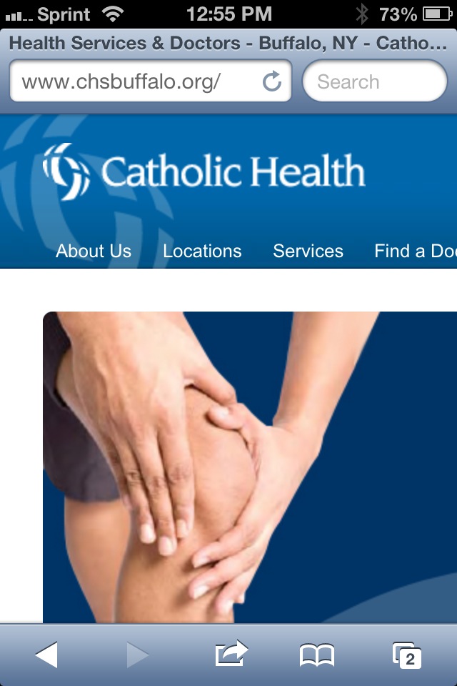
You can play around with what we implemented for our client at CHSBuffalo.org. View the source to see the styles and script. There is obviously logic on the server side, but you can make up your own for your own server platform.


These screen shots should give you an idea of what to expect when you visit the site:


The CHSBuffalo.org site as seen on an iPhone and on a Nexus 7, all styling determined by media queries.


The CHSBuffalo.org site as seen on an iPhone and on a Nexus 7 after clicking "View desktop layout" (with the zoom as the user would initially see it). The link to return to the mobile layout is at the top, though not as obvious as it could be.


This is what the user on an iPhone sees as soon as the desktop view loads—note the link to return to the mobile view is nowhere to be found. We did a poor job there and will have to fix it. Don't make the same mistake if you try this.


Related


  • Turning off responsive web design, January 12, 2013 from Bruce Lawson.

  • Opt-Out Responsive Design? September 12, 2012 at CSS-Tricks.com.

  • Creating a faux ‘View full site’ button for responsive sites, May 26th, 2012 at NeilCarpenter.com.

  • View Full Site Link for Responsive Web Design, April 12, 2012 at CreativeAndCode.com.


Update: March 25, 2013


In this post, Roger Johansson shows code the code behind making his similar technique work: Letting users disable responsive layout.


Update: March 29, 2013


Two more posts popped up this week around the idea of disabling responsive design, both of them looking a bit at the larger issue and then proposing an icon to toggle a design between responsive and non responsive: Thoughts on Toggling a Responsive Design On and Off by Jordan Moore and A suggestion for Responsive Design toggle icons by Andy Clarke.


I'm of the opinion that icons only mean something to a sub-set of users, so relying on them may be inadequate. I still like plain text.


Update: May 3, 2013


An article over at SitePoint asks "Should Users Have the Option to Switch Off Responsive Design?" The author tends to think that such an option is superfluous and many of the commentors agree. Many others point to bad RWD implementations as a reason to offer the option (though the developers of those bad RWD examples probably wouldn't care about letting users disable it). An interesting read if only to see more opinions.

Read More
Posted in browser, css, JavaScript, mobile, standards, touch, usability, UX | No comments

Monday, 7 January 2013

Google Maps: Misbehaving with UA Sniffing

Posted on 14:17 by Unknown


Here's the TL;DR: Google Maps sniffs a browser's user agent string. If it finds Internet Explorer on Windows Phone, then it kicks it over to the m.google.com mobile home page.


So let's be clear. It's 2013 and one of the biggest companies on the internet is using a sniffer to redirect users on a browser and platform that it sees as competition.


Google's general claim is that the mobile version of Google Maps is optimized for WebKit browsers (such as Google Chrome) and therefore Google doesn't support non-WebKit browsers. Even though Google Maps works fine on Firefox mobile (which supports panning, but not pinch-to-zoom) and Opera Mobile (which sometimes supports panning, but not pinch-to-zoom), neither of which uses the Webkit engine. It even renders using Opera Mini, although I can't get it do anything. I can't test Internet Explorer on Windows Phone because I don't have it.


I can, however, test Google's browser sniffer by changing the user agent string in my browser to report itself as Windows Phone and watch my request for maps.google.com get redirected to m.google.com, the Google mobile home page. This tells me that Google isn't performing feature detection (such as touch events or multi-touch support), but is instead damning the browser by name alone.


This is the lesson Google is teaching young web developers who don't understand how flawed this approach is (contrary to its own instructions on best practices from less than a month ago). Google Maps happily lets me have a sub-par experience in Opera Mobile or Firefox mobile. It even lets me have a broken experience in Opera Mini. But Internet Explorer on Windows Phone? Google Maps just boots those users.


Reports I have read (and watched) on assorted articles online suggest that Google Maps works reasonably well on IE on Windows Phone (supporting panning and pinch-to-zoom). As such, I don't buy Google's argument that it wants to prevent users from having a poor experience—there is already evidence that a large number of users (more than use Windows Phone) are having a poor experience.


From Google:


The mobile web version of Google Maps is optimized for WebKit browsers such as Chrome and Safari. However, since Internet Explorer is not a WebKit browser, Windows Phone devices are not able to access Google Maps for the mobile web.


…Because we actively block them, should be how that quote ended.


So why is Google really doing this? Is it because it's fun to pick on Microsoft? Is it because Google thought it could get away with it? Is it to make the Windows Phone experience less appealing than Android's? Is it because Google doesn't like Microsoft's touch events specification (and how well it's been received) at the W3C? Is it because of recent court cases between Google and Microsoft?


In this case I don't much care. I care instead about the terrible example Google is setting for web developers.


Background


  • Google Maps Has Never Been Accessible On Internet Explorer Mobile Now Blocked on Windows Phone (Updated), January 4, 2013.

  • Now Google is blocking Windows Phones from accessing maps.google.com, January 4, 2013.

  • Many Windows Phone users report being cut off from Google Maps (update), January 4, 2013.


  • Google Maps never supported Internet Explorer on Windows Phone 8, and it likely never will, January 5, 2013.

  • Shenanigans: Google Maps redirect issue on Windows Phones is a matter of competition, not compatibility, January 5, 2013.

  • This is Why You Can't Access Google Maps on Windows Phone, January 5, 2013.


  • Google Admits It Was Deliberately Blocking Windows Phone Users From Google Maps, January 6, 2013.

  • Google says Maps redirect on Windows Phone was a product decision, and will be removed, January 6, 2013.

  • Windows Phone Doesn't Support Google Maps Because Google Doesn't Want It To, January 6, 2013.


  • Google Maps, Windows Phone, and an avoidable mess, January 7, 2013.


My Related Posts


  • Let's Treat Old Browser Users Better, July 5, 2012.

  • Another Anti-IE Gimmick, June 14, 2012.

  • Exclusion Is a Feature Now, May 10, 2012.

  • The Return of “Best Viewed in…”, March 4, 2012.

  • Detecting Mobile Devices — Don't Bother, October 11, 2011.

Read More
Posted in browser, geolocation, Google, internet, Microsoft, mobile, rant, standards, usability, UX | No comments

Saturday, 1 December 2012

2012 Advent Calendars for Web Devs

Posted on 15:10 by Unknown


Now that the (Western, my favorite) holiday season is upon us, the tradition of advent calendars whose chocolate is replaced with web-related tips and articles is back. This year's crop is missing some from last year, but there's still good stuff to be found.


If you know of any others, please pass them along. For those not returning, I have listed them at the end.


1. 24 Ways


24 Ways, the one that pretty much defines the genre for me, is back again. It's been going strong since 2005 and based on its history this year should have some good articles.


2. Performance Calendar


Performance Calendar dates back to 2009 (and still defaults to 2011 if you go straight to the domain). It focuses on techniques to speed up your site via scripting, CSS, and general mark-up, along with server tweaks and analysis suggestions.


3. Perl Advent Calendar


Perl Advent Calendar goes all the way back to 2000 (and back then looked a bit more like a traditional advent calendar, too) and has been dispensing tips for Perl developers ever since.


4. Webkrauts


Webkrauts has an all German advent calendar, and it also dates back to 2005. It covers general web topics, but being in all-German readers like me will benefit from a Google Translate version of the page. Suggestion via @patrick_h_lauke.


5. 24 Jours de Web


24 Jours de Web has kicked off its first year as an advent calendar for web folk. Written in French it is clearly primarily targeted at French speakers, but a round of Google Translate will open it up to far more readers (like me). Suggestion via @PhilippeVay.


6. Japanese HTML5 Advent Calendar


HTML5 Advent Calendar 2012 is in Japanese, and thanks to the wonderful powers of Google Translate, it was very little confidence that I suggest it is produced by volunteers who have each picked a day and written something about the web (based on this statement: 登録した日に自分のブログなどにエントリーを書いてください。). If you know Japanese, I welcome any corrections. The site Adventar.org appears to host other advent calendars, some about web technologies, some not.


7. Web Advent


Web Advent is back. I had incorrectly listed it as not returning below, under its original address as the PHP advent calendar. With its name and domain change, it appears to be back again this year and keeping its streak from 2007 going strong.


8. HTML & CSS Advent


HTML & CSS Advent uses a rather self-explanatory name. Moving away from last year's advent-calendar-flap layout and to more of a list of articles, you'll find some experimentation with cutting-edge (or nearly so) features that may not make into client work just yet.


9. 12 Devs of Xmas


12 Devs of Xmas was also listed below as not returning (it has articles from last year), but I misunderstood — it will be starting the day after Christmas and going for 12 days from then. When all the other calendars have wrapped up, you'll still have one to read.


10. UXmas


UXmas is an advent calendar aimed at the user experience community. Coming from Australia, American readers may be thrown just a bit by the schedule. The calendar promises everything from sketches, to articles, to tools, to videos. Found this one via .net Magazine.


11. Freelancember


Freelancember 2012 is produced by the makers of Freckle time tracking software and targeted squarely at freelancers. Its daily entries will consist of downloadable gifts in the form of PDF worksheets. Think of this as less about web-tech and more about MadLibs for projects. Found this one via .net Magazine.


12. Mozilla Developer Network Holidays calendar


Mozilla Developer Network Holidays calendar includes brief links to resources or demos and suggests that you can edit them (if they are MDN resources). I had this one listed as non-returning because last year's address was very generic and the site has no navigation on the home page to direct users here. Perhaps that should be tip #1.


13. She Said It


She Said It is an advent calendar dedicated to providing general tips for the web industry in general, with quotes provided by women in the field. I only discovered this on Christmas Eve eve, so I've seen it fully populated by now. This calendar is produced in Sweden, but its contributors hail from everywhere.


14. 12 Days of Podcasts


12 Days of Podcasts, which I discovered on the day after Christmas, runs from December 26 to January 6, 2013. Each day will have a different audio-only interview with assorted web folks. You can stream them off the site or download the MP3 for later listening pleasure (perhaps during that terrible New Year party you're attending).


Not Returning


A handful of calendars aren't returning this year (so far), but content from previous years is still available. These include Font Deck's Adfont Calendar, and the Fronteers advent calendar (in Dutch).


Completely Unrelated


I discovered this one this morning and have no idea what to expect (other than the first day so far), but it might worth a look: Popperfont's Sciencegeek Advent Calendar Extravaganza. With such a compelling name, how can you not look?

Read More
Posted in accessibility, css, html, internet, JavaScript, usability, UX | No comments

Friday, 23 November 2012

Network Solutions and Dark Patterns

Posted on 08:04 by Unknown


We should be familiar with anti-patterns in user interface design — counter-intuitive or ineffective user interface techniques.


Dark patterns are user interface design patterns that intentionally try to steer users into taking actions that are in the best interest of the site owner, not the user. Sadly, users encounter these all the time. You can get a more verbose overview at the dark patterns wiki, which is from where I am stealing this phrase.


For example, do you ever notice how banner ads (typically for questionable weight loss or beauty aids) tend to vibrate every few moments, shaking just a pixel or two? This is intentional because our visual systems are trained to react to movement in our peripheral vision, like an attacking tiger (or liposuction ad).


The real problem comes when this intentional exploitation of user behavior is designed to ultimately confuse users into submission or to hand over (too much) money.


In the case of the latter, I have an example I'd like to take you through. I have used Network Solutions as my domain registrar for years, primarily because that's who I was with before ICANN opened up the registry business to others. I have stayed with Network Solutions because of the hassle of moving away from it, even though the hassle of staying has probably far outweighed it by now.


As an aside, I'd like to take this opportunity to explain that I will not use the morally bankrupt filth that is GoDaddy for a variety of reasons, not least of which is related to its absurd objectification of women, its founder's flimsily explained killing of elephants, its support of SOPA, or its status as a target to the likes of script kiddies.


Back to the meat of my post. I wanted to both register a new domain and renew an existing domain this week and found the process so overwhelming that I feel it's a great example of an ecommerce anti-pattern, a dark pattern. I'll run you through each process, both in my personal Network Solutions account and in my corporate Network Solutions account. I did this using two different browsers to avoid polluting my cookies, so I cannot say whether the differences in design elements are a function of my accounts or my browser.


For each screen capture you can click/tap/select it to see the full-size image.


Registering a Domain


My first test was to register a domain name using Firefox 16.02 and my personal account and Chrome 23.0.1271.64 with my company account.


Screen shot of Network Solutions home page in Chrome.
Screen shot of Network Solutions home page in Firefox.


The Network Solutions home page in Chrome (left, company account) and Firefox (right, personal account).


As you can see, the home page is pretty straightforward. There are a few sales pitches, and the link to log in may be hard to find, but the blue button is established as a prominent way of taking action.


Immediately after logging into my personal account using Firefox I am presented with a sales pitch. Note the use of the blue button in the green box surrounded by the gray border. The option to continue without adding this product is drawn in grays below the sales pitch.


On my Account Manager page, my company account (left) is straight to business, listing domains and actions I can take. My personal account is trying to pitch me on the private registration product and also continues to establish the blue button as a means of taking action.


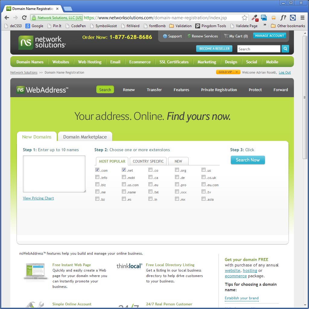
As I move to conduct a search for a new domain name, in both cases the .com and .net are pre-selected as options. I know I am only interested in .com, so I de-select .net as an option.


This screen is fairly straightforward — it shows me what is available, offers me more extensions from which to choose, and allows me to remove a domain entirely. The blue button allows me to add my selection to my shopping cart.


Clicking Add to Cart immediately results in this overlay for both accounts. I can add a bundle of three or five more domains, using the blue button. Or I can skip this with the far less prominent No Thanks button.


Now it starts to get a bit tricky. In both cases I am being offered an opportunity to keep my information hidden with private registration. You'll note that in both cases private registration is pre-selected and the price is listed, though far less obviously in the Chrome view. There is no language saying that I am adding this to my cart (as I have seen on previous screens), just a Continue or Next button. There isn't an obvious "no thanks" option, either.


To get past this screen without adding $10 to your order you have to read the text, which means you are being subjected to its fear-mongering language (I'm already getting spam, and telemarketers call my house, so there's no real benefit to me). Then you have to choose the radio button for the standard registration, and then press the Next button. This is a departure from previous screens where the user has been trained to look for the gray "nope" option.


The Next button without an accompanying No Thanks gray button beneath it can cause users to breeze through this page without noticing the pre-checked option.


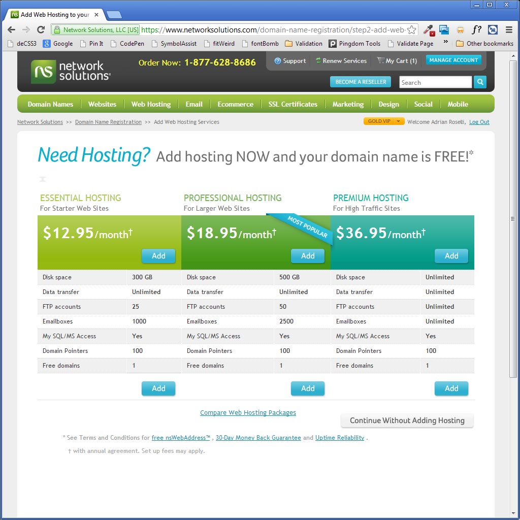
On this screen I am hit with the hosting pitch. Far stronger for my company account, but I still get the pitch when in my personal account. You may note the price difference between the cheapest plan for my company account versus the only plan offered to my personal account. The plans may in fact be different, but at a glance it looks like Network Solutions is playing a numbers game based on my account type.


You may also note that one screen offers a button to Continue Without Adding Hosting while the other simply uses a Next button with no hosting pre-selected.


These are the kinds of clues that suggest someone has made a conscious decision about what I should see as a customer and may be intentionally using these dark patterns.


Now I am getting hit with the leftover product pitches. For my company account (still in Chrome but spanning two screen shots) I see domain forwarding, email for my new domain, and SSL options. Reading the language for each, especially the SSL, these are clearly targeted to less technical customers. However, none of the options are pre-selected and just clicking the blue Continue button gets me past this screen.


For my personal account, I get similar product pitches. No SSL option is listed, but there is forwarding, email, and a "mobile" add-on option for the email. The "none" options are pre-selected, so in this case pressing the blue View Your Shopping Cart will get you past this screen without adding any products.


The shopping cart is your last chance to make sure you haven't added anything you don't want. For this demonstration I didn't add anything along the way, so it's easy to see what I have. Oddly, the shopping cart in Chrome for my company account shows me my "savings" and pitches me on why I should register my domain for five years. The shopping cart in Firefox (personal account) does no such thing.


I bet when you clicked the all-caps blue SECURE CHECKOUT button you thought you were done with the sales pitches. Not so. Here we see the the pitch to protect your domain if you forget to renew it, along with a blue Add to Cart button. At least there is a gray No Thanks, Continue button below it.


This may be a bit jarring in case you thought you were free and clear, after all you were just in you cart, just reviewed it and are ready to pay. If you do accidentally click Add to Cart, you are not presented with your shopping cart again to verify the charges. It just takes you right to the payment screen.


Here you see the total (I did not add the expiration protection), with no cart, as Network Solutions takes your credit card details and bills you. You may also notice that the auto-renew option is pre-selected. What isn't mentioned is that Network Solutions will bill your credit card 90 days before the domain is set to expire, well before the period when many organizations make a decision to switch registrars and well before the 60 days-to-expiration window many registrars impose when they won't allow a switch.


This screen shot is not part of the order flow. If you do select auto-renew accidentally you cannot simply deselect it in your account later, you have to call Network Solutions and sit through its CSRs' protestations and sales pitches to undo it.


Renewing a Domain


Assuming you weren't tricked into auto-renewing, this next test shows renewing a domain name using Chrome 23.0.1271.64 with my company account. I tried to do this in Opera, but had no luck:


@netsolcares Trying to renew a domain using @opera 12.2/Win doesn't work. Checking box, pressing "Renew" returns same page, unchecked box.

— Adrian Roselli (@aardrian) November 21, 2012


Regardless, the process will look very similar. For each screen capture you can click/tap/select it to see the full-size image.


Upon choosing my domain to renew I am promptly pitched on picking up yet more domain names.


Here is the pitch to make my already-public information private (for a fee). You may notice that this screen is different from the two analogous versions we saw above. Here the radio buttons next to the two options are replaced with a grid below, though the option to add the $10 charge is still pre-selected with the big blue Continue button cheerily prompting you to click it without paying attention.


This pitch confounds me. I am renewing my domain, which already has DNS managed elsewhere, but I am still being offered hosting. At least on this screen, unlike the previous screen, it is safe to click Continue.


The suggestion that I need a mobile site is laughable and belies the complexity involved in taking a pre-existing site and suddenly spinning up a mobile version elsewhere. However, I can safely click Continue. Someone who adds this, however, may end up spending more time and money to undo it as a result.


The shopping cart is a brief safe area, assuming I am comfortable with the five year registration period.


Once again comes an offer after I have reviewed the cart, and as I mentioned above, adding the product at this point doesn't bring you back to the cart. This screen makes it too easy to add more to your order without an easy way to verify it.


Wrap-up


Network Solutions is not the only one to make use of dark patterns. It just happens to be one that has tricked me before and has caught many of my clients as well. I simply consider the Network Solutions dark pattern order process to be low hanging fruit, an easy example of how a confusing ecommerce flow and user interface can negatively impact users, intentionally or otherwise.


Update, July 24, 2013


In a post titled The slippery slope, Harry Brignull provides even more examples of dark patterns.

Read More
Posted in design, rant, usability, UX | No comments
Older Posts Home
Subscribe to: Posts (Atom)

Popular Posts

  • New Google Analytics Features
    In the article " Google Analytics Now More Powerful, Flexible and Intelligent " from last Tuesday (yes, I know I'm behind on t...
  • Speaking: Accessible Web Apps & Standards
    I will be speaking twice in September, both of them sponsored by Infotech Niagara. If you're in the Buffalo area, these are great opport...
  • HTML5 Finally Gets... a Logo?
    Start Rant With all the debate about elements , attributes , semantic meaning and who really owns HTML5 , it's thrilling to see that t...
  • Speaking at WordCamp Buffalo 2013
    This Saturday I will be speaking at Buffalo's second WordCamp . Last year was a great day-long event filled with many good speakers (not...
  • Current CSS3, HTML5 Support
    The Tool Last week saw the launch of FindMeByIp.com , a very handy web site that displays a user's current IP address (along with a geog...
  • Copying Content Styled with Text-Transform
    Using the CSS property text-transform to automatically shift copy to uppercase has been popular for a while now, but a combination of a rec...
  • Come See Me: October 6
    I will be one of the panelists at the Business First Power Breakfast: Online Networks , this coming Tuesday, October 6, 2009 at 7:30am at S...
  • Accessibility Bookmarklets and Tools
    Testing accessibility on your web projects can be a tricky task if you have no firsthand experience with visual, audible, physical or even c...
  • Brightkite Yields to Foursquare, Gowalla, Etc.
    Brighkite has made an announcement today that affects me and a handful of other people (not counting all the people on Facebook whose timel...
  • Social Media Day 2011 in Buffalo #smdayBUF
    Last night marked the second Mashable-sponsored Social Media Day here in Buffalo. With 154 RSVPs for the event, the venue, The Eights Bist...

Categories

  • accessibility
  • Adobe
  • analytics
  • Apple
  • apps
  • ARIA
  • Bing
  • Blink
  • Brightkite
  • browser
  • Buzz
  • Chrome
  • clients
  • css
  • design
  • Facebook
  • Firefox
  • Flash
  • fonts
  • food
  • Foursquare
  • g11n
  • geolocation
  • globalization
  • Google
  • Gowalla
  • html
  • i18n
  • ICANN
  • infographic
  • Instagram
  • internationalization
  • internet
  • Internet Explorer
  • JavaScript
  • JAWS
  • Klout
  • L10n
  • law
  • localization
  • Lynx
  • Mapquest
  • Microsoft
  • mobile
  • Netscape
  • ning
  • Opera
  • patents
  • picplz
  • Plus
  • print
  • privacy
  • project management
  • QR
  • rant
  • RSS
  • Safari
  • SCVNGR
  • search
  • SEM
  • SEO
  • social media
  • Sony
  • speaking
  • standards
  • SVG
  • touch
  • translation
  • Twitter
  • typefaces
  • usability
  • UX
  • Verizon
  • video
  • W3C
  • WAI
  • WCAG
  • WebKit
  • whatwg
  • Wired
  • WOFF
  • xhtml
  • Yahoo
  • YouTube

Blog Archive

  • ▼  2013 (39)
    • ▼  December (1)
      • Web Development Advent Calendars for 2013
    • ►  November (7)
    • ►  September (4)
    • ►  July (3)
    • ►  June (2)
    • ►  May (5)
    • ►  April (3)
    • ►  March (6)
    • ►  February (2)
    • ►  January (6)
  • ►  2012 (63)
    • ►  December (2)
    • ►  November (4)
    • ►  October (5)
    • ►  September (5)
    • ►  August (4)
    • ►  July (6)
    • ►  June (7)
    • ►  May (7)
    • ►  April (8)
    • ►  March (5)
    • ►  February (3)
    • ►  January (7)
  • ►  2011 (67)
    • ►  December (5)
    • ►  November (7)
    • ►  October (5)
    • ►  September (4)
    • ►  August (8)
    • ►  July (3)
    • ►  June (8)
    • ►  May (3)
    • ►  April (1)
    • ►  March (6)
    • ►  February (6)
    • ►  January (11)
  • ►  2010 (100)
    • ►  December (8)
    • ►  November (7)
    • ►  October (5)
    • ►  September (10)
    • ►  August (7)
    • ►  July (11)
    • ►  June (12)
    • ►  May (6)
    • ►  April (8)
    • ►  March (10)
    • ►  February (5)
    • ►  January (11)
  • ►  2009 (51)
    • ►  December (9)
    • ►  November (6)
    • ►  October (21)
    • ►  September (13)
    • ►  August (2)
  • ►  2003 (3)
    • ►  October (1)
    • ►  January (2)
  • ►  2002 (9)
    • ►  December (1)
    • ►  June (3)
    • ►  April (1)
    • ►  March (3)
    • ►  January (1)
  • ►  2001 (1)
    • ►  February (1)
  • ►  2000 (4)
    • ►  October (1)
    • ►  July (1)
    • ►  June (1)
    • ►  January (1)
  • ►  1999 (7)
    • ►  November (1)
    • ►  September (2)
    • ►  August (2)
    • ►  July (1)
    • ►  June (1)
Powered by Blogger.

About Me

Unknown
View my complete profile